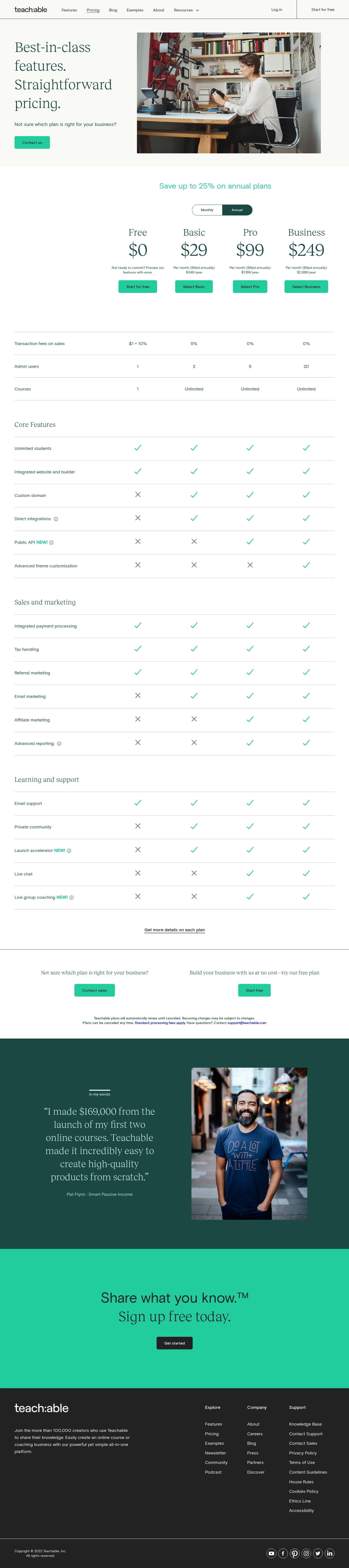
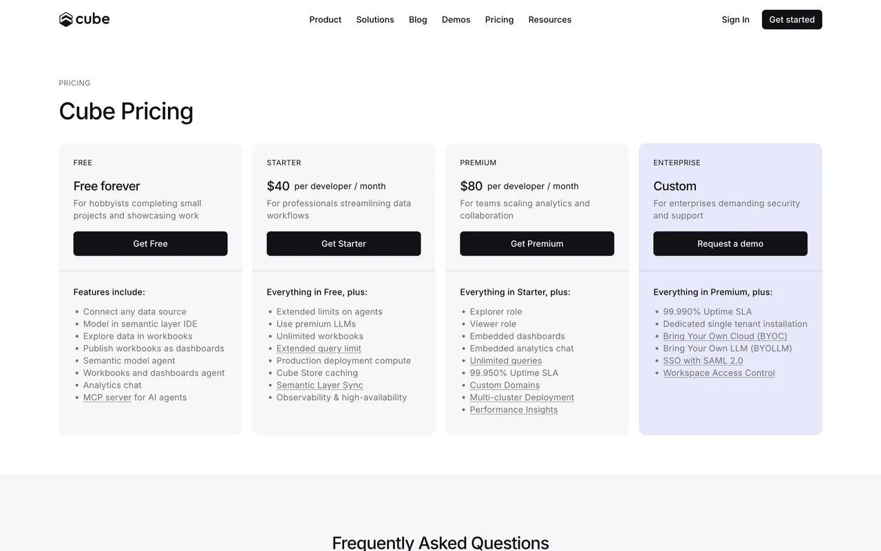
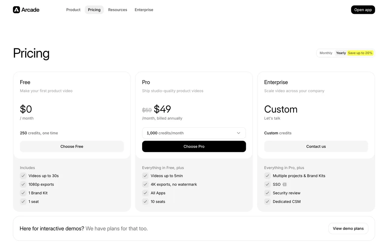
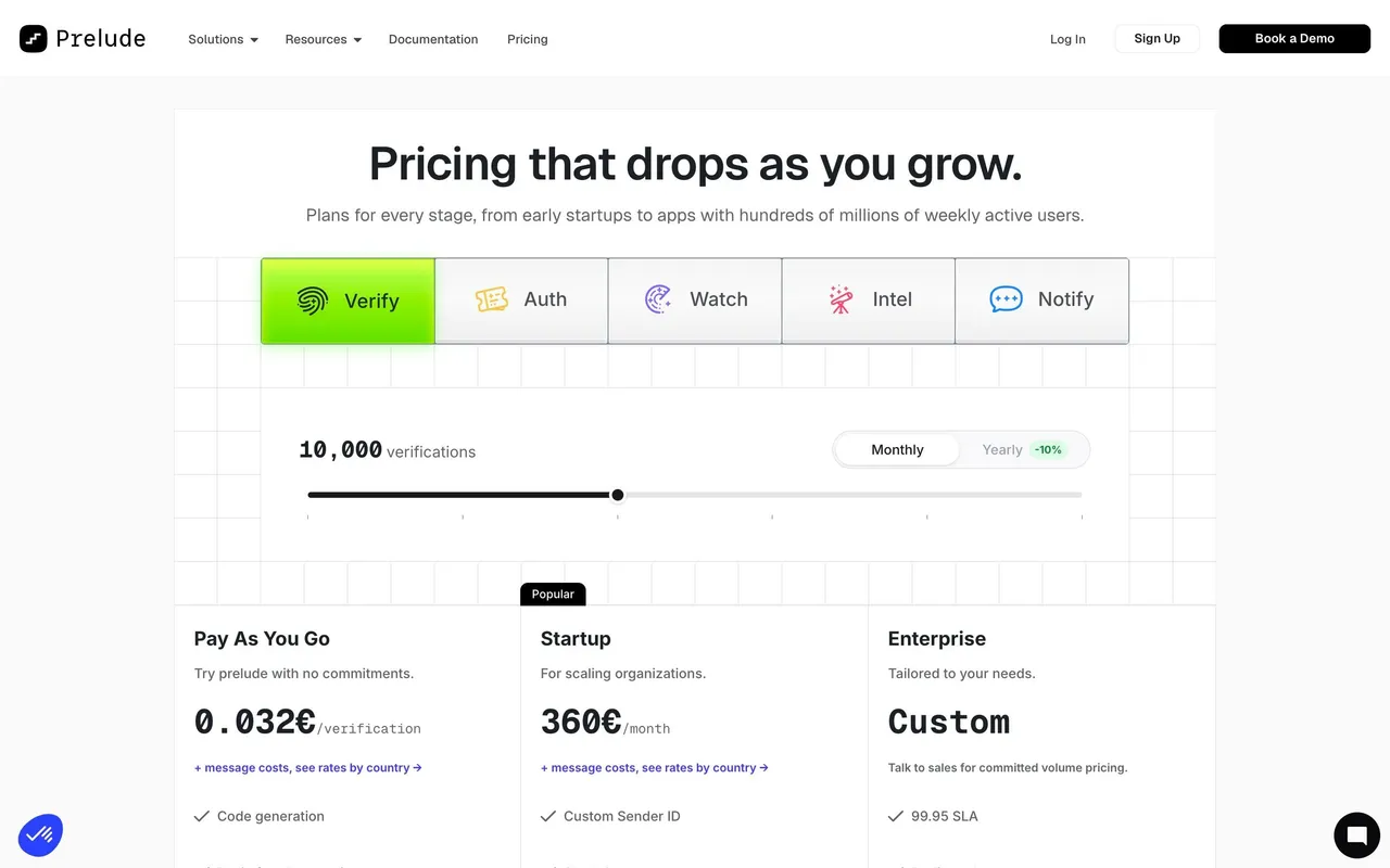
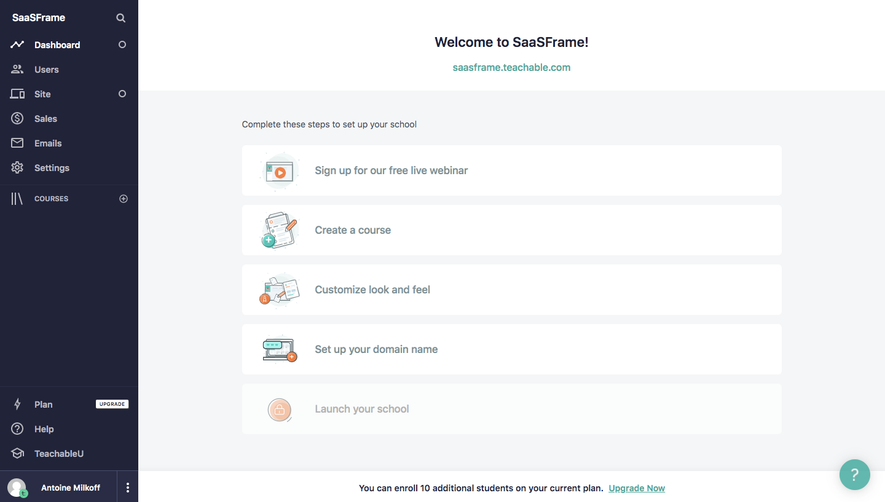
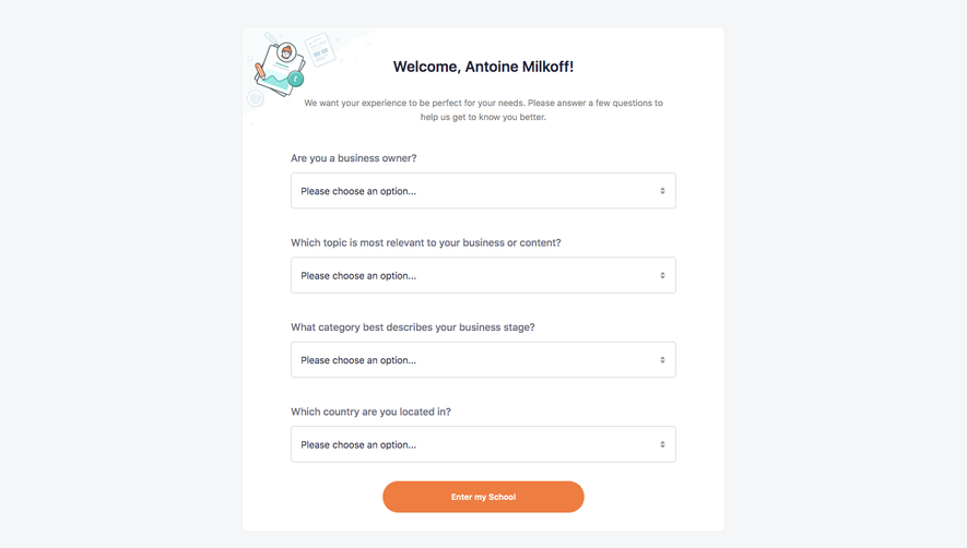
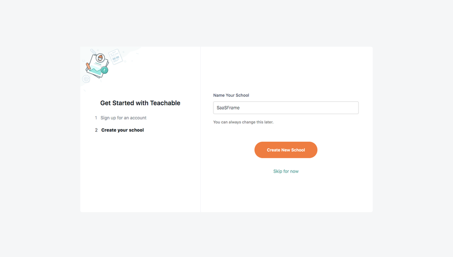
Teachable’s pricing page embodies a polished blend of modern minimalism and approachability. Clean lines, generous white space, and soft shadows establish a professional yet welcoming tone. The subtle playfulness of curved sections offsets the sharp precision of a grid-driven structure, creating a visually inviting experience that avoids feeling sterile or overwhelming.
Layout and Structure
The page flows intuitively, opening with a concise hero highlighting their value proposition and leading directly to a meticulously organized pricing comparison. Plans are showcased in side-by-side cards, each with a definitive CTA (“Get started”) and a quick features snapshot—ensuring effortless comparison. Following this, users find an animated FAQ accordion and customer testimonials, deepening trust and addressing objections without breaking the page’s rhythm. The footer is compact, housing essential links and understated branding.
Visual Elements
Consistent use of custom icons, soft gradients, and vector-style illustrations adds depth and personality. Delicate hover interactions (like button color transitions and subtle shadows) create a tactile, responsive feel. Content is broken up by sparing photography and supportive animation, reinforcing the SaaS narrative without pulling attention away from conversion goals.
Color Palette and Typography
A contemporary palette—anchored in deep navy, crisp white, and vibrant teal—conveys both clarity and confidence. Accent colors are deployed to direct the eye toward interactive elements. Typography features a hierarchy-driven sans-serif stack, using bold weights and ample spacing for headings, and softer weights for supporting text, ensuring readability and visual appeal.
User Experience Patterns & Unique Choices
Intuitive sticky navigation, clear CTAs anchored at just the right moments, and helpful microcopy streamline the user journey. Transparent feature lists and upfront pricing cultivate trust. Notably, the page employs a plan-highlighting effect based on user type (creator, business), reinforcing the relevance of each option. The overall tone radiates trustworthiness, empowerment, and innovation—making technical details feel accessible and actionable.
 SaaSFrame