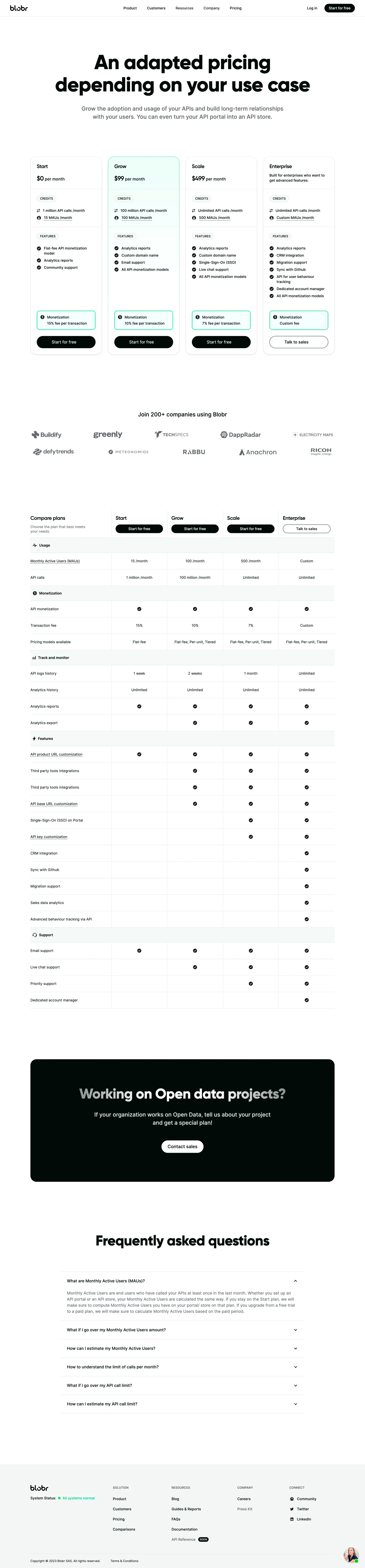
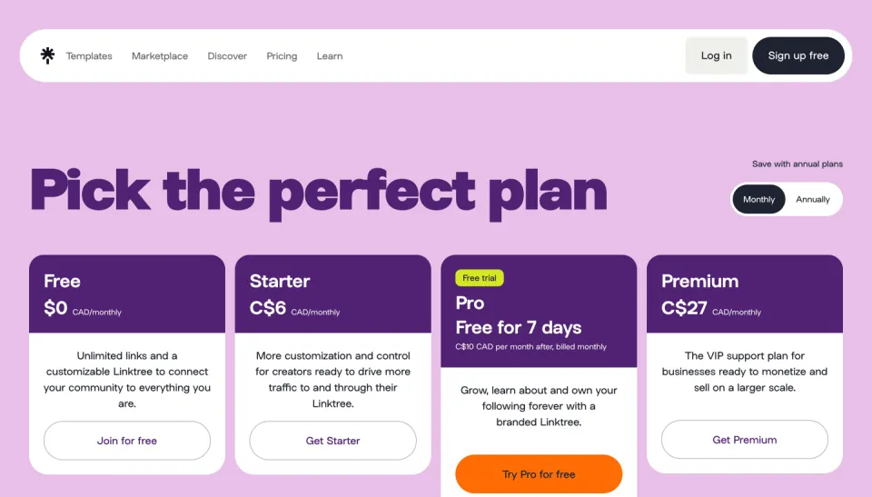
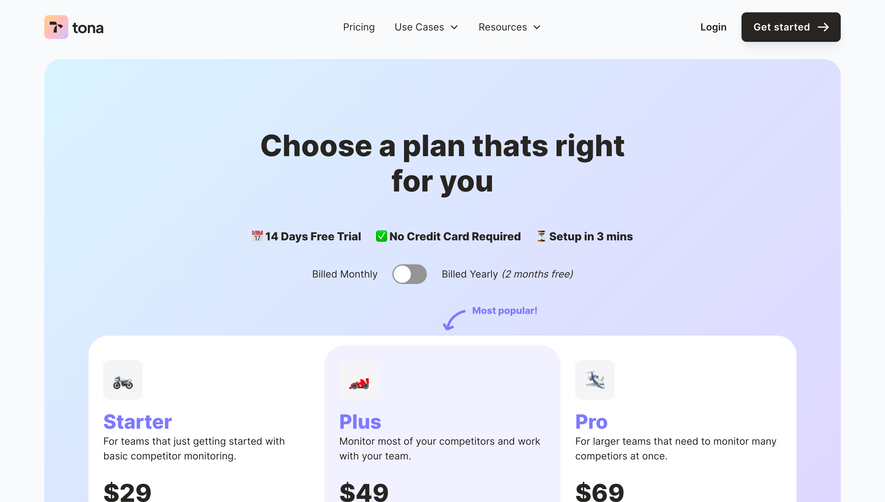
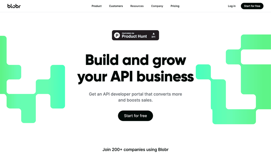
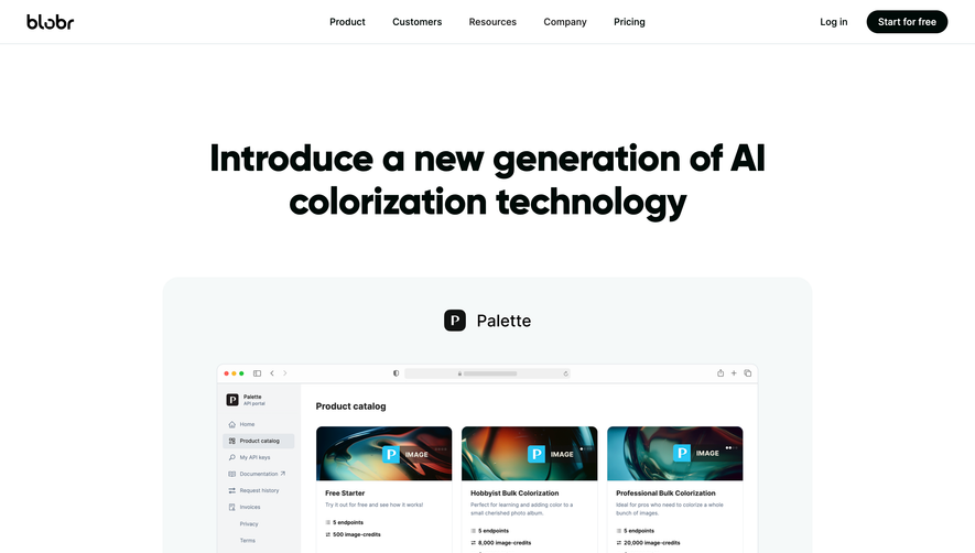
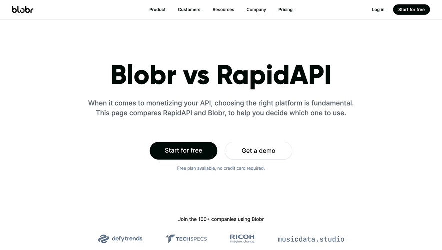
Blobr’s pricing page radiates a contemporary, confident, and professional vibe. It effortlessly blends minimalist sensibilities with playful undertones, striking a perfect balance between seriousness and approachability. Generous whitespace, clean lines, and soft curves guide the eye, while subtle microinteractions warm up the interface.
Layout and Structure
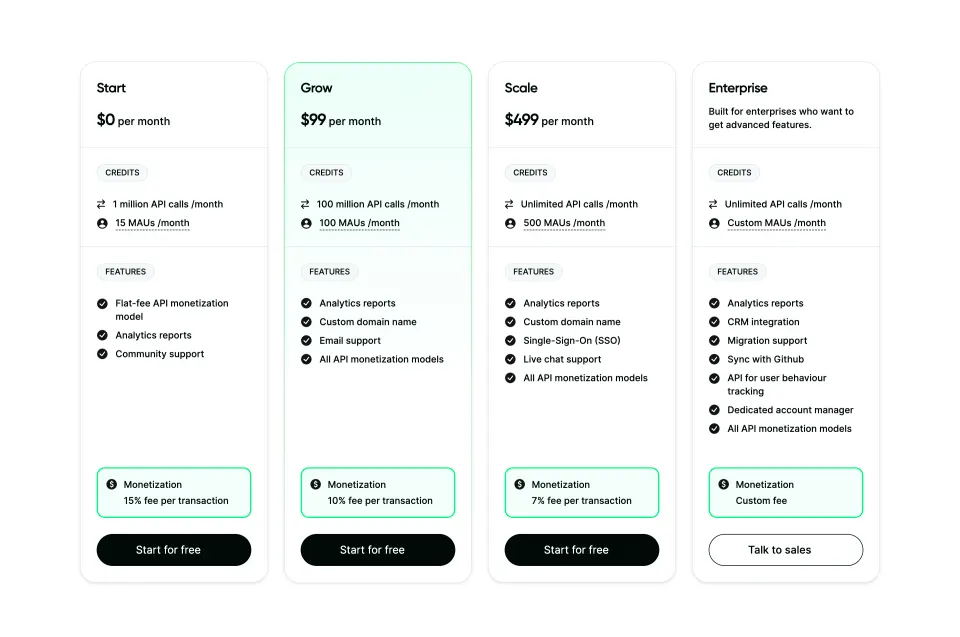
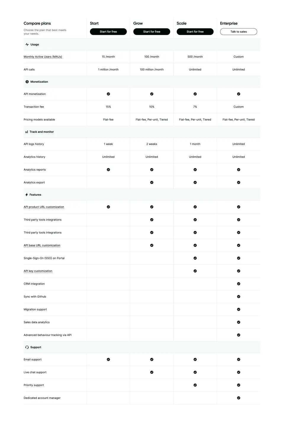
The page follows a logical, user-centric hierarchy: a sticky navigation bar with key sections, an inviting hero section that immediately communicates value, followed by segmented pricing options prominently displayed in side-by-side cards. Below, supplemental callouts tease more features, and a concise FAQ answers common queries. The sticky “Try for Free” button ensures a clear primary CTA throughout the experience.
Visual Elements
Instead of overwhelming the viewer, Blobr uses bespoke iconography and light vector illustrations to accentuate benefits and differentiate pricing tiers. Delicate shadow effects and color accents anchor card elements, while consistent icon styles lend cohesion. A conspicuous absence of heavy photography or video content shifts focus to the product offering.
Color Palette and Typography
A soothing palette—dominated by whites, gradients of blue and purple, and lively accent hues—promotes calm and clarity. Clean, geometric sans-serif typefaces (such as Inter or similar) drive legibility. Judicious use of bolding and font sizing establishes hierarchy, making navigation effortless.
User Experience Patterns & Unique Choices
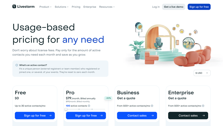
Smart, frictionless navigation keeps the user oriented, backed by persistent access to key actions. Attention-grabbing yet tasteful CTAs build momentum without being invasive. The subtle hover states and clean switch between pricing frequencies (monthly/annual) impart a sense of technical polish. The blend of playful visuals, non-distracting animations, and intuitive structure builds trust and signals innovation—ideal inspiration for SaaS teams aiming to convert with clarity and style.
 SaaSFrame