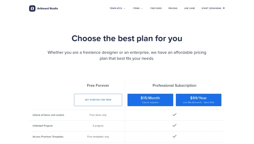
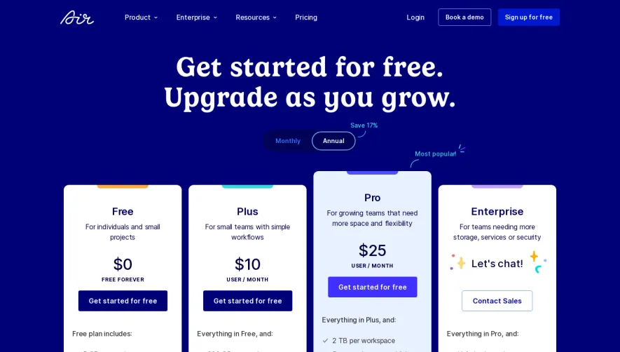
Overall Style and Aesthetic
Stripe’s pricing page embodies a modern, minimalist approach balanced with just enough color and interaction to feel innovative and inviting. There’s abundant white space, crisp lines, and a decidedly professional aura, yet it avoids feeling sterile thanks to vibrant accent hues and gentle gradients. The design feels both approachable and deeply trustworthy, reinforcing Stripe’s brand as reliable and forward-thinking. Layout and Structure
The page begins with a succinct hero section—straight to the point, with bold headings and a confident value proposition. Pricing tables are clearly organized, featuring toggle controls for country and billing frequency, making comparison effortless. Supporting content, like feature highlights and explanations, is dispersed through collapsible sections and subtle tabs, enabling information to unfold smoothly without clutter. A utility-rich footer anchors navigation and adds credibility. Visual Elements
Subtle, animated icons and diagrams provide clarity without overwhelming the page. Hover interactions and micro-animations add polish and coach users’ attention fluidly between sections. There’s limited photography, opting instead for expressive product visualizations and vector illustrations—giving the tech-heavy content a fresh lift. Color Palette and Typography
A signature indigo blue forms the backbone, supported by soft grays, bright white, and bright accent colors for interactive elements. The typography is sharp: bold headings, clean sans-serif body copy, and careful sizing establish an intuitive visual hierarchy that enhances readability and scans beautifully. User Experience Patterns and Unique Choices
Intuitive navigation, intelligent use of tabs and toggles, and ever-present CTAs streamline the buying journey. Features like expanding details and contextual tooltips deliver in-depth information without bloat. The overall effect is a page that’s sophisticated, friendly, and meticulously user-centric—an inspiring model for SaaS pricing design.