Design with AI
Generate a new design based on this screen using your own content.
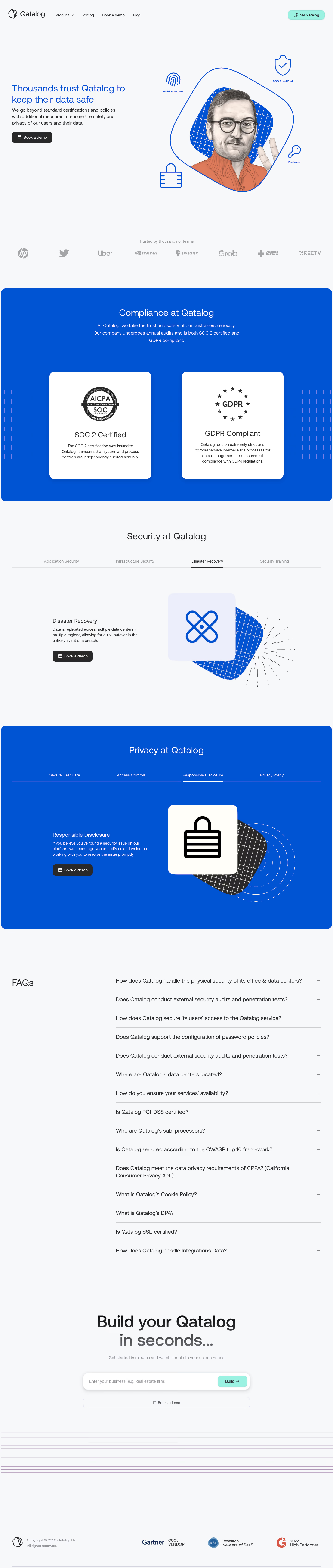
# Design from Reference: Qatalog Security Page
Create an original, high-fidelity visual design inspired by the reference. Prioritize composition, typography, colors, spacing, and component styling over technical implementation.
## Reference
- **Product:** Qatalog
- **Category:** Security Page
- **Screenshot:** https://cdn.prod.website-files.com/5e9dc792e1210c5325f7ebbc/6acb6ea42837b9f3168fb623_6acb6c900e8221f13082f371_cms-2ebb6f863f728522b9ea7fe5.webp
Analyze the screenshot first. If inaccessible, request it rather than guessing.
## Content
{{content.instructions}}
{{content.data}}
Preserve essential messaging and factual accuracy. Adapt structure and copy length for visual balance; never invent product claims.
## Visual Design
### Overall aesthetic
- **Character:** Friendly security marketing page combining pale backgrounds, saturated blue bands and hand-drawn technical illustrations.
### Page composition
- **Canvas:** 1440 × 6773 screenshot px.
- **Sequence:** Split security hero, muted logo strip, blue compliance block with two certification cards, light tabbed security block, blue tabbed privacy block, long FAQ, centered signup form and recognition footer.
### Information hierarchy
- **Priority:** Trust headline and illustrated portrait lead; certification cards and tab panels organize supporting evidence before FAQ.
### Typography
- **Family:** Rounded humanist sans serif, exact font unverified.
- **Scale:** Estimated screenshot section headings 36–40 px, card headings 30 px, body 18 px and navigation/tabs 14–16 px.
### Colors & surfaces
- **Sampled palette:** Pale canvas #F6F8FA; blue #0053D2; white #FFFFFF; warm icon card #FFFEF8; charcoal #292929; lavender #ECEFFB.
### Components
- **Illustrations:** Grayscale face with orange sweater inside tilted grid-backed shape; blue outline shield, fingerprint/key/lock icons; layered rounded symbol tiles and loose radial lines.
- **Panels:** Large blue rounded sections, white certification cards approximately 24 px corners, underlined active tabs.
- **FAQ/actions:** Thin ruled accordion rows with plus icons; black demo buttons; mint signup action inside a shadowed white input.
### Visual rhythm
- **Spacing:** Approximately 120–180 screenshot px major-section padding; big certification panels contrast with dense FAQ rows.
### Responsive
- **Observed:** Desktop only.
- **Adaptation:** Stack certification cards and tab content, make tabs scrollable, and use readable FAQ tap targets.
### Adaptation guidance
- **Preserve:** Blue/pale alternation, illustrative warmth and structured trust information.
- **Replace:** Use verified certifications and security statements; visual reference does not establish compliance for another product.
Use this context to reproduce the reference's visual language: layout, typography, colors, spacing, borders, radii, and distinctive elements. The screenshot takes priority if descriptions conflict.
## Direction
{{preferences.fidelityInstructions}}
## Output
{{output.instructions}}
Deliver a polished, cohesive design with precise alignment, hierarchy, and spacing. Produce the requested visual artifact, not just a description. If unsupported, explain the limitation.