
Thank you! Your submission has been received!
Oops! Something went wrong while submitting the form.
Get SaaSFrame Pro
Monthly
$18
Quarterly
$48
Yearly
$180
Upgrade to access this feature
Browse all screens & flows
Filter and search screens & flows
Access Figma files
Access mobile versions
Bookmark screens & flows
Join now


ProductBoard roductboard About Page

ProductBoard
Product Management Software
Designed by
No items found.

Bookmark
Bookmark

Design with AI
Thank you! Your submission has been received!
Oops! Something went wrong while submitting the form.
# Design from Reference: ProductBoard roductboard About Page
Create an original, high-fidelity visual design inspired by the reference. Prioritize composition, typography, colors, spacing, and component styling over technical implementation.
## Reference
- **Product:** ProductBoard
- **Category:** About Page
- **Screenshot:** https://cdn.prod.website-files.com/5e9dc792e1210c5325f7ebbc/62f272df2f69d377d5e5bd00_1660054808064-93373875-86f6-493b-b7b0-2255f02f0fa4-name%3DProductboardAboutPage.webp
Analyze the screenshot first. If inaccessible, request it rather than guessing.
## Content
{{content.instructions}}
{{content.data}}
Preserve essential messaging and factual accuracy. Adapt structure and copy length for visual balance; never invent product claims.
## Visual Design
### Overall aesthetic
- **Style:** Bright company page with navy typography, blue actions, soft-gray rounded regions and playful line-art space motifs.
- **Character:** An open narrative combines company story, oversized statistics, customer/investor marks, office cards and colorful values icons.
- **Accent:** Yellow announcement/signup details and a saturated blue legal footer add contrast to the mostly white page.
### Page composition
- **Canvas:** Source 1440 × 6856 pixels, inspected throughout in five crops at 1400px width. Measurements use inspection pixels; exact CSS scale is unverified.
- **Top:** Rounded pale-yellow announcement strip, followed by a large pale-gray hero shell containing navigation and centered headline/subtitle.
- **Story:** Narrow left-aligned copy sits within a broad region decorated with faint planets, stars, galaxy and globe outlines.
- **Statistics:** Three large statistics occupy the first row, with a fourth below at left. A centered proof sentence and two rows of customer logos follow.
- **Offices:** A pale-gray rounded section contains centered introduction, world map with blue dots and six white office cards in two columns.
- **Values/investors:** Five icon-led value groups form three then two columns, followed by investor marks in two rows.
- **Ending:** Newsletter strip, four footer-link columns and a broad rounded blue legal/social region finish the page.
### Information hierarchy
- **Hero:** Two-line mission headline dominates, with a centered two-line subtitle.
- **Story:** Our story heading precedes two paragraphs; illustration stays faint and decorative.
- **Proof:** Very large numerical values and small captions create a strong statistics layer before customer logos.
- **Locations:** Map establishes global presence; office title, address text and Open positions link repeat in cards.
- **Culture:** Colored round icons identify values, each with a bold short title and muted paragraph.
- **Conversion:** Blue trial action in navigation and yellow newsletter Subscribe action stand apart from informational links.
### Typography
- **Hero:** Approximately 48px semibold sans serif, around 52px line height with tight tracking.
- **Section headings:** Around 34px semibold; office titles around 24px semibold.
- **Statistics:** Approximately 82px bold with compact line height; captions around 18px muted.
- **Body:** Story text around 18px/28px; smaller values/footer copy around 14–16px/22px.
- **Newsletter:** Around 24px semibold; navigation around 16px medium. Exact font family is unverified.
### Colors & surfaces
- **Measured base:** #FFFFFF and #FAFAFA dominate white and soft-gray surfaces.
- **Measured accent:** #0967FB saturated blue, #FFF2D0 announcement fill.
- **Near-white variations:** #FEFEFE, #FDFFFF, #FFFEFF and #FAFAFC occur in pale rendering transitions.
- **Foreground:** Headings appear deep navy; secondary copy is cool gray. Value icons add blue, orange, purple, red and green.
- **Depth:** Thin pale card boundaries with minimal shadow; rounded section shells provide most grouping.
### Components
- **Hero shell:** Nearly full-width with about 20px radius and substantial vertical padding.
- **Trial button:** Compact blue rounded rectangle around 142 × 32px; announcement action is yellow with roughly 8px radius.
- **Statistics:** Small colored diamond marks above large numerals, with captions beneath; no enclosing cards.
- **Map:** Pale outlined continents and varied-size blue location circles; exact geographic data should come from supplied content.
- **Office cards:** Approximately 388 × 185px for fuller rows, around 16px radius, thin border and 32px padding.
- **Values:** About 57px round colored icon disks above short text groups.
- **Newsletter:** Soft-gray rounded band with underlined email field, yellow button and checked consent control.
- **Footer:** Four simple link columns and blue legal block with social icons; a multicolor ring/shield graphic overlaps its upper edge. Floating chat appears in multiple captured positions and should be implemented as one overlay.
- **States:** No navigation dropdown, newsletter validation or office-link result is visible.
### Visual rhythm
- **Hero:** Broad space separates navigation and central message, with extensive lower breathing room.
- **Story/proof:** Large vertical gaps and faint illustration create a slow editorial cadence.
- **Office grid:** Approximately 30px gaps separate equal-width cards.
- **Values:** Consistent icon/title/body stacks use broad column gutters and generous row spacing.
- **Footer:** Newsletter, link columns and legal block are clearly separated by large white bands.
### Responsive
- **Observed scope:** Desktop long page only; mobile behavior is unverified.
- **Recommended grids:** Reduce statistics, offices and values to fewer columns while preserving reading order.
- **Recommended art:** Scale or crop decorative space motifs independently of text; make the map fluid.
- **Recommended form/footer:** Stack newsletter controls and wrap footer columns, preserving consent readability.
- **Recommended typography:** Reduce hero/statistic scale without losing their relative emphasis.
### Adaptation guidance
- **Preserve:** Navy/blue hierarchy, soft rounded sections, playful faint line art and distinct proof/culture/location layers.
- **Content:** Replace company metrics, addresses, logos and investor claims with supplied verified information.
- **Implementation:** Use responsive grids and reusable office/value components instead of fixed screenshot positions.
- **Accessibility:** Provide meaningful map alternatives, labeled consent/input controls and visible link focus.
Use this context to reproduce the reference's visual language: layout, typography, colors, spacing, borders, radii, and distinctive elements. The screenshot takes priority if descriptions conflict.
## Direction
{{preferences.fidelityInstructions}}
## Output
{{output.instructions}}
Deliver a polished, cohesive design with precise alignment, hierarchy, and spacing. Produce the requested visual artifact, not just a description. If unsupported, explain the limitation.


Category
Patterns
Tech Stack



Added on
May 13, 2020
Similar screens
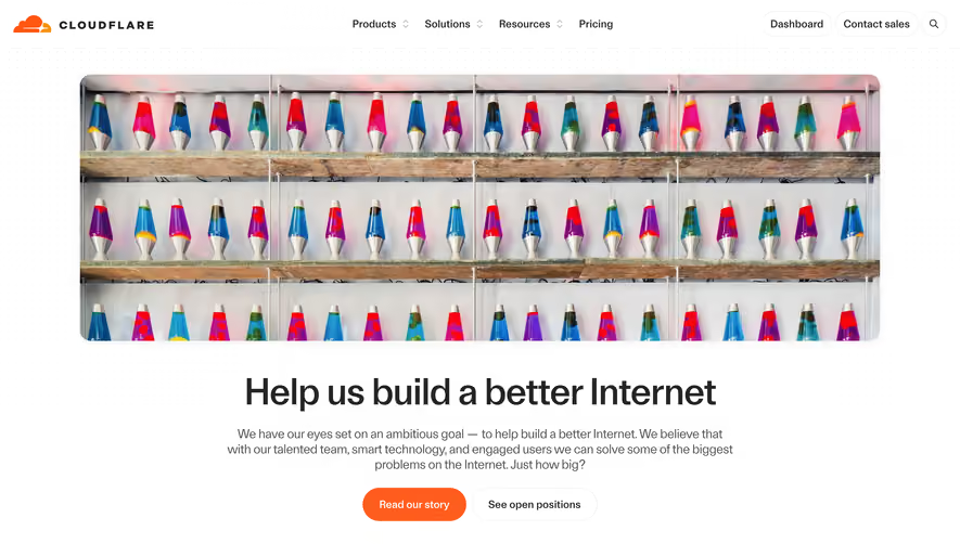


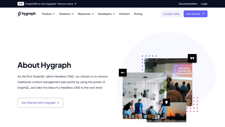

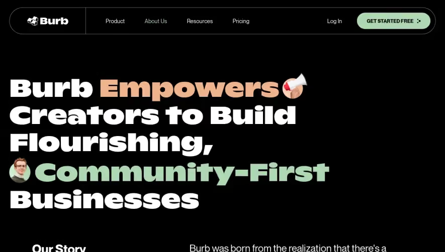

Upgrade to SaaSFrame Pro now to see similar examples.
Monthly
$18 /month
Billed $18 monthly
Browse all screens & flows
Filter and search screens & flows
Search text in screenshots
Access Figma files
Access mobile versions
Join now
Quarterly
$16 /month
Billed $48 quarterly
Browse all screens & flows
Filter and search screens & flows
Search text in screenshots
Access Figma files
Access mobile versions
Join now
Yearly
$15 /month
Billed $180 yearly
Browse all screens & flows
Filter and search screens & flows
Search text in screenshots
Access Figma files
Access mobile versions
Join now