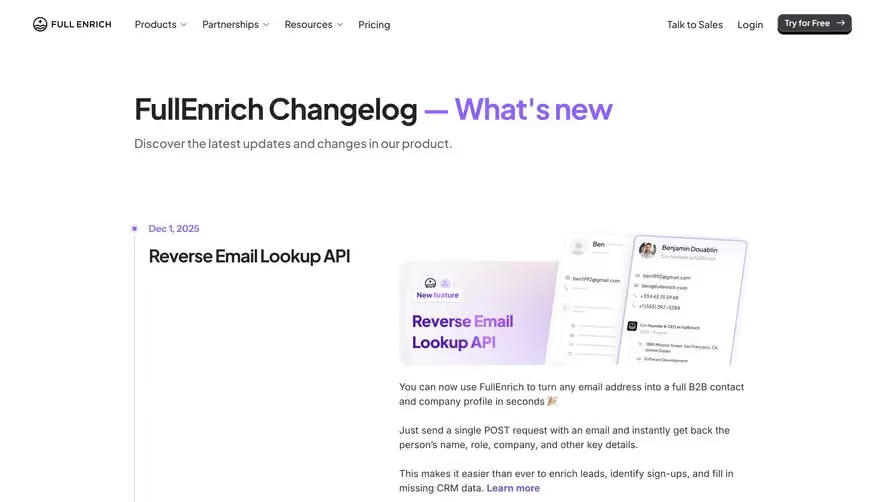
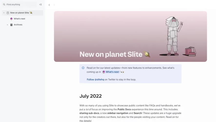
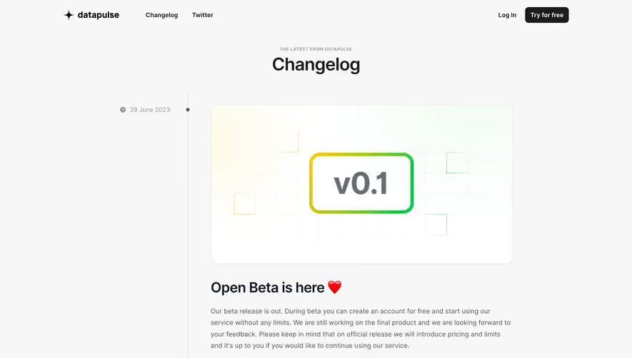
Generate a new design based on this screen using your own content.
Thank you! Your submission has been received!
Oops! Something went wrong while submitting the form.
# Design from Reference: Plain Changelog
Create an original, high-fidelity visual design inspired by the reference. Prioritize composition, typography, colors, spacing, and component styling over technical implementation.
## Reference
- **Product:** Plain
- **Category:** Changelog
- **Screenshot:** https://cdn.prod.website-files.com/5e9dc792e1210c5325f7ebbc/6acad7f51025e911ae521112_6acad781782887bd3974ea75_cms-187951d87f1a03b2afc4f1c7.webp
Analyze the screenshot first. If inaccessible, request it rather than guessing.
## Content
{{content.instructions}}
{{content.data}}
Preserve essential messaging and factual accuracy. Adapt structure and copy length for visual balance; never invent product claims.
## Visual Design
Use this context to reproduce the reference's visual language: layout, typography, colors, spacing, borders, radii, and distinctive elements. The screenshot takes priority if descriptions conflict.
## Direction
{{preferences.fidelityInstructions}}
## Output
{{output.instructions}}
Deliver a polished, cohesive design with precise alignment, hierarchy, and spacing. Produce the requested visual artifact, not just a description. If unsupported, explain the limitation.
Plain’s changelog page is a masterclass in modern minimalism. The interface embraces generous white space, refined layout grids, and subtle accents to spotlight essential information. The aesthetic exudes professionalism while remaining approachable—a perfect fit for SaaS customers seeking clarity.
Layout and Structure
The page forgoes a traditional hero banner, jumping straight to the changelog entries. Content is stacked vertically with precision, each update card visually separated by lightly tinted containers and gentle drop shadows. Navigation is anchored by a focused top bar, while a slim sticky header ensures orientation as users scroll.
Visual Elements
Visual intrigue is created through icons that signify update categories and soft gradient highlights for individual changelog cards. Each entry is punctuated by familiar, colorful emojis, making updates feel personable and scannable. The use of illustration is restrained, letting functional visuals shine over decorative flourishes.
Color Palette and Typography
A cool, inviting palette—led by soft whites and pale gray backgrounds—dominates, with key accent hues in blue and purple for callouts and links. Typography leverages a geometric sans-serif font, balancing clarity and friendliness. Headings and update titles vary in weight and size for immediate visual hierarchy.
User Experience Patterns
Navigation is streamlined; the sticky header provides persistent access to site navigation from anywhere on the page. Changelog entries are easily digestible, supplemented by timestamp metadata and clear labels. Tags and links are tactile and accessible, with ample padding and high-contrast hover states.
Unique or Notable Design Choices
What sets this page apart is its editorial framing—each entry feels like a curated announcement, enhanced by friendly copy and discrete, emoji-driven cues. The design conveys both innovation and approachability, making frequent product evolution feel exciting, yet reliably managed.