
Thank you! Your submission has been received!
Oops! Something went wrong while submitting the form.
Get SaaSFrame Pro
Monthly
$18
Quarterly
$48
Yearly
$180
Upgrade to access this feature
Browse all screens & flows
Filter and search screens & flows
Access Figma files
Access mobile versions
Bookmark screens & flows
Join now

Pipefy Careers Page

Pipefy
Workflow Management
Designed by
No items found.

Bookmark
Bookmark

Design with AI
Thank you! Your submission has been received!
Oops! Something went wrong while submitting the form.
# Design from Reference: Pipefy Careers Page
Create an original, high-fidelity visual design inspired by the reference. Prioritize composition, typography, colors, spacing, and component styling over technical implementation.
## Reference
- **Product:** Pipefy
- **Category:** Careers Page
- **Screenshot:** https://cdn.prod.website-files.com/5e9dc792e1210c5325f7ebbc/62f272dc530a766d07fcbdd9_1660054896764-3a023d4f-acf9-410f-be91-462bf286aa4e-name%3DPipefyCareersPage.webp
Analyze the screenshot first. If inaccessible, request it rather than guessing.
## Content
{{content.instructions}}
{{content.data}}
Preserve essential messaging and factual accuracy. Adapt structure and copy length for visual balance; never invent product claims.
## Visual Design
### Overall aesthetic
- **Character:** Expansive careers page with a white foundation, blue recruitment actions, colorful employee photography and bright icon-led culture cards.
- **Evidence and scale:** Screenshot measures 1440 × 8744 image pixels. Sizes estimate 1× CSS capture; actual DPR and font identity remain unverified. All portions through the footer were inspected.
### Page composition
- **Header/hero:** Compact product navigation precedes a centered two-line recruitment statement, explanatory paragraph and paired filled/outlined actions. A small workplace-certification badge sits to the right.
- **People and company:** Six employee portraits form a full-width strip with names/roles beneath. A split company-introduction row leads into an eight-entry alternating timeline.
- **Culture:** A split values introduction precedes eight colored cards in a four-column, two-row grid.
- **Recruitment:** A text/portrait introduction leads into eleven department/talent-pool tiles across three rows.
- **Benefits and proof:** A pale band holds three bulleted benefit columns; review logos, award badges and social links follow on white.
- **Further narrative:** Diversity content pairs a colorful geometric mark with copy; an early-career section pairs text with a large astronaut helmet.
- **Closing/footer:** A pale recruitment callout overlaps the dark footer, which contains breadcrumb, five navigation columns, legal/social elements and cookie/chat overlays.
### Information hierarchy
- **Recruitment priority:** Large bold headline and blue Join the team action lead; outlined company-discovery action is secondary.
- **Narrative levels:** Company history, values, roles, benefits and inclusion each have distinct major headings and visual formats.
- **Timeline:** Colored year labels and circular icons alternate beside outlined explanatory panels, making chronology scannable.
- **Proof:** Employee portraits, ratings and awards add visual credibility; their claims are captured content rather than independently verified facts.
### Typography
- **Hero:** Approximately 72px CSS bold sans-serif with tight 72–76px leading.
- **Section headings:** Approximately 40–48px semibold; timeline years around 34px bold.
- **Body:** Approximately 16–20px with 26–30px leading. Employee names and card titles are bold around 16px.
- **Utilities:** Header/buttons around 14–16px; footer links around 16px, uppercase group labels around 14px. Exact font family and computed weights are unverified.
### Colors & surfaces
- **Measured foundation:** White #FFFFFF dominates; pale #EFF3F8 supports benefits and closing surfaces.
- **Measured footer:** Dark slate #253239 forms the large footer.
- **Measured bright accents:** Orange #F4A933, blue #349DFB, red #E94032 and violet #6B4FFC appear prominently in portrait backgrounds, timeline markers and culture tiles.
- **UI color:** Saturated blue actions contrast with dark headings and muted gray body text; thin pale rules separate structural regions.
### Components
- **Hero actions:** Blue filled and blue outlined rectangles around 158–170 × 50px CSS, with small radii.
- **Employee strip:** Six roughly 210 × 266px rounded portrait tiles, each on a different saturated background, followed by centered two-line metadata.
- **Timeline:** Large colored circular icons around 128px diameter beside bold years; alternating text boxes around 615px wide have 2px color-matched outlines and 16px radii.
- **Values cards:** Approximately 330 × 356px, 16px radii, large white line icons, centered bold titles and lower left-aligned copy.
- **Role tiles:** Four-column grid of shorter colored rectangles around 327 × 110px, centered small icon and white label.
- **Proof/narrative assets:** Review marks and award ribbons sit in centered rows; diversity graphic and helmet use generous white space.
- **Overlays:** White cookie panel includes close, acceptance and settings controls at lower-left; small blue support control sits lower-right.
### Visual rhythm
- **Wide framing:** Most content spans nearly the full width with 30–80px gutters; split narrative rows use larger internal side padding.
- **Section cadence:** Broad 80–120px intervals separate company, values, roles and later narrative regions.
- **Grid rhythm:** Consistent 20–24px gaps connect values and role tiles; the timeline uses large regular vertical steps.
- **Contrast:** Color-dense grids alternate with open white text/image regions, then a dark footer.
### Responsive
- **Observed limit:** Only desktop is shown; navigation, role selection, cookie choices and mobile behavior are unobserved.
- **Recommended grids:** Reduce employee/value/role columns progressively and preserve readable card copy.
- **Recommended timeline:** Convert alternating history entries to a single vertical sequence, retaining year/icon associations.
- **Recommended narrative/footer:** Stack split sections, simplify decorative imagery and collapse footer groups without shrinking links or legal text.
### Adaptation guidance
- **Preserve the structure:** Build an employer story through people, history, values, opportunities, practical benefits and inclusion.
- **Control color:** Use a consistent bright palette for culture categories while keeping body regions neutral and recruitment actions blue.
- **Implementation:** Provide accessible headings, image alternatives, clear job links and focus states. Benefit lists, ratings, certification and historical company claims require separate verification before reuse.
Use this context to reproduce the reference's visual language: layout, typography, colors, spacing, borders, radii, and distinctive elements. The screenshot takes priority if descriptions conflict.
## Direction
{{preferences.fidelityInstructions}}
## Output
{{output.instructions}}
Deliver a polished, cohesive design with precise alignment, hierarchy, and spacing. Produce the requested visual artifact, not just a description. If unsupported, explain the limitation.


Category
Patterns
No items found.
Tech Stack


Added on
May 26, 2020
Similar screens



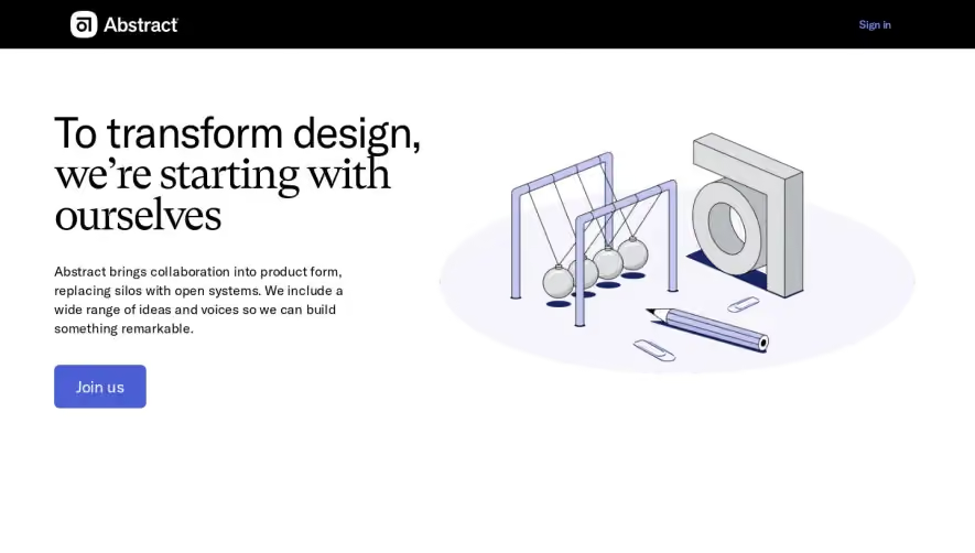

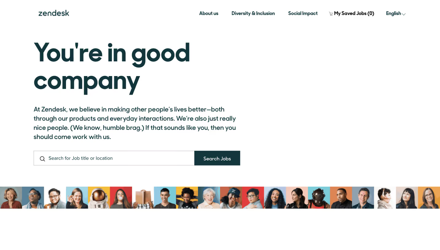

Upgrade to SaaSFrame Pro now to see similar examples.
Monthly
$18 /month
Billed $18 monthly
Browse all screens & flows
Filter and search screens & flows
Search text in screenshots
Access Figma files
Access mobile versions
Join now
Quarterly
$16 /month
Billed $48 quarterly
Browse all screens & flows
Filter and search screens & flows
Search text in screenshots
Access Figma files
Access mobile versions
Join now
Yearly
$15 /month
Billed $180 yearly
Browse all screens & flows
Filter and search screens & flows
Search text in screenshots
Access Figma files
Access mobile versions
Join now