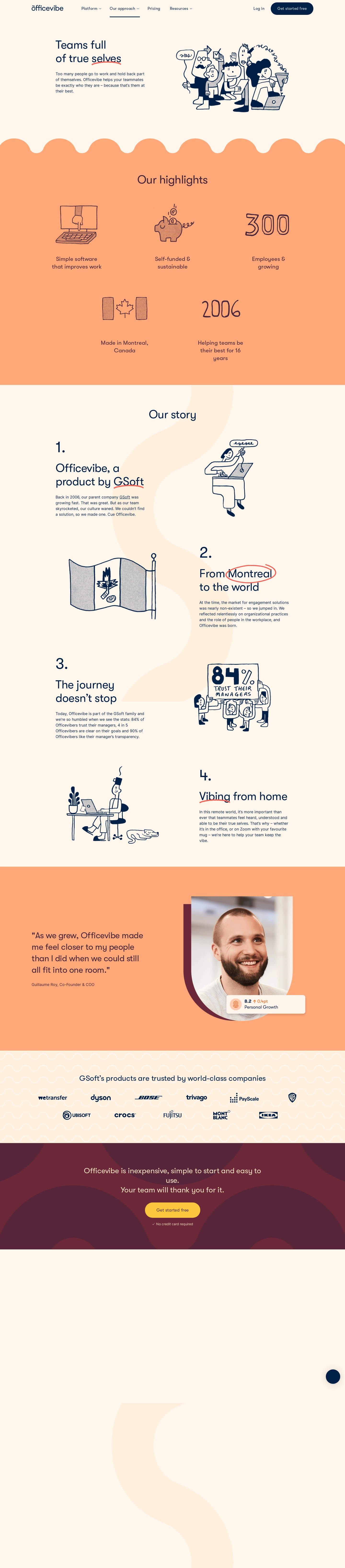
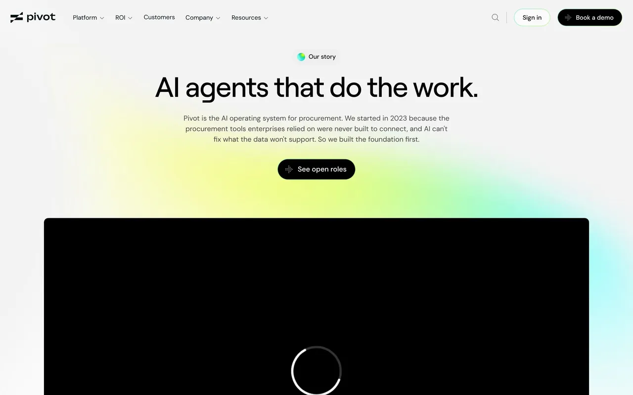
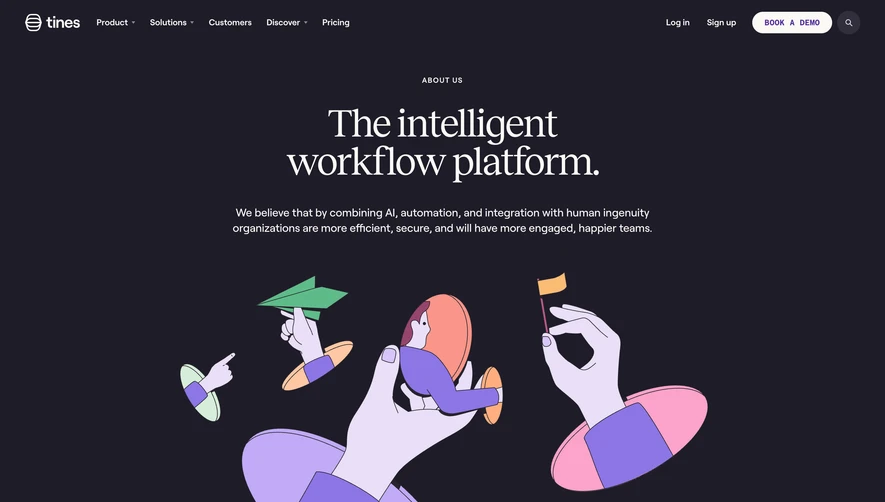
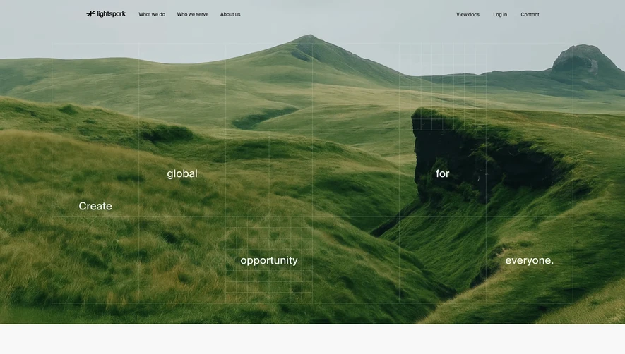
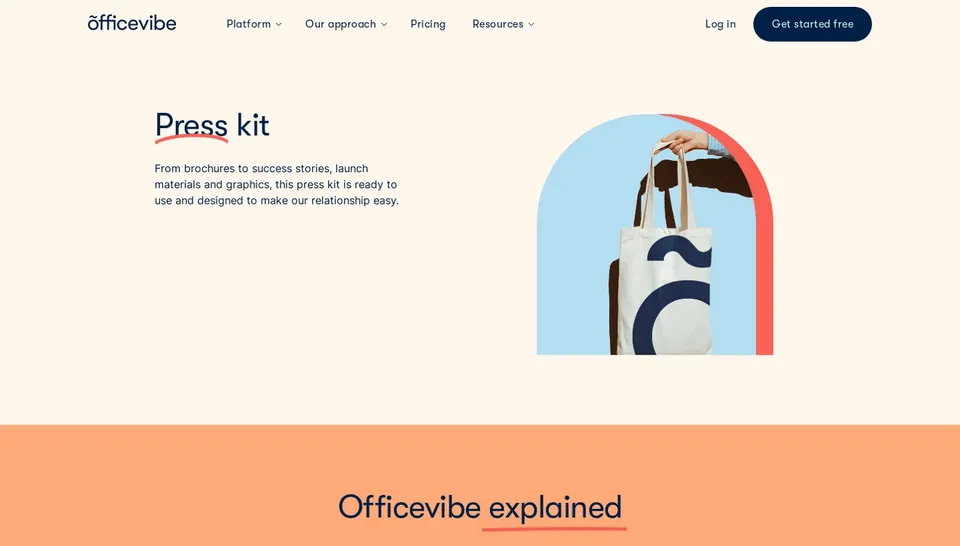
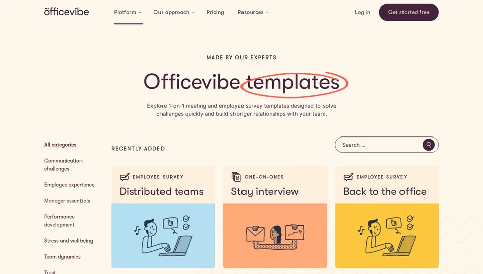
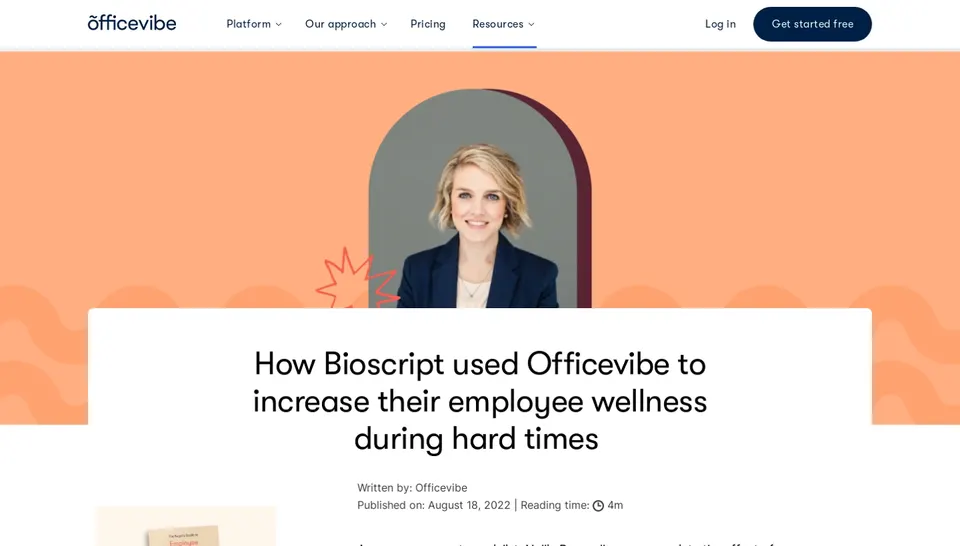
Officevibe’s About page radiates a dynamic yet approachable aesthetic, masterfully blending playful illustrations with a clean, professional layout. The design feels modern and energetic, channeling friendliness without sacrificing brand credibility. Subtle animations enliven the page while generous white space keeps the experience airy and welcoming.
Layout and Structure
The structure is straightforward and intuitive: a bold hero section introduces the brand’s mission, followed by concise team and purpose statements. Supporting sections seamlessly reveal the company’s values, leadership, and global impact, leading into subtle calls-to-action and a generous footer. Information is laid out in digestible blocks that encourage easy scanning.
Visual Elements
Vivid, custom illustrations play a starring role, injecting character and warmth into the narrative. Team photography is casual and candid, providing authenticity and humanizing the brand. Playful icons punctuate content, guiding the eye and reinforcing key messages. Micro-animations, such as fading in elements and hover states, enhance cohesion and interactivity.
Color Palette and Typography
A bold, harmonious color palette—highlighted by teal, mint, deep navy, and bursts of coral—keeps the experience engaging and lively. The primary sans-serif font is crisp, with clear hierarchy between playful headers and legible body copy, enhancing readability and visual rhythm.
User Experience Patterns
Navigation is sticky and minimal, ensuring constant access to key pages without distraction. Calls to action are distinct and inviting, often framed by color or whitespace. Scrolling reveals content with smooth transitions, while contact and follow links are easily accessible in the footer.
Unique or Notable Design Choices
What sets this page apart is its commitment to human connection via illustration and storytelling. The blend of imagery and illustrated elements creates a narrative-driven, memorable experience, projecting a trustworthy and progressive brand personality that ensures users feel engaged and understood.
 SaaSFrame