Generate a new design based on this screen using your own content.
Thank you! Your submission has been received!
Oops! Something went wrong while submitting the form.
# Design from Reference: Height Download Page
Create an original, high-fidelity visual design inspired by the reference. Prioritize composition, typography, colors, spacing, and component styling over technical implementation.
## Reference
- **Product:** Height
- **Category:** Download Page
- **Screenshot:** https://cdn.prod.website-files.com/5e9dc792e1210c5325f7ebbc/6acbba8ad01e364847659850_6acb71d6a985900f7f28866e_cms-21b83ab8118ba1927e86ccd1.webp
Analyze the screenshot first. If inaccessible, request it rather than guessing.
## Content
{{content.instructions}}
{{content.data}}
Preserve essential messaging and factual accuracy. Adapt structure and copy length for visual balance; never invent product claims.
## Visual Design
Use this context to reproduce the reference's visual language: layout, typography, colors, spacing, borders, radii, and distinctive elements. The screenshot takes priority if descriptions conflict.
## Direction
{{preferences.fidelityInstructions}}
## Output
{{output.instructions}}
Deliver a polished, cohesive design with precise alignment, hierarchy, and spacing. Produce the requested visual artifact, not just a description. If unsupported, explain the limitation.
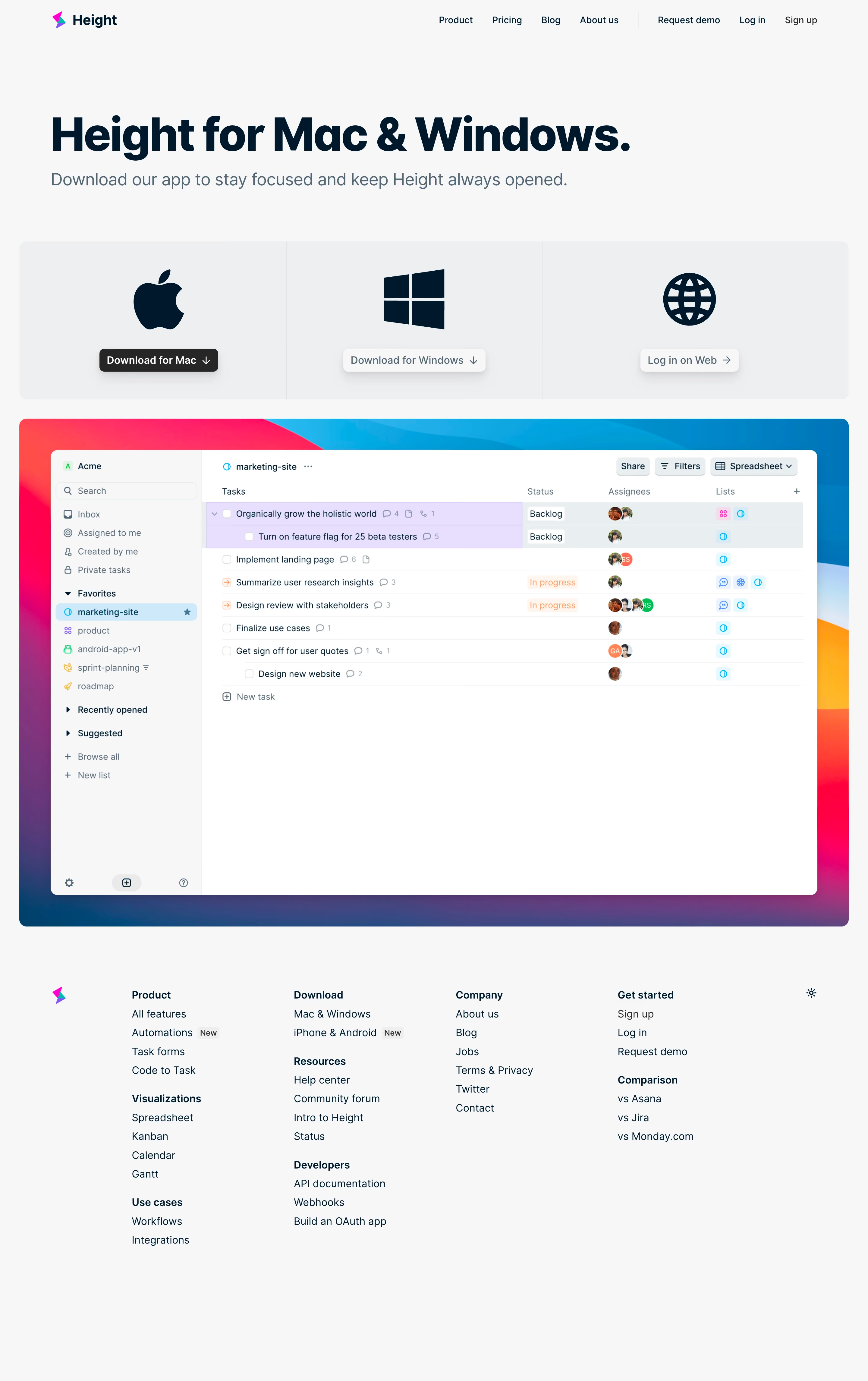
Height’s download page exudes a refined, modern minimalism that feels clean yet inviting. The design leverages significant white space, imparting a sense of calm and focus. Subtle accent colors inject energy without overwhelming, striking a balance between approachable and professional—ideal for a SaaS productivity tool.
Layout and Structure
The layout begins with a prominent hero section featuring concise value-driven messaging and clear download CTAs for multiple platforms. A straightforward grid succinctly presents the different app versions (Mac, Windows, Linux, iOS, Android), ensuring users immediately find the version they need. The page omits excessive fluff—no testimonials or long-winded features—maintaining a streamlined structure that respects users’ time.
Visual Elements
Custom icons and crisp device mockups visually distinguish each download option. Soft shadows and gradients add dimensionality, while interactive button states and micro-animations enhance engagement. The restrained use of visuals keeps the focus practical and conversion-oriented, preventing distraction.
Color Palette and Typography
A neutral base (white and light grays) pairs with bold, lively accents—blue-violet primaries and soft gradients lend visual hierarchy and brand identity. Typography is modern and legible, using a sans-serif font with ample line spacing and bold weights for headings, ensuring clarity and easy scanning.
User Experience Patterns
Direct, frictionless navigation is at the heart of the experience, with sticky headers and minimal scrolling. Prominent, context-aware CTAs (“Download for Mac,” etc.) streamline user flow, and the absence of extraneous forms keeps conversion easy. Everything feels designed for speed and clarity.
Unique or Notable Design Choices
Height’s refreshing focus on utility—eschewing lengthy marketing copy in favor of immediate value—stands out. The site’s ability to deliver necessary information at a glance exemplifies user-first SaaS design, prioritizing action and accessibility without sacrificing aesthetic appeal.