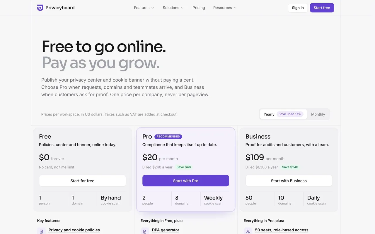
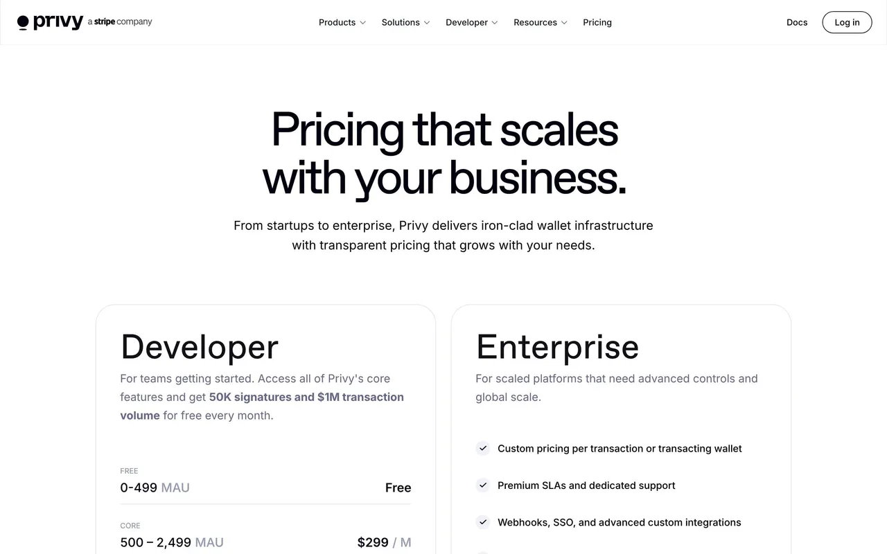
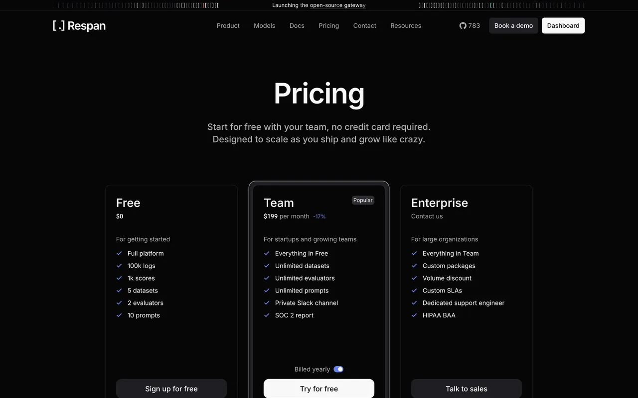
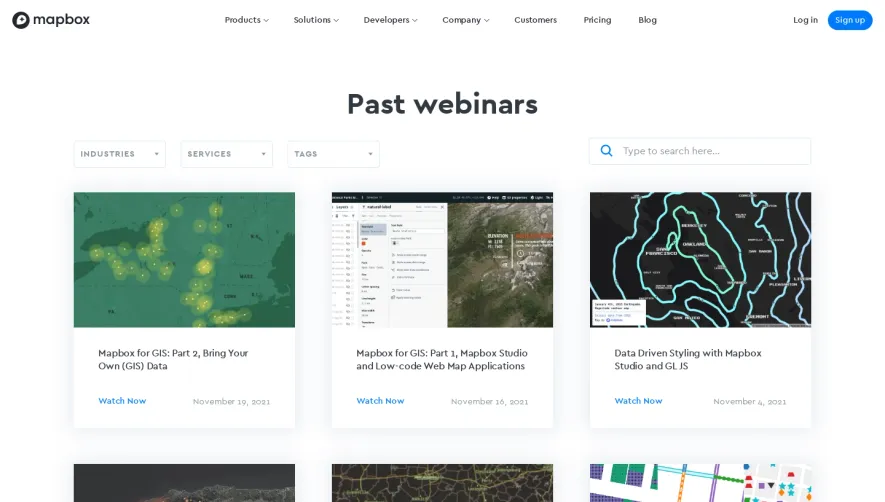
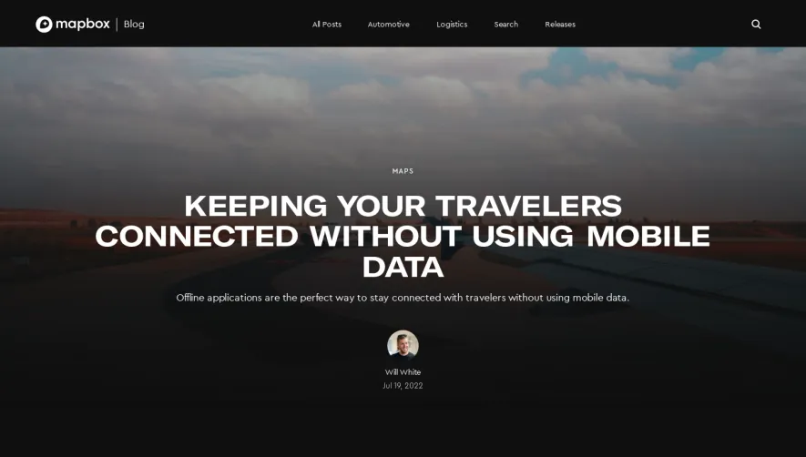
Mapbox's pricing page embodies a modern, minimalist approach grounded in professionalism and clarity. The interface leverages spacious white backgrounds with sharp-edged card components, giving each pricing tier a strong presence. Pops of electric blue and strategic color accents deliver a subtle sense of innovation and energy without overwhelming the content, creating a harmonious and inviting user experience.
Layout and Structure
The page opens with a succinct hero section featuring a clean headline, a brief explanatory subheading, and a primary call-to-action button—all set against ample negative space. The pricing plans are displayed in an evenly spaced grid, each within distinct, shadowed containers that emphasize separation and choice. Supplemental sections—such as feature summaries, usage examples, enterprise contact prompts, and a comprehensive footer—flow logically, guiding visitors seamlessly from exploration to engagement.
Visual Elements
Distinctive, lightweight icons and subtle inline illustrations complement key feature highlights, reinforcing understanding while maintaining visual coherence. Interactive elements, like toggles for monthly/annual billing, introduce gentle animations that provide immediate feedback. Soft gradients and animated hover states on buttons enhance interactivity, while concise microcopy and supportive tooltips clarify technical details at a glance.
Color Palette and Typography
Clean whites and soft greys dominate the background, contrasted with vivid blues and highlights in greens or reds for emphasis (e.g., “most popular” plan labels). Typography is sharp and legible—headlines use a bold, modern sans-serif, while body text remains readable and approachable. Clear hierarchy draws the eye to pricing figures and essential plan details.
User Experience Patterns and Notable Choices
Navigation remains fixed and highly accessible, with persistent CTAs ensuring users can act at any point. Plan comparison features and tooltips reduce friction for indecisive users. The absence of visual clutter, the prioritization of transparency (through detailed usage breakdowns), and interactive pricing calculators foster trust and encourage exploration. Overall, the tone is sophisticated yet approachable, positioning Mapbox as both trustworthy and cutting-edge.
 SaaSFrame