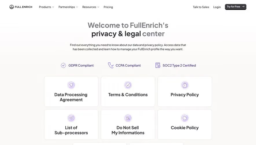
Generate a new design based on this screen using your own content.
Thank you! Your submission has been received!
Oops! Something went wrong while submitting the form.
# Design from Reference: Mailchimp GDPR Compliance Page
Create an original, high-fidelity visual design inspired by the reference. Prioritize composition, typography, colors, spacing, and component styling over technical implementation.
## Reference
- **Product:** Mailchimp
- **Category:** Compliance Page
- **Screenshot:** https://cdn.prod.website-files.com/5e9dc792e1210c5325f7ebbc/6acb6de60e8221f130836515_6acb6bc8667052503812202c_cms-94c9dcf1169cbb8aa350e416.webp
Analyze the screenshot first. If inaccessible, request it rather than guessing.
## Content
{{content.instructions}}
{{content.data}}
Preserve essential messaging and factual accuracy. Adapt structure and copy length for visual balance; never invent product claims.
## Visual Design
Use this context to reproduce the reference's visual language: layout, typography, colors, spacing, borders, radii, and distinctive elements. The screenshot takes priority if descriptions conflict.
## Direction
{{preferences.fidelityInstructions}}
## Output
{{output.instructions}}
Deliver a polished, cohesive design with precise alignment, hierarchy, and spacing. Produce the requested visual artifact, not just a description. If unsupported, explain the limitation.
Mailchimp’s GDPR page showcases a modern, minimalist approach while maintaining a professional and approachable tone. The design feels open and airy, using ample negative space to ensure readability and avoid cognitive overload. Bold headings and a clean grid layout keep the page easy to navigate, exuding both transparency and confidence.
Layout and Structure
The structure unfolds logically, beginning with a concise hero section that clearly states the page’s purpose. Subsequent content is neatly arranged into digestible sections: an overview, compliance tips, FAQs, and resource links. There’s no overwhelming text block; instead, information is broken into skimmable chunks, making complex legal content accessible.
Visual Elements
True to Mailchimp’s playful roots, the page uses subtle illustrations—think friendly icons and understated line drawings—to guide the visitor’s eye. There are no excessive animations, ensuring the topic remains serious while still feeling visually engaging. The illustrations echo Mailchimp’s brand mascot without overpowering the content.
Color Palette and Typography
Muted pastels (soft yellows, blues, and off-whites) dominate the palette, balancing approachability with professionalism. The sans-serif typeface is crisp, with bold headers for hierarchy and ultra-legible body text. Custom font sizes and weights make it easy to differentiate titles from supporting copy.
User Experience Patterns
Sticky top navigation facilitates seamless site-wide exploration, while in-page anchor links and contextual CTAs (“Learn more”) enhance scannability. Clear buttons and smart section dividers minimize friction, and an unobtrusive back-to-top link boosts usability for deep scrolling.
Unique Design Choices & Tone
Notably, Mailchimp refrains from heavy-handed legal jargon or stock photography, choosing conversational copy and branded visuals that reassure visitors. The overall tone is trustworthy and empowering, perfectly poised between informative and inviting—a model for SaaS pages dealing with sensitive topics.