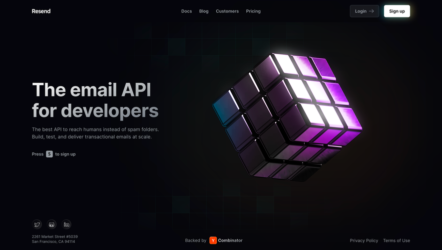
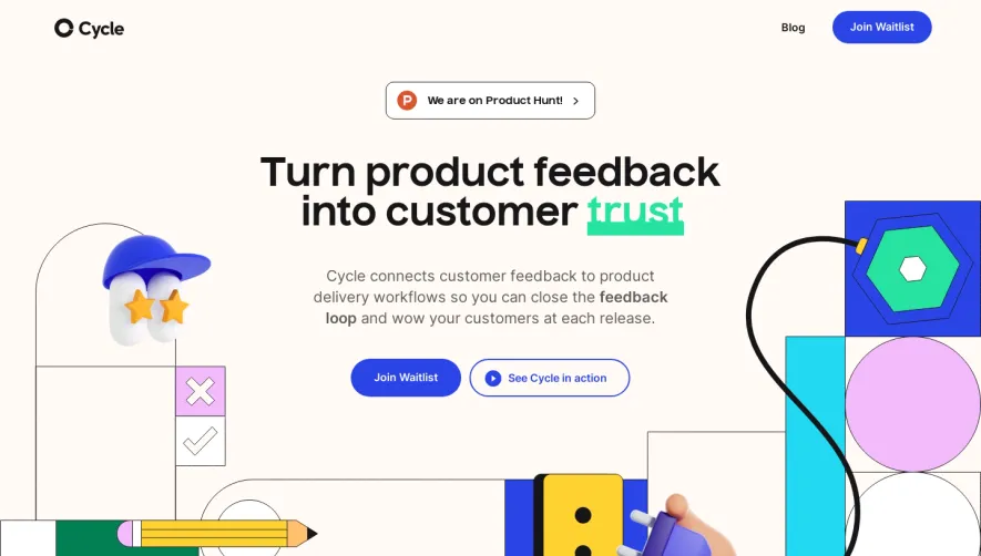
Generate a new design based on this screen using your own content.
Thank you! Your submission has been received!
Oops! Something went wrong while submitting the form.
# Design from Reference: Loops Early Access Page
Create an original, high-fidelity visual design inspired by the reference. Prioritize composition, typography, colors, spacing, and component styling over technical implementation.
## Reference
- **Product:** Loops
- **Category:** Early Access Page
- **Screenshot:** https://cdn.prod.website-files.com/5e9dc792e1210c5325f7ebbc/6acadbf1d05a3f53c0a863e5_6acadb49c6c5c12a38e6d762_cms-dbfd6ecbfb7ae3afcadaadd8.webp
Analyze the screenshot first. If inaccessible, request it rather than guessing.
## Content
{{content.instructions}}
{{content.data}}
Preserve essential messaging and factual accuracy. Adapt structure and copy length for visual balance; never invent product claims.
## Visual Design
Use this context to reproduce the reference's visual language: layout, typography, colors, spacing, borders, radii, and distinctive elements. The screenshot takes priority if descriptions conflict.
## Direction
{{preferences.fidelityInstructions}}
## Output
{{output.instructions}}
Deliver a polished, cohesive design with precise alignment, hierarchy, and spacing. Produce the requested visual artifact, not just a description. If unsupported, explain the limitation.
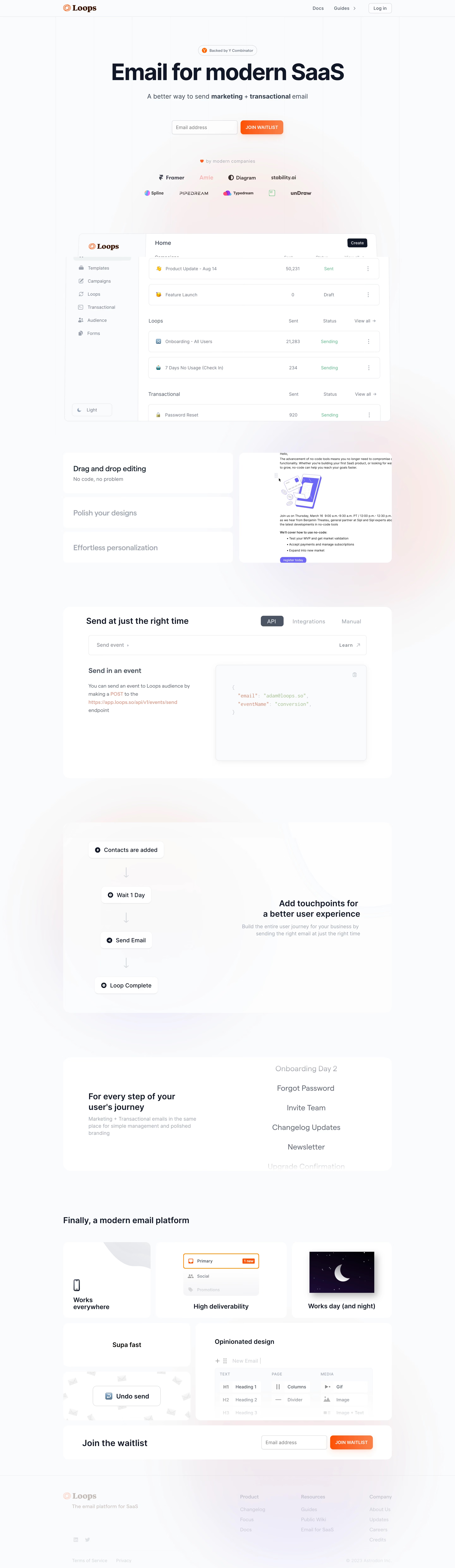
Loops showcases a modern, minimalist sensibility, refined through white space and select bursts of color. The interface feels simultaneously professional and playful—its visual language signals technical sophistication without sacrificing approachability. Clean lines, rounded corners, and crisp layouts exude understated confidence, while micro-animations add energy without clutter.
Layout and Structure
The page is structured for intuitive scanning: a bold hero section immediately establishes value and invites action. Following this, digestible feature sections use concise copy paired with visuals to communicate benefits. Social proof sits below, with affirming testimonials and recognizable brand logos, before flowing into a transparent pricing table. The footer is comprehensive yet organized, providing essential links and contact points.
Visual Elements
Custom illustrations and iconography bring personality to the interface. Motion is used judiciously—subtle bounces and transitions highlight interactions and guide attention. The absence of stock photography heightens originality, while playful vector graphics reinforce the product’s tech-forward ethos.
Color Palette and Typography
A fresh palette juxtaposes a crisp white background with vibrant accent colors—purples, blues, and gradients—creating visual waypoints for primary actions and highlights. Typography is geometric and sans-serif, using bold weights to establish hierarchy. Ample spacing and consistent type scales enrich legibility.
User Experience Patterns
Sticky navigation ensures easy orientation, while call-to-action buttons use clear, high-contrast color blocks. Forms are minimal—fast onboarding is prioritized with simple, single-field inputs. Smooth scroll-triggered animations offer feedback and direct focus.
Unique or Notable Design Choices
Standout elements include interactive demo snippets directly embedded above the fold, and small, witty microcopy that humanizes the brand. The dynamic pricing toggles and animated feature cards balance engagement with usability, reflecting an innovative, confident, and genuinely user-first philosophy.