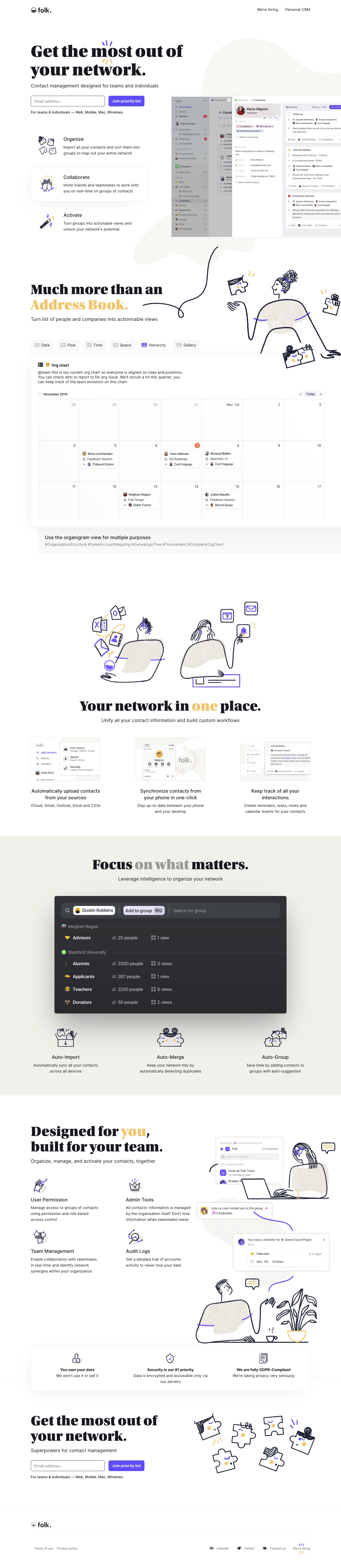
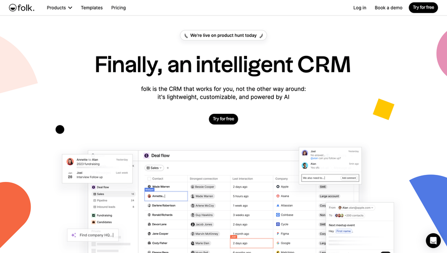
The Folk.app homepage exudes a sleek, understated modernism. Its minimalist approach lets content breathe, blending professional refinement with approachable warmth. Subtle use of animations and clean lines establish an atmosphere that feels both innovative and calm—inviting users to explore without distraction.
Layout and Structure
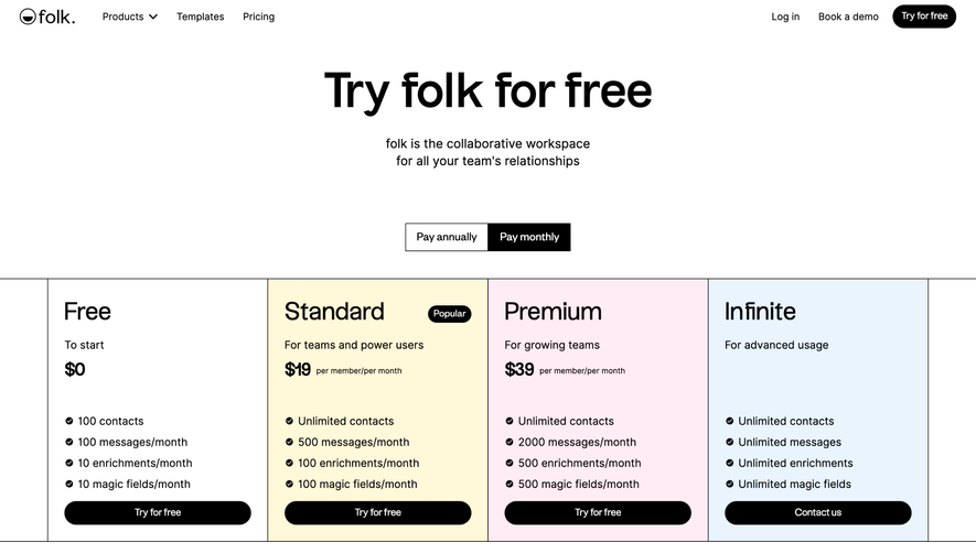
The site follows a classic SaaS flow with clever enhancements. A visually striking hero section greets visitors, immediately communicating value. Features are arranged in digestible groups, often supported by animated mockups that convey function at a glance. Social proof—testimonials and partner logos—bolster credibility before progressing to concise pricing cards. The footer is compact but information-rich, guiding users toward support and resources.
Visual Elements
Folk.app utilizes playful, geometric illustrations and elegant interface mockups to illuminate product features. Micro-animations and transitions breathe life into static elements, enhancing engagement without overwhelming. Custom icons and soft shadows provide both clarity and visual continuity. Occasional use of subtle video backgrounds or animated sequences maintain user focus.
Color Palette and Typography
A refined palette of off-white, gentle grays, and accents of vivid blue and lavender reflects both professionalism and fresh energy. Typography is clean and modern; strong sans-serifs lead headings with generous letter-spacing, while body text is feather-light and legible. Hierarchy is sharply defined, guiding eyes from primary messages down through supporting content.
User Experience Patterns
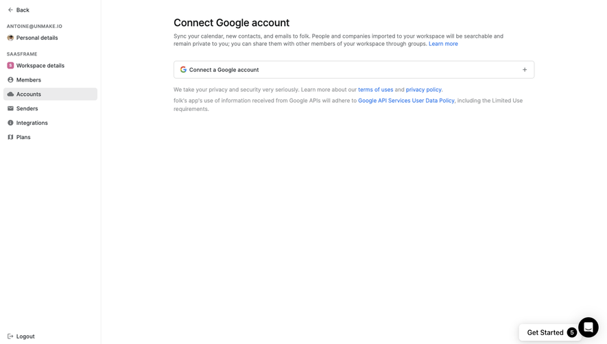
Navigation is sticky and unobtrusive, always accessible yet never interrupting. Bold, high-contrast CTAs are thoughtfully spaced, encouraging interaction without hard selling. Gentle scroll-triggered animations provide context and delight. Forms are minimal, requiring only essential info to reduce friction.
Unique or Notable Design Choices
Folk.app stands out with its modular feature cards, dynamic device mockups, and harmonious blending of illustration with UI preview. The tone is consistently trustworthy and quietly dynamic—striking the right balance between confidence and approachability. This site is a benchmark for SaaS design that both inspires and reassures.
 SaaSFrame