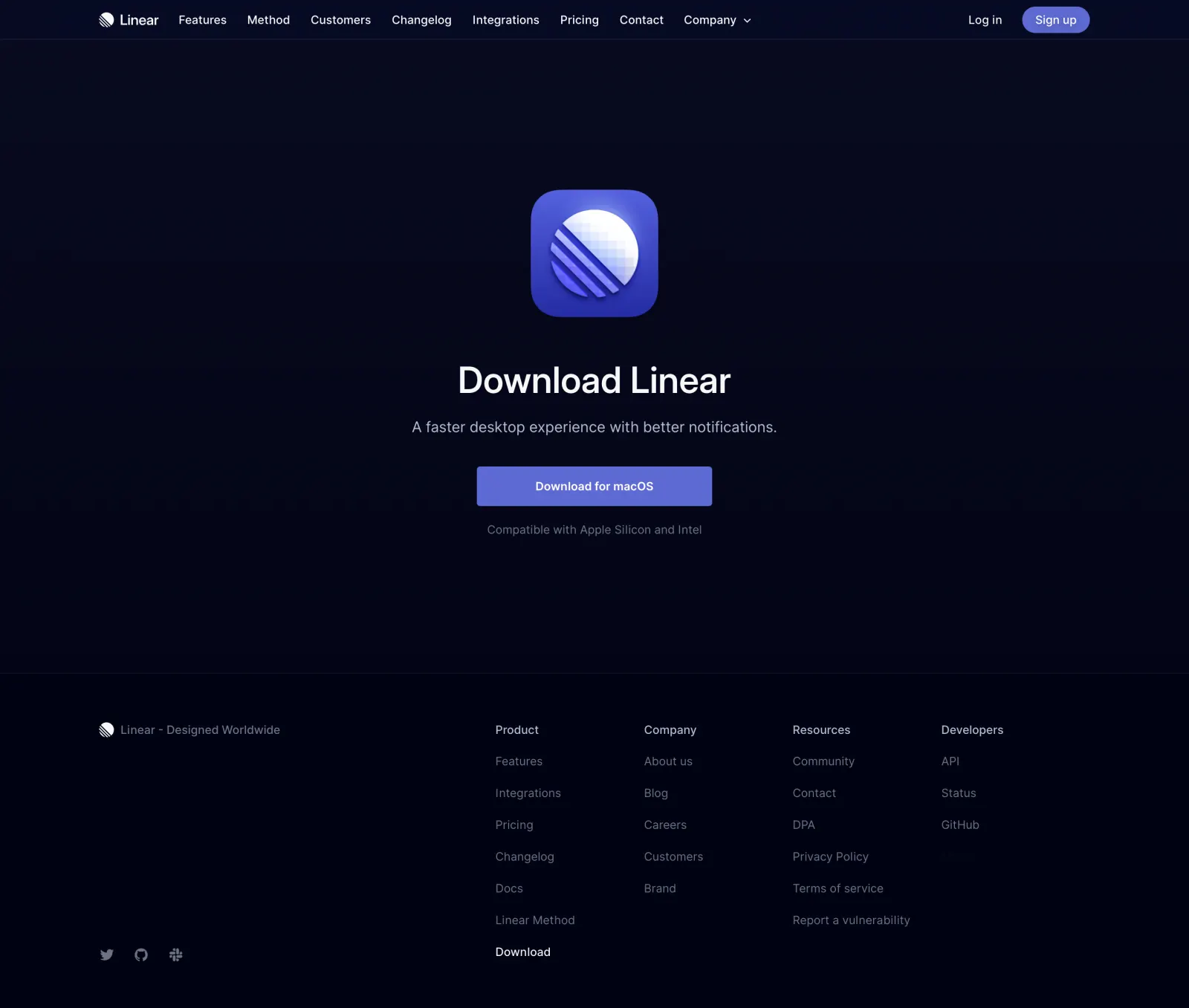
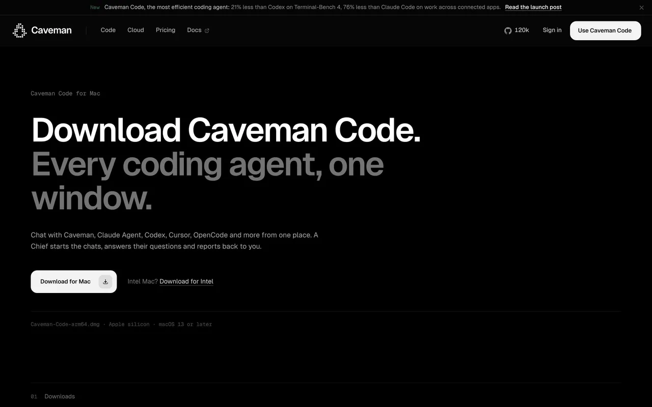
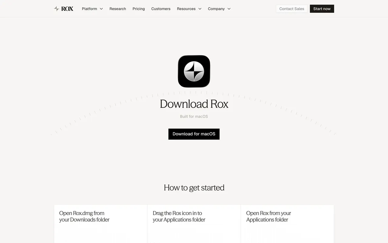
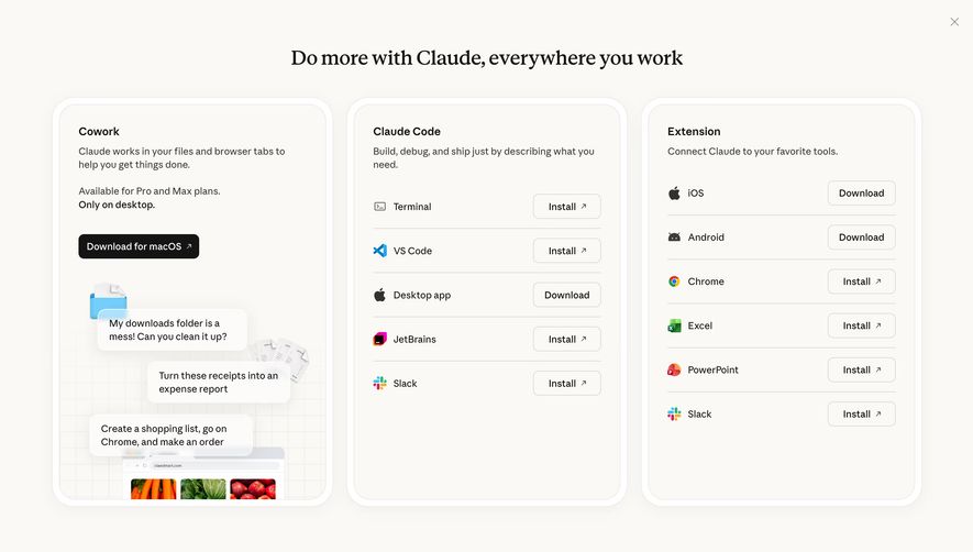
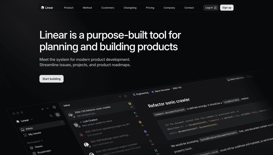
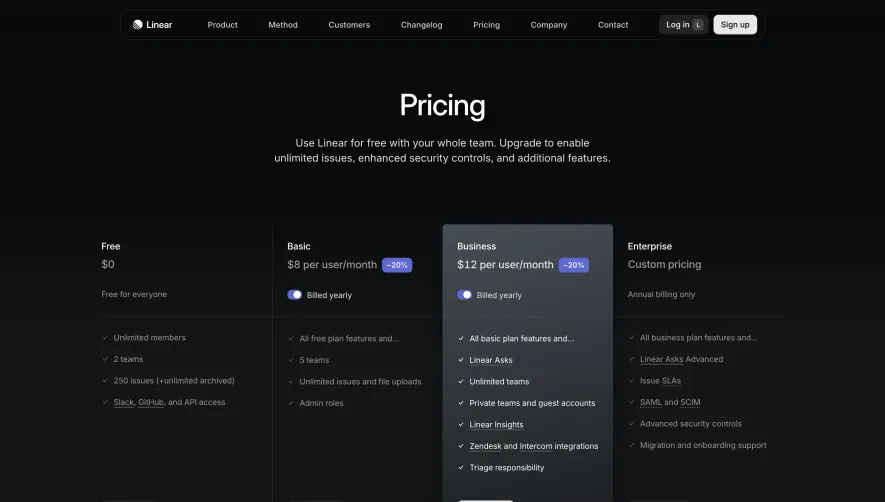
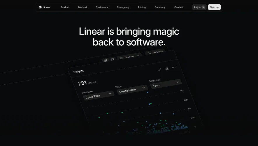
Linear’s download page exemplifies a minimalist, modern aesthetic rooted in clarity and sophistication. The visual space is generous, with abundant negative space that exudes calm and confidence. The page dazzles with a professional yet approachable tone, thanks to slick micro-interactions and subtle gradients.
Layout and Structure
The hero section dominates the initial view, presenting platform-specific download options front and center—no distractions or fluff. Beneath, a succinct features grid hints at cross-platform compatibility. The page forgoes lengthy testimonials or pricing tables, maintaining laser focus on the task at hand: downloading the app. A compact, unobtrusive footer completes the experience, echoing the site’s broader brand elements.
Visual Elements
Visual storytelling comes alive through crisp, precisely rendered icons and device mockups that instantly clarify platform choices (Mac, Windows, etc.). Carefully animated states on buttons and platform cards add a tactile sense of interactivity. Subtle shadows and smooth transitions create hierarchy and emphasize clickable elements, making each action intuitive.
Color Palette and Typography
A stark, high-contrast palette—predominantly black, white, and muted gray—reinforces a sense of precision. Accents of purple provide a digital flair without overpowering the content. Typography leans on clean, geometric sans-serifs, establishing clear visual hierarchy: bold, oversized headlines and sparingly used secondary text for supporting details.
User Experience Patterns
Navigation is ultra-streamlined: direct downloads are available with a single click, and floating links at the top ease movement between sections. Call-to-action buttons are unmistakable, visually prominent, and offer immediate feedback. The scroll experience is frictionless, with no unnecessary artifacts or forms to impede the user’s goal.
Unique or Notable Design Choices
What sets Linear apart is its unwavering focus and restraint: every element serves a purpose, nothing distracts from download intent, and interactions feel fluid and deliberate. This design ethos establishes an aura of innovation and reliability, making the page feel both cutting-edge and deeply trustworthy to any visitor seeking inspiration.
 SaaSFrame