Found in 0 flow
No items found.

Upgrade to SaaSFrame Pro now to see similar examples.

Monthly

$14 /month

Billed $14 monthly
Browse all screens & flows
Filter and search screens & flows
Bookmark items
Access Figma files
Access mobile versions
Join now

Quarterly

$12 /month

Billed $36 quarterly
Browse all screens & flows
Filter and search screens & flows
Bookmark items
Access Figma files
Access mobile versions
Join now

Yearly

$10 /month

Billed $120 yearly
Browse all screens & flows
Filter and search screens & flows
Bookmark items
Access Figma files
Access mobile versions
Join now

Biggest SaaS library.

Browse website pages, product interfaces and emails from a growing library of hundreds of SaaS.
Abstract red geometric shape with diagonal lines forming a diamond on a black background.Black and white 3D cube with a bold letter N on the front face, representing the Notion app logo.White lowercase 'fs' letters on a pink and orange gradient background.White uppercase letter S on a blue and purple gradient background.A purple icon consisting of two vertically overlapping circles on a light lavender background.White circle with three diagonal white stripes in lower left corner on a gradient blue background.

Desktop & mobile versions.

Switch from desktop to mobile versions to see how the best designers make websites responsive.
Attio website homepage with navigation links, headline 'Customer relationship magic,' a CRM dashboard screenshot, call-to-action buttons, and logos of companies like CocaCola, OpenAI, and Pallet.Attio homepage showing the tagline 'Customer relationship magic' with a description about flexible, data-driven CRM, buttons for 'Start for free' and 'Talk to sales', and a screenshot of a sales pipeline interface with a play button.

Access the Figma files.

You like a design? Download the Figma file of any website page you see on SaaSFrame.

Advanced filtering.

Use filters to find the design or copywriting inspiration that you need in seconds.
Thank you! Your submission has been received!
Oops! Something went wrong while submitting the form.

Let it flow.

Discover the user journey of the best SaaS with interfaces organized in flows.
Mercury banking dashboard showing account balances, recent transactions, and a menu for moving money with options to pay, add funds, request payment, or transfer between accounts.
Payment interface showing recipient selection with options to add or invite a recipient and a list of recently paid recipients including Jason Green (Contractor) and Aliyah McMahon (Vendor).
Payment method selection screen for 'Payment to Jason Green' showing options ACH, Check, Wire, and selected International Wire with details and navigation buttons.
International wire payment interface showing $120 USD to Jason Green with options to send wire as SHA for free or OUR for $15, sending from Ops/Payroll account with balance $1,374,471.14, with navigation buttons Go Back and Next.
Confirmation screen showing a recurring international wire payment setup to pay $120 monthly to Jason Green on the 27th, with dates for April 27, May 26 noting May 27 is a weekend, and June 27, no end date, and buttons to view payments or make another payment.
Mercury banking dashboard showing account balances, recent transactions, and a menu for moving money with options to pay, add funds, request payment, or transfer between accounts.

Save design inspirations.

Bookmark screens and flows so you can find them any time you need it.
โŒ˜
B
BOOKMARK DESIGN
Start your design
research
Web form titled 'Create a new order' for selecting journey type, origin, destination, departure and return dates, passengers, and class with a 'Find available flights' button.Three software interface screenshots: Surfe CRM LinkedIn integration, Linear product management tool, and Mercury banking dashboard.Three side-by-side website screenshots showing a login page for Copperx, a team collaboration platform with bright yellow background, and an AI-powered developer platform with space-themed graphics.Three website screenshots showing a design tool and distribution dashboard for design tokens, promoting ease and automation.Three side-by-side website screenshots showing a login page for Copperx, a team collaboration platform with bright yellow background, and an AI-powered developer platform with space-themed graphics.

How do you process payment?

SaaSFrame subscriptions are sold on Lemon Squeezy, a secured online selling platform for creators.

What about future updates and versions?

SaaSFrame gets updated all the time! Every new update and version will immediately be made available to all SaaSFrame users.

Can you send me an invoice?

You can generate an invoice on your Lemon Squeezy portal once you purchased SaaSFrame. You will find the link in the order confirmation email.

How can I cancel my membership subscription?

You can cancel your membership subscription at any moment on your profile page.โ€

Can I get a refund?

If you're not satisfied, you can ask for a refund within 7 days. Just send me an email at antoine[at]unmake[dot]io

I have another question.

You can send me an email at antoine[at]unmake[dot]io, I'll be happy to help with any questions.

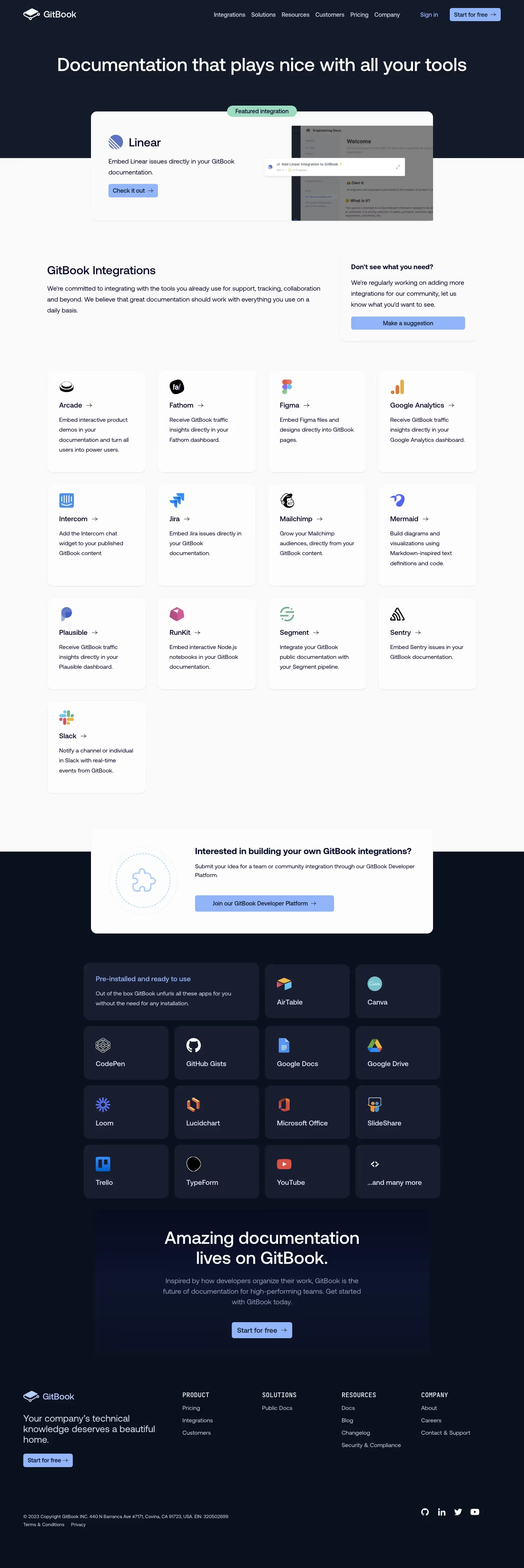
GitBook Integrations Page Structure

Overall Style and Aesthetic

GitBookโ€™s Integrations page exemplifies a modern, minimalist aesthetic with a professional yet inviting tone. The interface is clean and uncluttered, giving breathing space to each element, while vibrant accent colors infuse energy and warmth. Subtle gradients and rounded corners throughout add a sense of approachability without sacrificing sophistication.

Layout and Structure

The page opens with a bold hero section that clearly states purpose and value, supported by concise copy and an eye-catching illustration. Below, integrations are presented in a neat grid, each card combining logos, concise descriptions, and direct links. Logical sectioning and generous white space guide the eye and prevent overwhelm, while a sticky navigation bar ensures smooth movement throughout the site.

Visual Elements

Custom illustrations and sleek integration icons create instant visual recognition, while micro-animations on hover provide tactile feedback. The use of subtle shadows and layered card effects brings a sense of depth and interactivity, engaging the user without distraction.

Color Palette and Typography

A restrained paletteโ€”predominantly white, with deep grays for text and accents of electric blue and seafoam greenโ€”brings clarity and focus to the page. The typography marries clean sans-serif headers with lighter body text, establishing clear hierarchy and accessibility.

User Experience Patterns and Unique Choices

Clear, prominent CTAs (โ€œView integration,โ€ โ€œRequest integrationโ€) are strategically placed. Search and filter options enable power users to find integrations efficiently. Noteworthy is the seamless, animated transition on hover states and the uniform visual language applied across all integration cards, instilling trust and consistency. The tone throughout feels innovative and reliable, positioning GitBook as a forward-thinking SaaS solution.