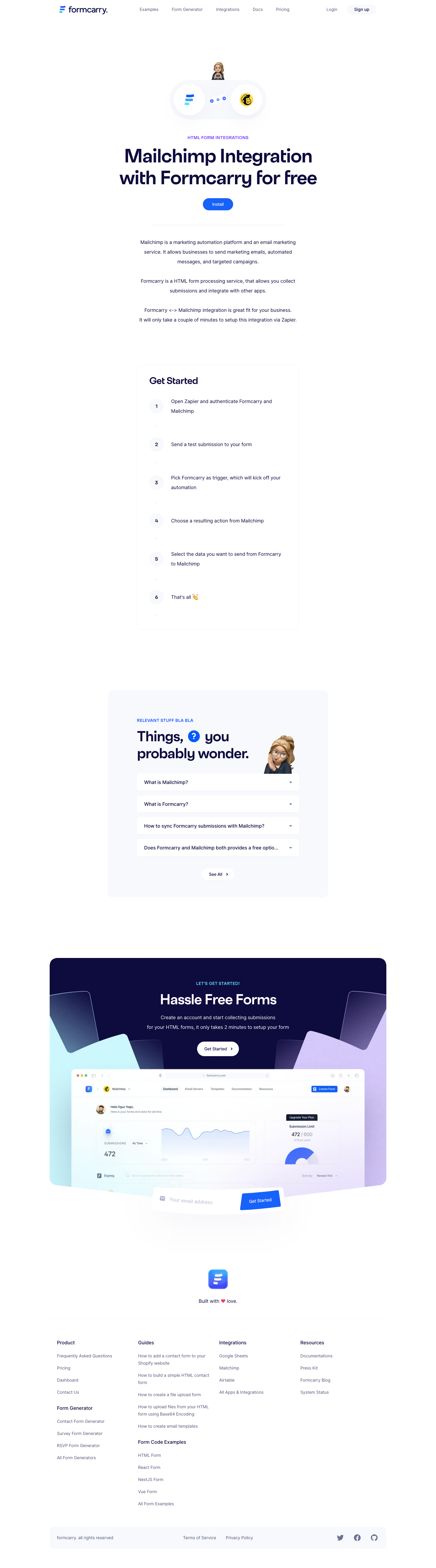
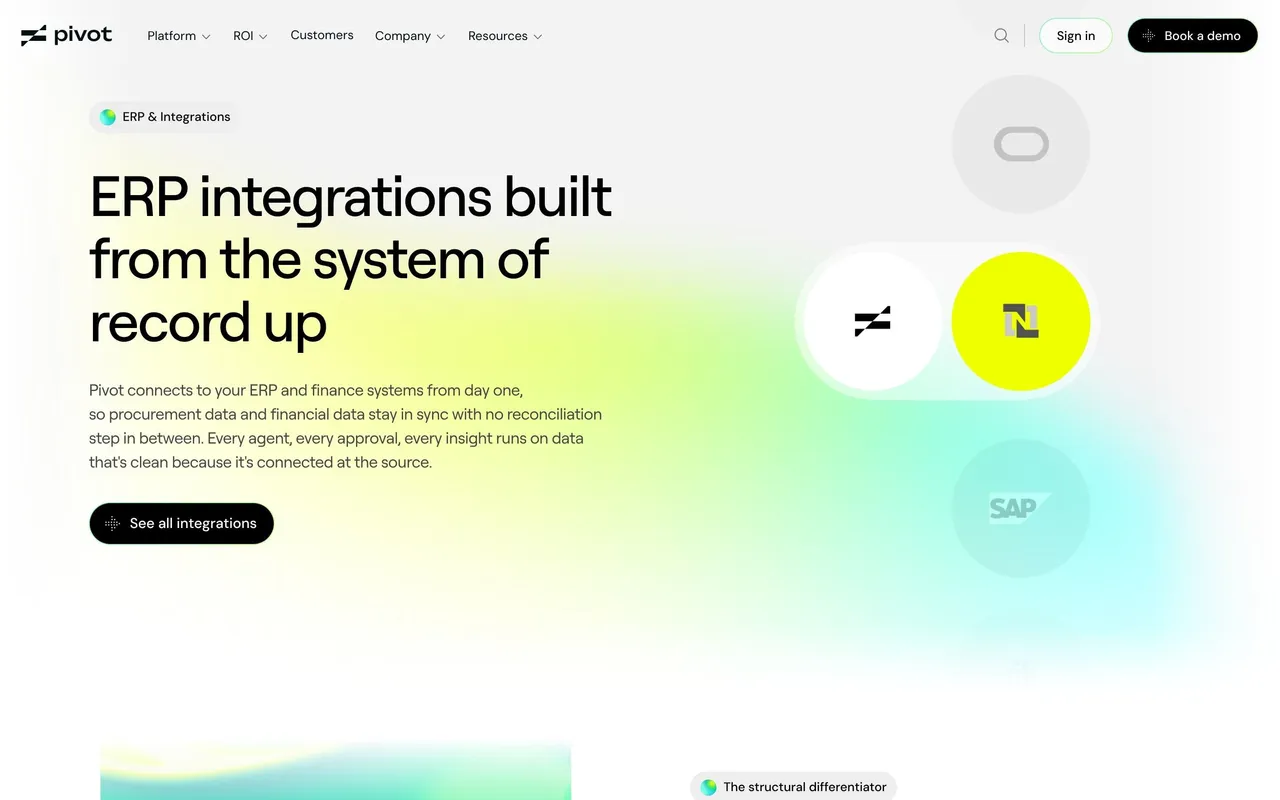
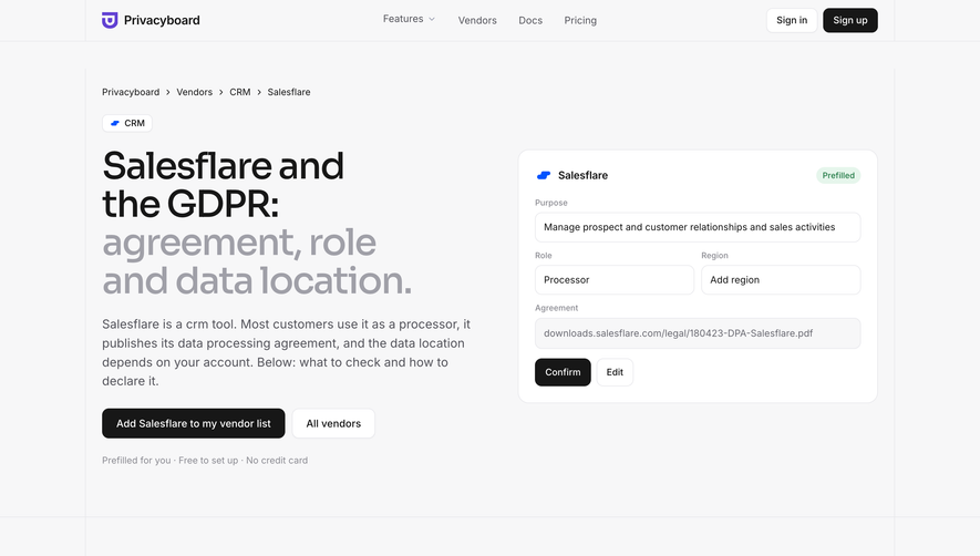
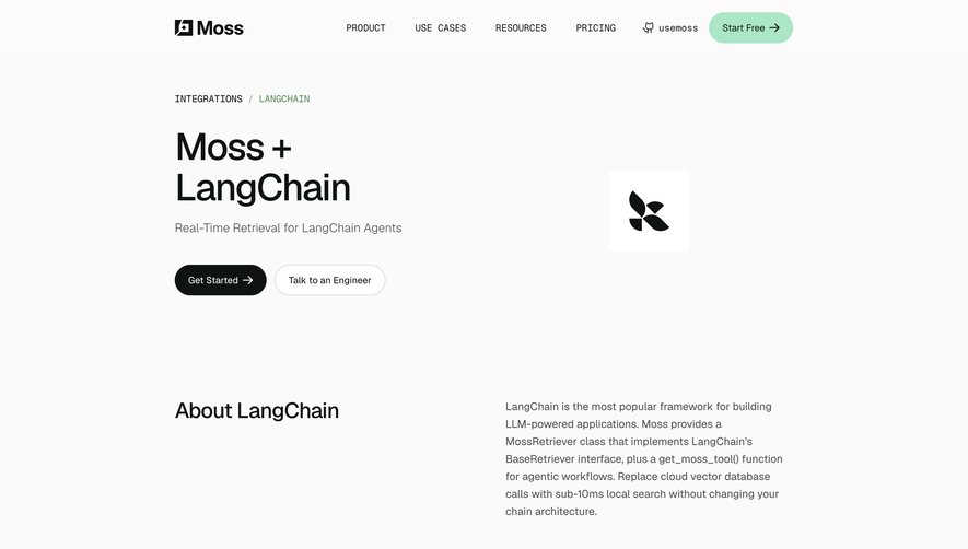
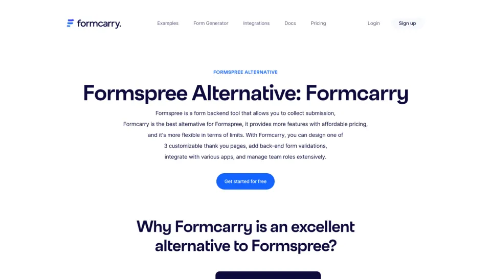
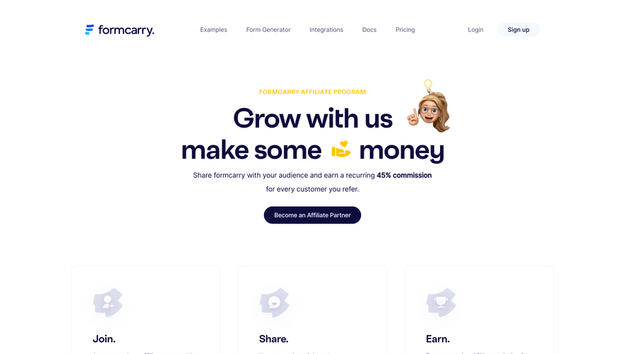
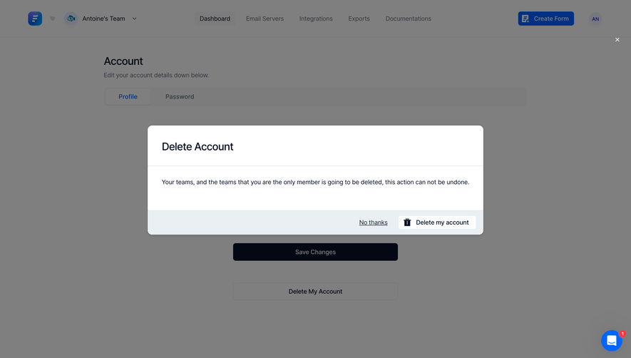
The Formcarry Mailchimp integration page encapsulates a sleek, modern minimalism that conveys professionalism and clarity. Crisp white backgrounds provide breathing space, with energetic accent colors that highlight interactive elements and CTAs. The design feels approachable and sophisticated, balancing utility and visual appeal.
Layout and Structure
Content flows in a logical, single-column structure. The hero section immediately communicates the integration’s value proposition, reinforced by clear headings and subheadings. Below, concise feature descriptions use spacing to direct focus and avoid visual clutter. The page avoids excessive scrolling, keeping core information above the fold. Subtle dividers and cards are used to segment content without overwhelming the user.
Visual Elements
Custom icons and flat illustrations stand in for screenshots, adding instant context and a friendly feel. There’s a consistent use of vector-style graphics for technical concepts, while animations are minimal—focusing attention rather than distracting. The use of branded integration logos (Formcarry + Mailchimp) reinforces trust and provides immediate recognition.
Color Palette and Typography
The visual hierarchy is driven by bold, readable headings in a sans-serif font, paired with lighter body text for contrast. Bright, saturated blues and greens guide users’ eyes to CTAs, while muted grays handle secondary information. This careful pairing ensures information feels digestible and actionable.
User Experience Patterns
Persistent top navigation makes exploration effortless, while large, high-contrast “Get Started” buttons amplify conversion opportunities. Clear visual feedback on hover states and well-padded forms further enhance usability. Microcopy and tooltips offer gentle guidance as needed.
Unique or Notable Design Choices
Noteworthy is the seamless blend of visual brand identities (Formcarry and Mailchimp), achieved through color accents and dual-logos. The restrained use of whitespace and consistent iconography create a polished, trustworthy impression while making onboarding feel unintimidating. The overall tone projects reliability and technical finesse—ideal for inspiring modern SaaS design.
 SaaSFrame