Overall Style and Aesthetic
Figma’s Customers page embraces a polished, modern aesthetic that resonates with creative professionals. The design feels vibrant yet refined, with clean lines and an airy layout that balances white space and rich, dynamic artwork. There’s a subtle playfulness woven through the page, but the overall tone remains mature and credible, perfectly aligning with SaaS for design teams. Layout and Structure
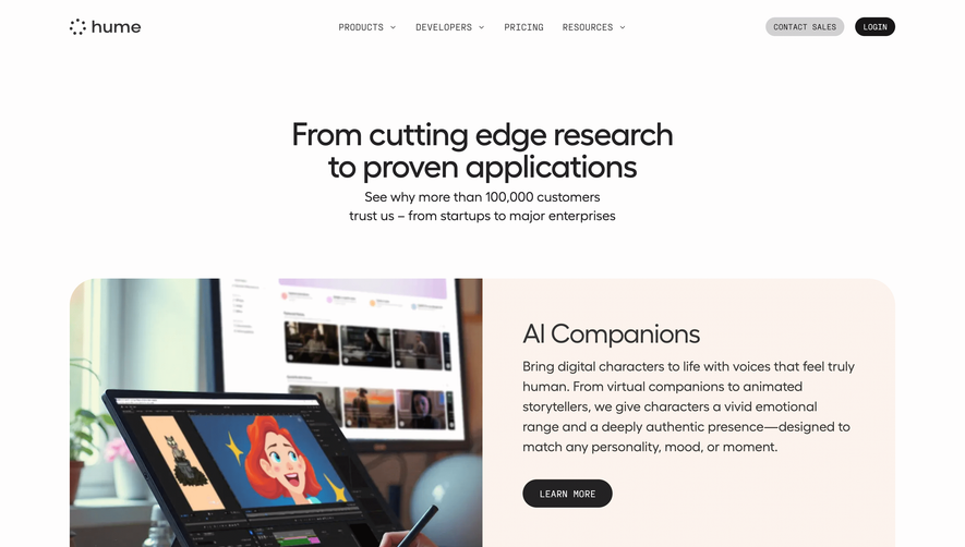
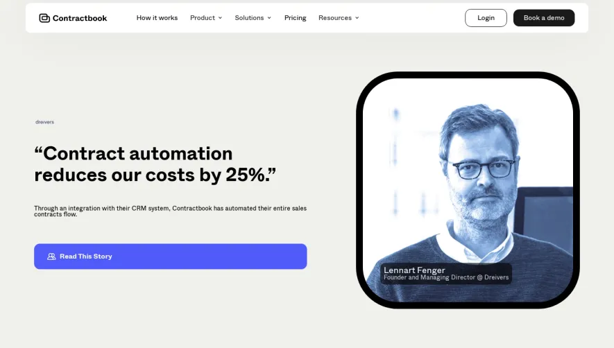
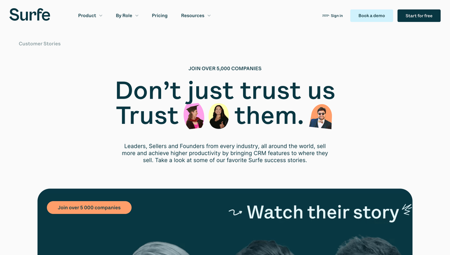
The structure is modular and effortless to navigate. A compelling hero section immediately showcases marquee client logos and a subtle animation loop. The page then flows into “customer stories” as featurettes, each given generous real estate that alternates imagery and text for smooth visual scanning. Instead of hard-sell CTAs or pricing content, the focus is on relatable use cases and real-world impact, wrapped up in a tidy, informative footer. Visual Elements
Photography dominates—bold, warmly-lit lifestyle images paired with product screenshots fuel authenticity. Minimal animations (notably logo marquees and subtle reveals) keep content lively without distraction. Custom icons accentuate stories, while headline typography is big and inviting, playing perfectly with friendly sans-serif body text. Color Palette and Typography
The palette is vibrant and flexible, leveraging Figma’s signature purples and blues, punctuated by warm overlays and plenty of white. Typography prioritizes clarity: a strong geometric headline font pairs with an open, easy-to-read sans for body copy, creating a clear hierarchy and effortless readability. User Experience Patterns and Notable Choices
Navigation remains sticky, ensuring users never lose their place. CTAs are non-intrusive, inviting deeper exploration rather than rushing conversion. Case study tiles use hover states for engagement. Notably, the flow feels editorial, allowing storytelling to lead, which builds trust and inspires prospective users through authentic examples. Tone and Feel
Overall, the tone is innovative, energetic, and approachable—emphasizing Figma’s position as a design leader while making the end-user feel both inspired and included. This is a SaaS showcase page that turns customer advocacy into a visual experience.