Generate a new design based on this screen using your own content.
Thank you! Your submission has been received!
Oops! Something went wrong while submitting the form.
# Design from Reference: Fernand Pricing Page
Create an original, high-fidelity visual design inspired by the reference. Prioritize composition, typography, colors, spacing, and component styling over technical implementation.
## Reference
- **Product:** Fernand
- **Category:** Pricing Page
- **Screenshot:** https://cdn.prod.website-files.com/5e9dc792e1210c5325f7ebbc/6acbbd143b6b24eada5489bb_6acbbc50151c40fa4074e32b_cms-3137a64633e4c73603d50930.webp
Analyze the screenshot first. If inaccessible, request it rather than guessing.
## Content
{{content.instructions}}
{{content.data}}
Preserve essential messaging and factual accuracy. Adapt structure and copy length for visual balance; never invent product claims.
## Visual Design
Use this context to reproduce the reference's visual language: layout, typography, colors, spacing, borders, radii, and distinctive elements. The screenshot takes priority if descriptions conflict.
## Direction
{{preferences.fidelityInstructions}}
## Output
{{output.instructions}}
Deliver a polished, cohesive design with precise alignment, hierarchy, and spacing. Produce the requested visual artifact, not just a description. If unsupported, explain the limitation.
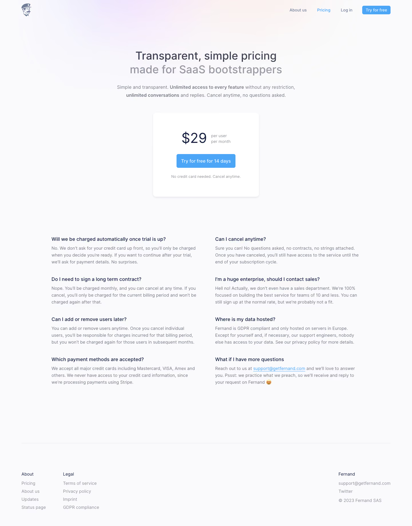
Fernand’s pricing page radiates a sleek, ultra-modern vibe, blending subtle minimalism with strategic bursts of color. The interface feels clean and uncluttered, but far from sterile; playful gradients and lively accent hues inject warmth and creativity, signaling a cutting-edge yet approachable SaaS solution.
Layout and Structure
The structure is carefully tiered for clarity. A punchy hero section immediately outlines the product’s value, reinforced by concise, well-positioned CTAs. Pricing tiers are front and center—scrolling flows naturally from plan overviews to FAQs and a compact, reassuring footer. Elements are generously spaced, which keeps focus clear and the journey intuitive.
Visual Elements
Illustrations shine throughout the page, using friendly, organic shapes and smooth animations to guide attention without distraction. Animated toggles and button hover effects add dynamic feedback. Sparse but strategic icons illustrate features within the pricing cards, while gentle motion in the visuals enlivens the experience.
Color Palette and Typography
A soft off-white background contrasts against vibrant orchids and turquoise accents—these pops cue important actions and information. Typography is crisp and modern, likely leveraging a geometric sans-serif such as Inter or Satoshi. Hierarchies are clear: bold headlines, orderly subheads, and high-contrast, legible body text.
User Experience Patterns
Navigation remains sticky and accessible, with clear, differentiated CTAs—“Start free trial” and “Contact sales” offer tailored pathways. Forms and toggles are delightfully minimal and frictionless, enhancing conversion without distraction. Subtle scroll-triggered transitions give feedback and maintain user momentum.
Unique or Notable Design Choices
The standout: an interactive pricing toggle enables real-time plan comparisons, while animated badges and micro-interactions emphasize limited-time offers. Overall, the tone is vibrant and confident—balancing innovation and trustworthiness for SaaS buyers craving both creativity and clarity.