Design with AI
Generate a new design based on this screen using your own content.
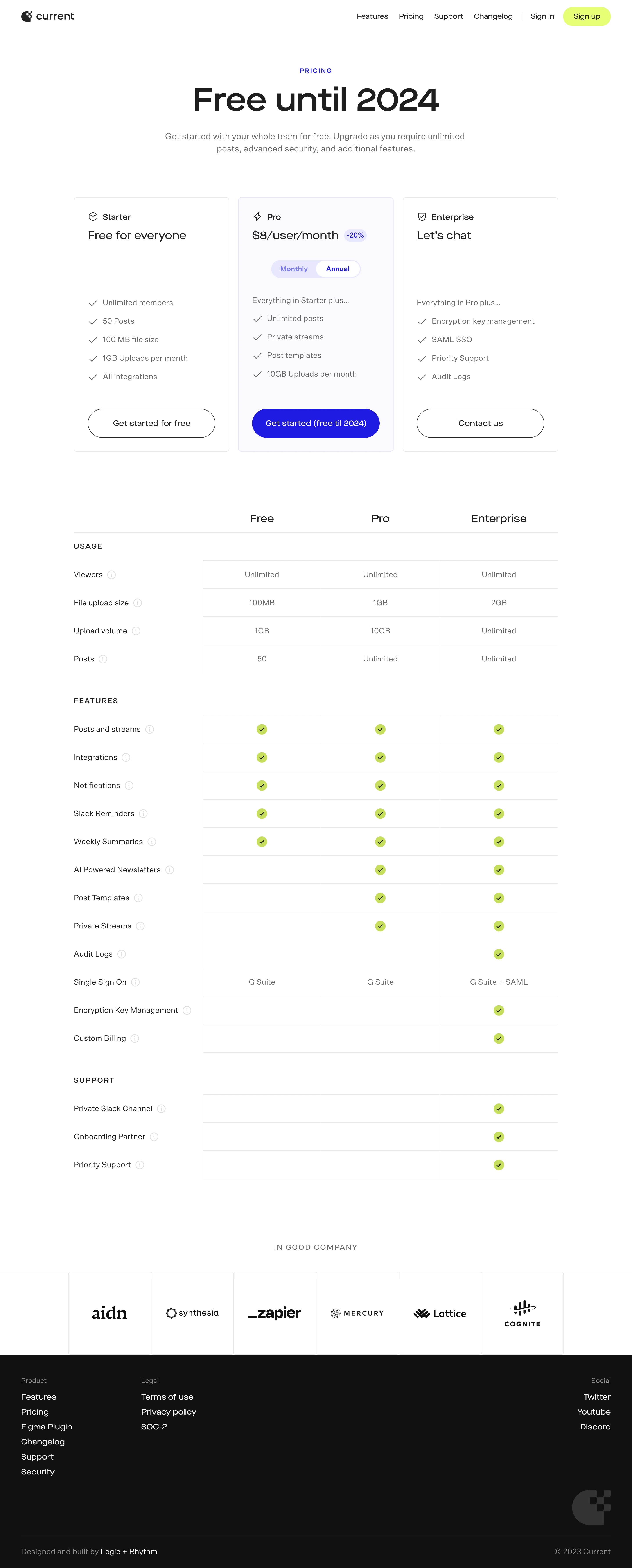
# Design from Reference: Current Pricing Page
Create an original, high-fidelity visual design inspired by the reference. Prioritize composition, typography, colors, spacing, and component styling over technical implementation.
## Reference
- **Product:** Current
- **Category:** Pricing Page
- **Screenshot:** https://cdn.prod.website-files.com/5e9dc792e1210c5325f7ebbc/6acb676c994832179b560731_6acb66c527f191c7cecf90e0_cms-c272d036777a36128ed5469b.webp
Analyze the screenshot first. If inaccessible, request it rather than guessing.
## Content
{{content.instructions}}
{{content.data}}
Preserve essential messaging and factual accuracy. Adapt structure and copy length for visual balance; never invent product claims.
## Visual Design
### Overall aesthetic
- **Character:** Minimal pricing page with black typography, violet highlighted plan and lime feature checks.
### Page composition
- **Capture:** 2880 × 7142 screenshot pixels; estimated 2× CSS scale.
- **Structure:** Navigation, centered pricing hero, three plan cards, detailed comparison matrix grouped by usage/features/support, customer-logo strip and black footer.
### Information hierarchy
- **Priority:** Large promotional headline leads into plan names/prices/actions. Highlighted middle plan includes billing-frequency switch; comparison details follow.
### Typography
- **Family:** Geometric sans serif; exact family unverified.
- **Estimated CSS sizes:** Hero 72px, plan price 26px, section/plan labels 20–24px, body 18px and uppercase group labels 14px.
### Colors & surfaces
- **Measured palette:** White #FFFFFF, footer #121212, highlighted plan #FAFAFF, rules #E8E8E8, dark #1E1E1E and violet #2019EA.
- **Accents:** Lime signup pill and circular comparison checkmarks.
### Components
- **Elements:** Three outlined plan cards, middle-plan tint, monthly/annual segment, discount badge, pill CTAs, info icons and three-column comparison cells.
- **Estimated geometry:** Content 1104px wide, 20px plan gaps, 8px card radius, 32px padding, 64px CTAs and 64px comparison rows.
### Visual rhythm
- **Spacing:** Large hero/card gaps lead into a regular comparison grid; logos and dark footer provide a clear endpoint.
### Responsive
- **Suggested adaptation:** Stack plan cards and retain horizontal comparison scrolling or a plan selector. Mobile behavior is unverified.
### Adaptation guidance
- **Transfer:** Preserve plan emphasis and comparison alignment. Treat the screenshot’s 2024 promotion and prices as historical reference, replacing them with actual terms.
Use this context to reproduce the reference's visual language: layout, typography, colors, spacing, borders, radii, and distinctive elements. The screenshot takes priority if descriptions conflict.
## Direction
{{preferences.fidelityInstructions}}
## Output
{{output.instructions}}
Deliver a polished, cohesive design with precise alignment, hierarchy, and spacing. Produce the requested visual artifact, not just a description. If unsupported, explain the limitation.