





1. Hero Section: The page begins with a Hero section that introduces users to the pricing plans offered by ConvertKit, along with their respective features. 2. Pricing Comparison Table: The website then presents a pricing comparison table that shows the key differences between the three pricing plans, along with their respective prices. 3. Plan Details Section: This section provides a detailed breakdown of each pricing plan, along with its features and limits. Each plan has its own dedicated section, which explains the unique features for that particular plan. 4. Testimonials: The website then showcases customer testimonials, with two prominent calls to action inviting users to "Start My 14-Day Free Trial" and "Join the Community". 5. Frequently Asked Questions (FAQ) Section: This section provides answers to common questions users might have, including questions related to billing, features, and pricing. 6. Bottom CTA Section: The page concludes with a prominent call-to-action section where users are invited to "Choose your plan", with a brief description of the benefits of joining ConvertKit, along with a list of key features. The website has an easy-to-navigate structure and presents all the necessary information in a clear, concise, and easily digestible format. It also makes it easy for potential users to sign up for the service, with multiple calls to action throughout the page.

Thank you! Your submission has been received!
Oops! Something went wrong while submitting the form.
Get SaaSFrame Pro
Monthly
$18
Quarterly
$48
Yearly
$180
Upgrade to access this feature
Browse all screens & flows
Filter and search screens & flows
Access Figma files
Access mobile versions
Bookmark screens & flows
Join now
ConvertKit Pricing Page

ConvertKit
Email Marketing for Online Creators
Designed by
No items found.

Bookmark
Bookmark
Design with AI
Thank you! Your submission has been received!
Oops! Something went wrong while submitting the form.
# Design from Reference: ConvertKit Pricing Page
Create an original, high-fidelity visual design inspired by the reference. Prioritize composition, typography, colors, spacing, and component styling over technical implementation.
## Reference
- **Product:** ConvertKit
- **Category:** Pricing Page
- **Screenshot:** https://cdn.prod.website-files.com/5e9dc792e1210c5325f7ebbc/62eca4430e99ef1db7d8a784_1659674993442-62ec9ca3df1bb8defff89fd0_screenshot-device-b7fcc610ea166b62857dcd649bed2ae6-1659617981680.webp
Analyze the screenshot first. If inaccessible, request it rather than guessing.
## Content
{{content.instructions}}
{{content.data}}
Preserve essential messaging and factual accuracy. Adapt structure and copy length for visual balance; never invent product claims.
## Visual Design
### Overall aesthetic
- **Character:** A calm creator-oriented pricing page pairs navy serif headlines with neutral sans-serif copy, pale mint/blue backgrounds, green pill actions and simple hand-drawn accents.
- **Evidence scale:** The screenshot measures 1440 × 5578 pixels. All four readable portions were inspected; approximate CSS sizes assume an unverified 1× capture density.
### Page composition
- **Header/hero:** A centered navigation row sits on pale mint above a two-line pricing heading, subscriber slider and monthly/yearly selector.
- **Pricing:** Three adjacent white columns represent Free, Creator and Creator Pro. The central recommended column projects slightly above and below its neighbors.
- **Supporting value:** A wide comparison-expansion action precedes a course-benefits section with two curriculum blocks.
- **FAQ/demo:** A softly waved pale-blue region contains eight white collapsed FAQ cards, a demo invitation and a large cropped product-display mockup.
- **Footer:** A full-width navy footer holds six text-link columns, then a separated copyright/legal/social row and chat launcher.
### Information hierarchy
- **Pricing input:** Subscriber count and billing cadence are shown before plan prices, clarifying the variables behind the comparison.
- **Plan differentiation:** Names, short audience descriptions, large prices and green actions lead each column; a blue Recommended ribbon emphasizes Creator.
- **Feature availability:** Included features use dark copy; excluded items are pale and struck through.
- **Decision support:** Courses, FAQ and demo content follow the comparison to answer questions before the footer navigation.
### Typography
- **Display headings:** The hero uses a bold serif around 46–48 pixels with approximately 62-pixel leading; FAQ/demo headings use the same serif at roughly 30–36 pixels.
- **Plan roles:** Plan names are around 24 pixels semibold; prices are approximately 44 pixels, with smaller monthly/unit text.
- **Body/features:** Sans-serif copy is roughly 16–18 pixels with 26–28-pixel leading. FAQ labels are about 18 pixels semibold.
- **Supporting accents:** Small italic notes and curved arrow drawings annotate billing and demo actions. Exact serif and sans-serif identities are unverified.
### Colors & surfaces
- **Measured colors:** ICC-to-sRGB sampling identifies #FFFFFF for cards, #EFF6F3 for pale mint and #F2F7FA for the FAQ/support background.
- **Measured dark/accent:** #20304F supplies navy foreground/footer areas; #48639C is the muted blue recommendation/control accent and #373F46 a dark neutral foreground.
- **Action color:** Medium green fills rounded trial/signup buttons and outlines the small puzzle illustrations.
- **Depth:** Plan cards use thin borders; FAQ cards use soft shadows and small radii. The footer is flat navy with muted light text.
### Components
- **Subscriber slider:** A long horizontal mint track spans about 570 pixels, with a blue circular thumb and pointed 300-value bubble beneath.
- **Billing toggle:** A small two-option pill highlights Yearly in blue, with an italic two-months-free note below.
- **Plan columns:** Each is roughly 390 pixels wide. Headers include puzzle icons, audience copy, price, billing note and approximately 50-pixel-high green pill actions.
- **Feature comparison:** Long centered feature lists share aligned row spacing. A full-width blue bar below offers expansion with a downward chevron.
- **Course panel:** A pale-blue two-column block uses tool/rocket line icons, short titles, descriptions and module/lesson metadata.
- **FAQ cards:** Approximately 570 pixels wide, with 30-pixel padding, right chevrons and heights that grow for wrapped questions.
- **Demo/footer:** A blue rectangular demo button sits above a large monitor-like product image; six footer groups use uppercase muted labels.
### Visual rhythm
- **Centered alignment:** Hero controls, pricing columns, courses, FAQ and demo maintain a central axis.
- **Comparison cadence:** Repeated feature rows and matching plan actions support side-by-side scanning.
- **Section spacing:** Broad gaps of roughly 80–120 pixels separate pricing, courses and FAQ/demo sections.
- **Surface transition:** The pale mint hero gives way to white pricing/support content, then pale blue FAQ and a dark footer.
### Responsive
- **Observed scope:** Only a desktop pricing state is visible, with Yearly selected and all FAQ rows collapsed.
- **Recommended layout:** Stack plan cards with their names and actions intact, keep the subscriber input keyboard accessible and allow billing labels to fit without clipping.
- **Recommended comparison:** Provide a usable narrow-screen feature comparison rather than shrinking three columns; stack curriculum and footer groups.
- **Recommended content:** Reduce serif display size and scale the monitor image within the viewport, preserving readable FAQ labels and tap targets.
### Adaptation guidance
- **Pricing system:** Show pricing variables first, compare a small set of plans, then support decisions with education, FAQ and demo routes.
- **Feature clarity:** Use explicit availability text alongside visual strike-through and make the recommended tier clear without obscuring other choices.
- **Content fidelity:** Prices, limits and brand naming reflect the supplied screenshot; verify live commercial details before reuse.
- **Implementation:** Confirm font identities and capture scale, define slider semantics and selected/expanded states, and preserve contrast for muted excluded features.
Use this context to reproduce the reference's visual language: layout, typography, colors, spacing, borders, radii, and distinctive elements. The screenshot takes priority if descriptions conflict.
## Direction
{{preferences.fidelityInstructions}}
## Output
{{output.instructions}}
Deliver a polished, cohesive design with precise alignment, hierarchy, and spacing. Produce the requested visual artifact, not just a description. If unsupported, explain the limitation.
Category
Patterns
Tech Stack
Added on
May 17, 2020
Similar screens



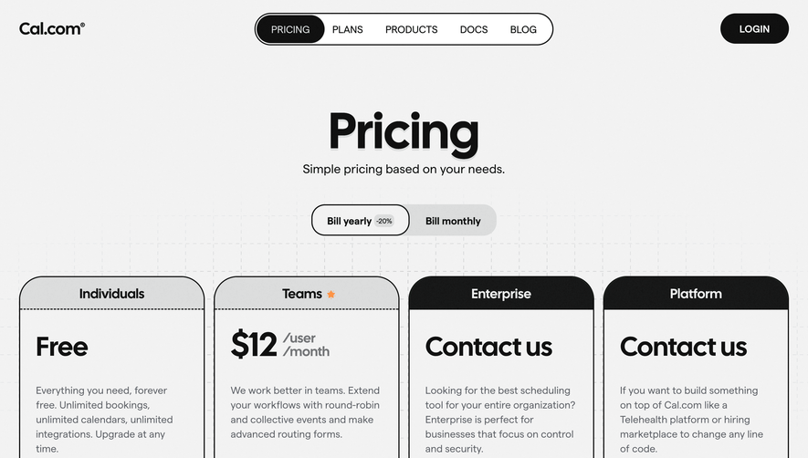

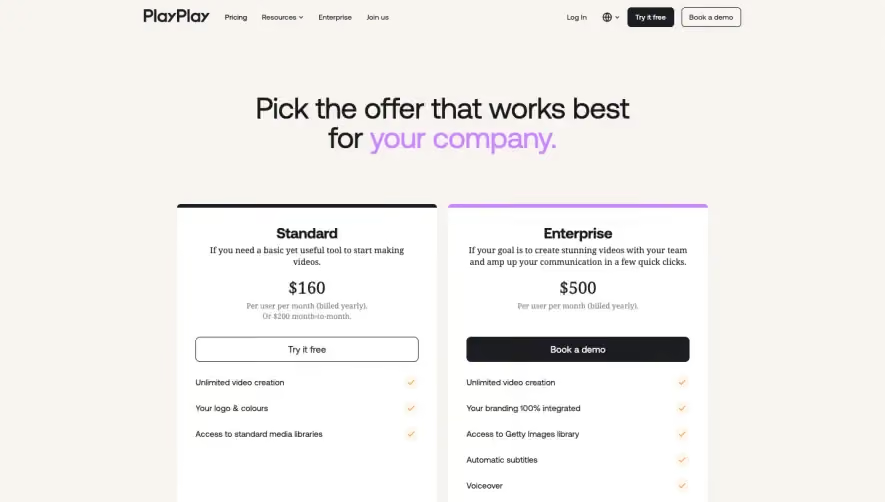

Upgrade to SaaSFrame Pro now to see similar examples.
Monthly
$18 /month
Billed $18 monthly
Browse all screens & flows
Filter and search screens & flows
Search text in screenshots
Access Figma files
Access mobile versions
Join now
Quarterly
$16 /month
Billed $48 quarterly
Browse all screens & flows
Filter and search screens & flows
Search text in screenshots
Access Figma files
Access mobile versions
Join now
Yearly
$15 /month
Billed $180 yearly
Browse all screens & flows
Filter and search screens & flows
Search text in screenshots
Access Figma files
Access mobile versions
Join now