Generate a new design based on this screen using your own content.
Thank you! Your submission has been received!
Oops! Something went wrong while submitting the form.
# Design from Reference: Contractbook Webinars Page
Create an original, high-fidelity visual design inspired by the reference. Prioritize composition, typography, colors, spacing, and component styling over technical implementation.
## Reference
- **Product:** Contractbook
- **Category:** Webinars Page
- **Screenshot:** https://cdn.prod.website-files.com/5e9dc792e1210c5325f7ebbc/6acb67f3c08cd859ff8692e5_6acb66d218ad202d01d77b2a_cms-bfc8779a2b9d1618010ef2b5.webp
Analyze the screenshot first. If inaccessible, request it rather than guessing.
## Content
{{content.instructions}}
{{content.data}}
Preserve essential messaging and factual accuracy. Adapt structure and copy length for visual balance; never invent product claims.
## Visual Design
Use this context to reproduce the reference's visual language: layout, typography, colors, spacing, borders, radii, and distinctive elements. The screenshot takes priority if descriptions conflict.
## Direction
{{preferences.fidelityInstructions}}
## Output
{{output.instructions}}
Deliver a polished, cohesive design with precise alignment, hierarchy, and spacing. Produce the requested visual artifact, not just a description. If unsupported, explain the limitation.
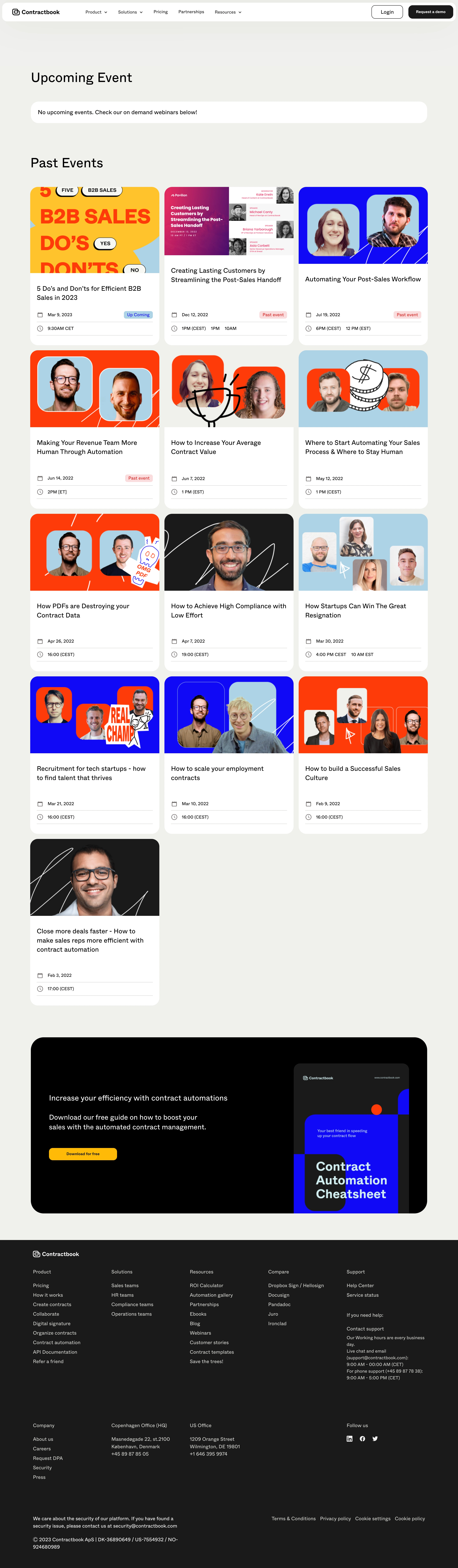
Contractbook’s Webinars page exemplifies a modern, minimalist approach with a crisp, professional finish. The design feels open and uncluttered, balancing ample white space with concise content blocks. Subtle micro-interactions and calm color transitions create a sense of polished sophistication, inviting visitors to explore with confidence.
Layout and Structure
The page launches with a clean hero section: a bold headline meets a compelling subtext beside a clear, prominent CTA. Below, webinars are presented in a flexible card grid, each module featuring a recognizable title, speaker thumbnail, date, and quick summary. Scrolling reveals a predictable, user-friendly rhythm, with navigation breadcrumbs up top, and a sticky header for quick access.
Visual Elements
High-quality speaker photos and subtle company branding sit alongside playful-yet-professional vector illustrations. The absence of cluttered animations puts the focus on content, while section dividers and card shadows subtly delineate information. Small icons reinforce key actions (like registration) without crowding the visual space.
Color Palette and Typography
A calming blue foundation (Contractbook’s signature) anchors the palette, accented with soft, muted gradients and fresh white backgrounds. Clean sans-serif fonts—weighted for hierarchy—guide the eye naturally from headline to detail. Strategic color splashes highlight CTAs and key webinar details, enhancing scannability.
User Experience Patterns
A sticky navbar and persistent CTAs ensure effortless navigation. Filtering and sorting make finding relevant webinars intuitive. Registration is a breeze: modal forms pop up without navigating away, reducing cognitive friction. Responsive design and finger-friendly tap targets keep the interface smooth across devices.
Unique or Notable Design Choices
The page distinguishes itself with its synergy of clarity and visual interest: floating cards, modular grids, and consistent visual cues maintain engagement. The design strikes a rare balance between corporate trustworthiness and approachable warmth—energizing without overwhelming—making it an inspired reference point for forward-thinking SaaS interfaces.