Prompt 1,584 words Copy
# Design from Reference: Intercom Webinars Page

Create an original, high-fidelity visual design inspired by the reference. Prioritize composition, typography, colors, spacing, and component styling over technical implementation.

## Reference

- **Product:** Intercom
- **Category:** Webinars Page
- **Screenshot:** attached to this message (also available at https://media.saasframe.io/o/2bb3debfeff1dfb53d6f.webp)
- **Source:** https://www.intercom.com/webinars

Analyze the attached screenshot first. If no image is attached, open the screenshot link; if neither is accessible, ask for it rather than guessing.

## Visual Design Context

### Overall aesthetic
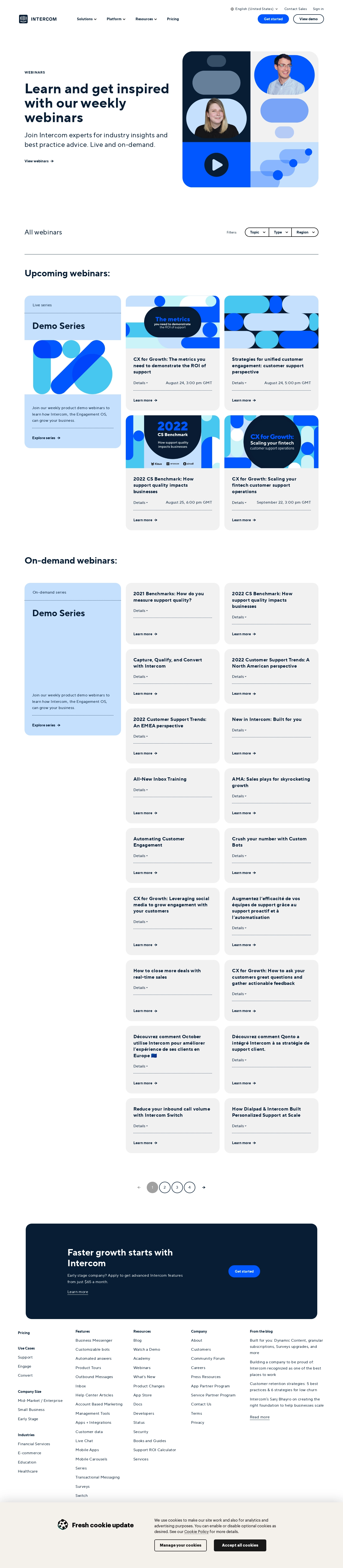
- **Character:** A webinar directory uses bold dark navy headings, white space, pale blue/gray cards, saturated blue actions, and modular rounded geometric artwork.
- **Brand language:** Capsules, circles, speaker portraits, and play symbols form a consistent visual vocabulary from hero to webinar thumbnails.
- **Observed scale:** The source measures 1440 × 6588 pixels. Sizes below are approximate image pixels; CSS estimates assume an unverified 1× capture.

### Page composition
- **Header:** Intercom branding sits left, product navigation occupies the middle, and language/contact/sign-in utilities sit above Get started and View demo actions at right.
- **Hero:** A two-column region pairs a small Webinars eyebrow, large multiline headline, explanatory copy, and View webinars link with a square rounded illustration at right.
- **Directory heading:** All webinars aligns left; a segmented Topic, Type, and Region filter control aligns right above a thin rule.
- **Upcoming region:** A tall pale-blue Demo Series card occupies the left column. Four illustrated event cards form two columns to its right.
- **On-demand region:** A second tall pale-blue series card appears left. Numerous compact gray webinar cards continue in two columns on the right, leaving white space below the shorter left card.
- **Pagination:** Four circular page controls and directional arrows sit centered beneath the on-demand grid.
- **Closing CTA:** A broad dark navy rounded banner pairs an early-stage offer with a blue Get started pill.
- **Footer and consent:** Five footer columns follow. A warm pale cookie panel at the captured bottom contains a title/icon, explanation, and two cookie-management actions.

### Information hierarchy
- **Hero message:** The large navy headline introduces learning and inspiration; the supporting copy clarifies live and on-demand formats.
- **Content division:** Upcoming and On-demand headings clearly separate event types.
- **Series versus individual:** Tall blue series cards carry an overview and Explore series link. Individual cards carry a title, Details control, divider, and Learn more action.
- **Upcoming metadata:** Illustrated cards include dates/times alongside Details. On-demand cards omit date/time rows in the visible layout.
- **Filtering:** Three compact dropdown segments give equal weight to topic, type, and region.
- **Commercial scope:** Event dates, titles, pricing, and offer terms are historical screenshot content, not verified current schedules or offers.
- **Consent scope:** The cookie panel is visible as content; the image does not establish fixed positioning or user consent state.

### Typography
- **Typeface appearance:** A broad rounded sans-serif with strong bold weights is used. Exact family is unverified.
- **Hero heading:** Approximately 56–60 pixels, bold, with line-height around 60 pixels and deliberate three-line wrapping.
- **Hero description:** Around 27–29 pixels with 39-pixel line-height, regular weight.
- **Section headings:** Approximately 36–38 pixels, bold. All webinars is smaller and lighter, around 27 pixels.
- **Card titles:** Around 19–21 pixels, bold, with 26-pixel line-height. Compact cards support two to four lines according to title length.
- **Metadata and controls:** Details, dates, filters, and links are around 14–16 pixels. Small eyebrow labels use uppercase and expanded tracking.
- **Footer roles:** Group headings are compact and bold; links use roughly 15–16-pixel text with generous vertical separation.

### Colors & surfaces
- **Measured base:** #FFFFFF dominates the page. #F1F1F1 supplies neutral webinar-card surfaces.
- **Measured navy:** #081D34 and nearby #091B33 support the main text/dark banner family.
- **Measured blue:** #0157FF, with nearby #0157FE, supplies saturated actions and graphic shapes.
- **Measured pale blue:** #C5E0FD forms series cards and artwork; #47C7F0 supplies cyan illustration accents.
- **Measured warm surface:** #F4F1EB supplies the cookie-panel family.
- **Depth:** Cards are mostly flat, with broad rounded corners rather than strong shadows. Thin dotted rules separate metadata from card actions.
- **Color roles:** Blue series cards distinguish ongoing programs; gray individual cards keep long lists visually restrained.

### Components
- **Header buttons:** Get started is a blue pill; View demo is a navy-outlined white pill.
- **Hero artwork:** A square panel with large rounded corners is divided into four blocks. Two speaker portraits sit among stacked capsules; a dark play circle and connected rounded forms fill the lower blocks.
- **Filter group:** A black/navy outlined pill is divided into three dropdown segments with chevrons.
- **Series card:** A pale-blue tall rounded rectangle contains a small series label, dotted rule, large Demo Series title, open middle area or graphic, lower description, and Explore series link.
- **Upcoming card:** A colorful geometric thumbnail sits above a gray body containing title, Details dropdown, date/time, dotted divider, and Learn more link.
- **On-demand card:** A compact gray rounded rectangle omits the thumbnail and begins directly with a bold title. Details and a dotted divider separate the title from Learn more.
- **Card grid:** The main directory uses three visual columns, with the left reserved for series and the right two for individual sessions.
- **Pagination:** Four circular numbered controls use outlines, with the first filled gray in the captured state. Previous is pale; next is dark.
- **Closing banner:** A navy rounded rectangle roughly 1225 pixels wide contains white heading/copy, underlined Learn more link, and blue pill action.
- **Footer:** Grouped links cover use cases, company size, industries, features, resources, company, and blog excerpts.
- **Cookie panel:** A cookie illustration and bold title sit left; explanation and an underlined policy link sit right above outlined Manage your cookies and dark Accept all cookies buttons.
- **Unshown states:** Open filters/details, registration pages, video playback, other pagination results, and cookie preference settings are not visible.

### Visual rhythm
- **Large hero breathing room:** The hero and directory are separated by broad white intervals.
- **Asymmetric grid:** Tall series cards anchor the left while smaller session cards create a denser right-hand rhythm.
- **Consistent card internals:** Titles, Details rows, dotted rules, and lower links repeat predictably despite varying title lengths.
- **Rounded vocabulary:** Hero panels, cards, filters, buttons, and pagination repeat soft curves.
- **Long-list restraint:** Gray cards avoid overusing colorful thumbnails in the on-demand section.
- **Distinct ending:** Pagination, dark conversion banner, dense footer, and warm cookie panel form progressively different closing zones.

### Responsive
- **Evidence limit:** Only a desktop page is captured. Mobile layout, sticky elements, and filter behavior are unverified.
- **Recommended hero:** Stack copy and artwork; reduce heading size to around 36–44 CSS pixels.
- **Recommended directory:** Convert the three-column composition to a single sequence, placing series introductions before relevant session cards.
- **Recommended filters:** Wrap or stack the three filter segments while retaining visible labels and selected values.
- **Recommended cards:** Allow metadata to wrap and preserve consistent action placement without fixed heights that clip long titles.
- **Recommended footer/consent:** Stack footer groups and consent actions, ensuring the cookie panel does not obscure essential page controls.

### Adaptation guidance
- **Preserve content types:** Distinguish upcoming events, on-demand sessions, and series through structure as well as color.
- **Use reusable cards:** Standardize illustrated upcoming cards, compact on-demand cards, and tall series cards.
- **Validate live content:** Confirm dates, regions, availability, prices, and offer terms before reuse.
- **Implement accessible controls:** Provide semantic filters, descriptive links, keyboard-operable pagination, and clear focus states.
- **Treat portraits and art as assets:** Use approved speaker imagery and scalable geometric artwork; do not infer playback from a static play symbol.
- **Handle consent deliberately:** Supply current approved cookie text and genuine preference controls, separate from the directory’s browsing state.

## Content

**Instructions:**

Generate realistic example content that fits the selected design reference.

Create appropriate headlines, descriptions, labels, buttons, and supporting copy based on the type of interface being designed.

If a product or business description is provided, use it to guide the content.

Otherwise, invent a plausible fictional SaaS product appropriate for the reference.

Keep the content concise, coherent, and visually balanced.

Do not present fictional statistics, customer names, or testimonials as verified facts.

## Design Direction

**Instructions:**

Use the reference screenshot as the main source of visual inspiration rather than a strict layout template.

Preserve its most distinctive design characteristics, such as typography, visual rhythm, color relationships, component treatments, and overall aesthetic.

Feel free to modify section arrangements, proportions, spacing, and individual components to better suit my content.

Introduce original design decisions where they improve usability, composition, or brand consistency.

The result should clearly reflect the reference's visual language without looking like a direct reproduction.

Follow the visual identity of the reference design.

Use its typography, color palette, component styling, and overall aesthetic as the primary design direction.

Do not introduce an unrelated visual identity.

## Output

**Instructions:**

Generate a high-fidelity visual mockup of the requested interface.

Present the design as a polished, realistic website or product UI screenshot.

Prioritize visual composition, typography, spacing, colors, alignment, and component details.

Use the available image-generation or visual-design capabilities.

Do not replace the mockup with source code, a written design specification, or a textual description.

If direct visual generation is unavailable, clearly explain the limitation.

## Constraints

- Use the actual screenshot as the primary visual reference.
- Preserve essential messaging and factual accuracy.
- Prioritize visual quality and consistency.
- Do not invent unsupported product claims.
- Adapt structure and copy length for visual balance.
Reference image Attach it to your message: assistants can’t open image links. Open in ChatGPT ↗ Open in Claude ↗
Build it in Lovable ↗ v0 ↗ Figma Make ↗
Opening a tool copies the screenshot so you can paste it with your prompt.
 SaaSFrame