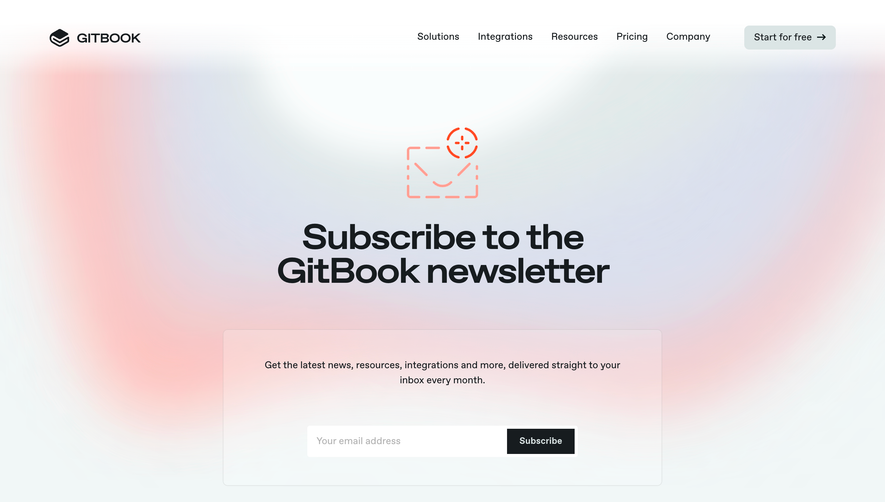
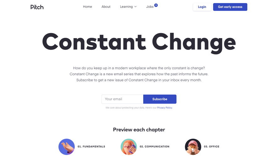
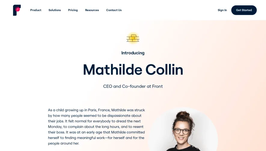
Generate a new design based on this screen using your own content.
Thank you! Your submission has been received!
Oops! Something went wrong while submitting the form.
# Design from Reference: Fellow Newsletter Page
Create an original, high-fidelity visual design inspired by the reference. Prioritize composition, typography, colors, spacing, and component styling over technical implementation.
## Reference
- **Product:** Fellow
- **Category:** Newsletter Page
- **Screenshot:** https://cdn.prod.website-files.com/5e9dc792e1210c5325f7ebbc/62ec9c6fbf75bb3693ce6cc1_1659621604505-screenshot-device-d6551fd98e642c23960d3269d82b467c-1659601362116.webp
Analyze the screenshot first. If inaccessible, request it rather than guessing.
## Content
{{content.instructions}}
{{content.data}}
Preserve essential messaging and factual accuracy. Adapt structure and copy length for visual balance; never invent product claims.
## Visual Design
Use this context to reproduce the reference's visual language: layout, typography, colors, spacing, borders, radii, and distinctive elements. The screenshot takes priority if descriptions conflict.
## Direction
{{preferences.fidelityInstructions}}
## Output
{{output.instructions}}
Deliver a polished, cohesive design with precise alignment, hierarchy, and spacing. Produce the requested visual artifact, not just a description. If unsupported, explain the limitation.
Fellow’s newsletter page radiates modern professionalism with a touch of playfulness. The design achieves a clean, uncluttered look while still feeling lively and approachable—balancing whitespace with pops of brand color. The refined layout supports easy scanning and immediate focus on the value proposition.
Layout and Structure
Right from the hero section, the purpose is unmistakably clear—subscribe to elevate your meeting skills. The page leverages a singular, high-impact structure: a prominent hero headline, a concise supporting statement, an email opt-in form, and then social proof featuring subscriber count and recognizable company logos. The footer extends the brand experience with minimal links and subdued visual treatment, keeping focus on conversion.
Visual Elements
Illustrations are prominent, with a spirited mascot inviting engagement. Animated squiggles and subtle motion add energy without distraction. Clean iconography supports trust messaging, and there’s a total absence of stock photography, pushing a unique, custom feel that differentiates the brand from template-driven SaaS sites.
Color Palette and Typography
A sharp, teal-dominant palette is complemented by sunny yellow highlights and strategic use of gray for depth. Typography is crisp: bold sans-serifs guide the eye to headlines and CTAs, while lighter body copy invites reading. Hierarchy is clear, with decluttered line lengths and ample spacing.
User Experience Patterns
Smooth, linear navigation ensures the user journey is frictionless—only one form field and a prominent CTA button for optimal conversion. Micro-animations add delight, while testimonial metrics build trust. Overall, the tone feels trustworthy and forward-thinking, grounded by subtle whimsy that sets Fellow apart in the crowded SaaS space.