Overall Style and Aesthetic
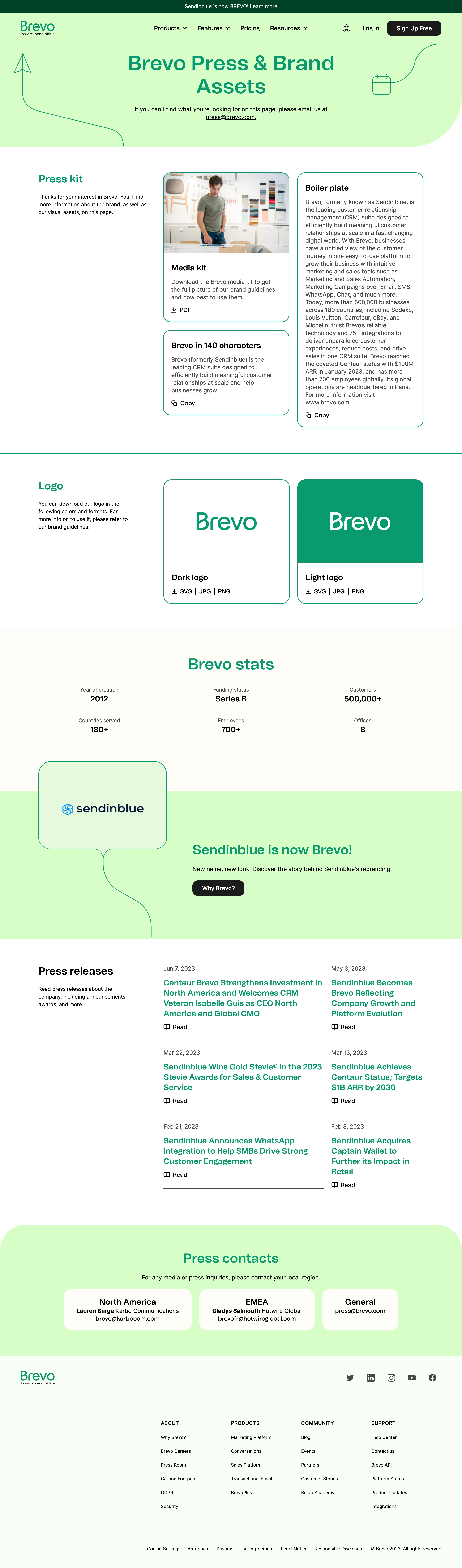
Brevo’s Press Room page exemplifies a modern, professional SaaS aesthetic with a welcoming and approachable twist. Clean lines, generous white space, and grounded layouts keep the focus crisp and uncluttered. Subtle blue and teal flourishes add an element of sophistication, while playful geometric graphics inject personality without overwhelming the content. The tone feels approachable yet trustworthy—perfect for media professionals and partners. Layout and Structure
The page opens with a bold hero section showcasing the Brevo logo, concise headline, and a helpful call-to-action for press inquiries. Content follows a modular grid, with succinct blocks segmenting the latest press releases, media resources, and company information. There’s a clear visual flow, guiding users intuitively through information without cognitive overload. The sticky navigation allows effortless access to key sections. Visual Elements
Iconography is simple and line-based, complementing minimalist spot illustrations that reinforce the brand without visual excess. Headshots for press contacts humanize the experience, supported by subtle hover effects. The media kit is presented as a sleek downloadable tile, making resources instantly accessible. Color Palette and Typography
A harmonious blend of deep navy, teal, and soft gray sets a calming, authoritative vibe, with vibrant accents used sparingly to signal interactivity. Modern sans serif fonts, with clear hierarchy and sufficient line spacing, ensure maximum legibility and accessible reading for all users. User Experience Patterns & Unique Touches
Clear, conversational copy, persistent CTAs, and frictionless resource downloads exemplify usability. Notably, a structured, media-friendly layout and helpful anchor links show a deep understanding of press needs—while the balanced use of brand visuals delivers memorability without noise.