Overall Style and Aesthetic
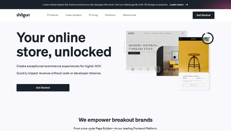
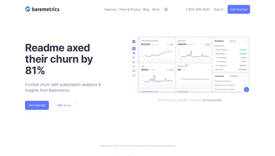
Blobr.io embodies a sleek, minimalist approach with a modern edge, radiating professionalism and innovation. The page design avoids excess, utilizing spacious layouts and ample white space to ensure clarity and focus. Core visual cues, such as subtle gradients and gentle shadows, add dimension while keeping the interface clean and distraction-free. Layout and Structure
The site’s structure follows a proven SaaS pattern: a bold hero section makes an immediate impact, followed by neatly separated feature highlights, testimonial carousels, a clear pricing breakdown, and a detailed footer. Each section flows smoothly into the next, guiding visitors naturally through information with well-placed anchor links and above-the-fold CTAs. Visual Elements
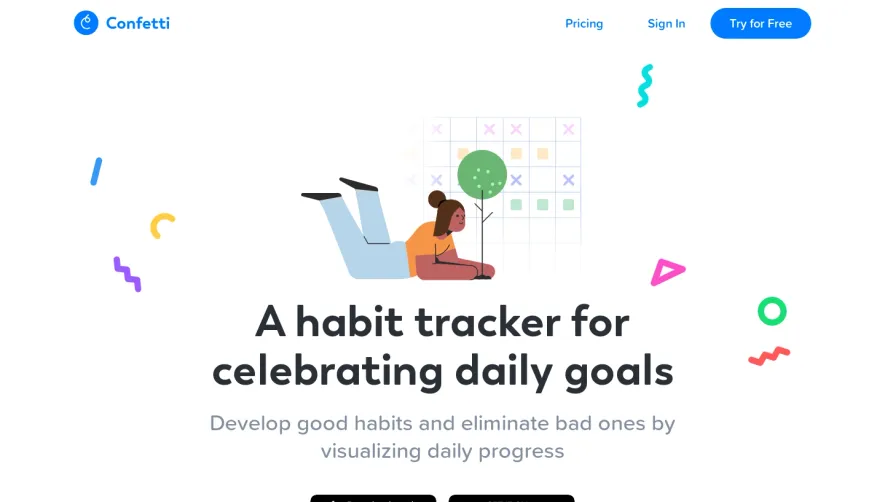
Custom illustrations and crisp iconography reinforce key concepts and product benefits, replacing generic stock photos with tailored imagery. Micro-animations—such as animated transitions and hover effects—infuse the experience with dynamism without overwhelming. Simple video embeds and modal pop-ups further engage users while maintaining a consistent visual style. Color Palette and Typography
A harmonious palette centers on fresh blues, steady neutrals, and uplifting accent colors, balancing vibrancy and trust. Typography features rounded, friendly sans-serif fonts, with large bold headings and clearly legible body text—creating a strong content hierarchy and enhancing readability across devices. User Experience Patterns
A sticky top navigation anchors the user, with persistent CTAs (“Start Free,” “Book a Demo”) driving engagement. Interactive elements respond fluidly to hover and scroll, and forms are slim, focused, and easy to complete. The overall flow feels intuitive, ensuring that users always know what step to take next. Unique or Notable Design Choices
Blobr.io stands out with playful, branded blobs in backgrounds and illustrations—a signature touch reinforcing name and identity. Feature cards are interactive rather than static, and testimonial sections are visually emphasized with bold avatars and gently sliding content. The overall tone is approachable yet cutting-edge—exuding confidence in both capability and creativity.