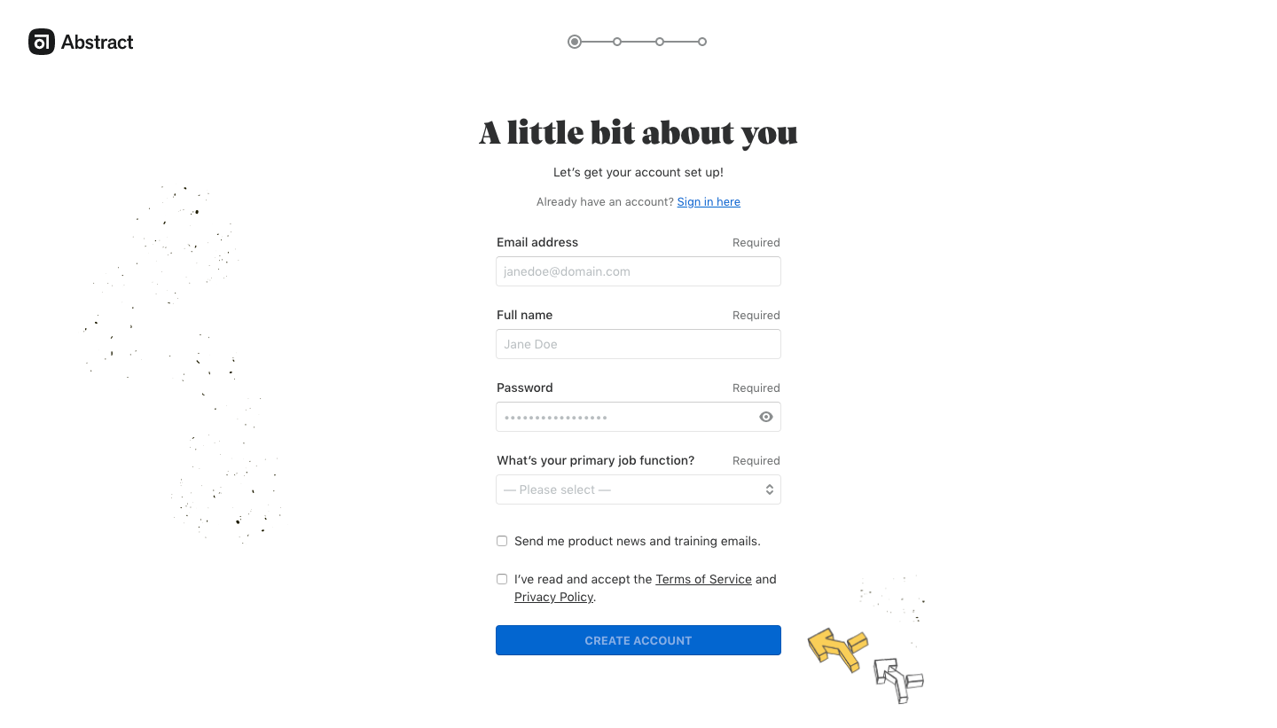
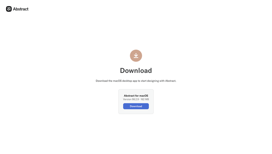
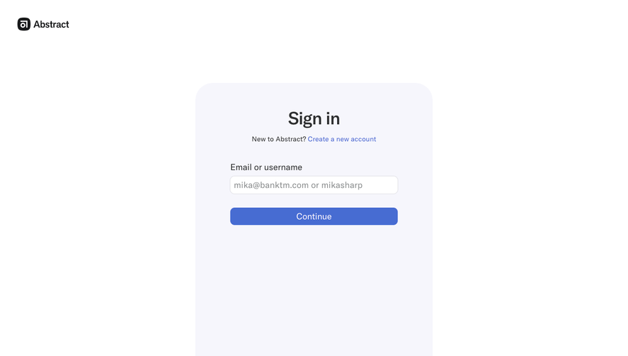
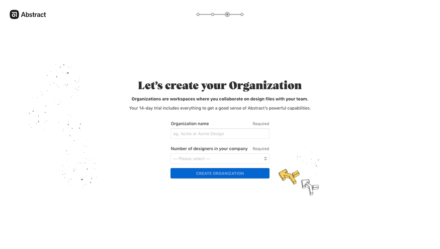
Abstract’s signup page embodies modern minimalism, favoring vast white space with crisp boundaries. Clean, professional, and subtly energetic, the interface balances simplicity with a contemporary feel. Visual restraint signals trustworthiness, while subtle accent colors inject vibrancy without overpowering the user.
Layout and Structure
The page focuses entirely on the signup process, eliminating distractions. A centered hero section houses the signup form, immediately engaging visitors. There are no traditional feature lists or testimonials here—just a focused journey, culminating in a sleek footer housing secondary links and essentials. The page hierarchy flows seamlessly from brand introduction to action, fostering momentum.
Visual Elements
The visual language is understated yet effective. Logo branding is boldly present at the top. SVG icons, used sparingly, clarify input fields and progression. No stock photography or heavy illustrations clutter the interface, enabling fast comprehension and a welcoming sense of order.
Color Palette and Typography
A predominantly white background amplifies clarity, supported by deep navy and vibrant teal accents for emphasis and interaction feedback. Typography is deliberate: bold sans-serif for headings ensures immediate legibility, while lighter weights for body text compress complexity. Inputs and CTAs stand out via colored borders or filled buttons, guiding action intuitively.
User Experience Patterns
Navigation is intentionally minimal; the focus is on conversion without navigational detours. Microinteractions—such as active states and gentle validation cues—help users progress confidently. The form is split into digestible steps, reducing friction and boosting completion rates. Clear CTAs, prominent from the outset, leave no ambiguity in next steps.
Unique or Notable Design Choices
By eliminating visual noise and optional content, Abstract transforms the signup page into a high-conversion funnel. The step-by-step form, paired with real-time feedback, makes the process feel approachable and low-pressure. The result is a sleek, inviting, and conversion-minded interface—ideal inspiration for SaaS designers seeking clarity and efficiency.
 SaaSFrame