.webp)
As the SaaS market matures, landing page design has evolved far beyond minimal hero sections and catchy CTAs. In 2026, SaaS design trends are leaning toward personality, interactivity, and conversion-focused storytelling.
We analyzed hundreds of landing page examples from the SaaSFrame library to highlight what’s shaping modern SaaS websites this year — and how you can apply these trends to your own product.
1. Story-Driven Hero Sections
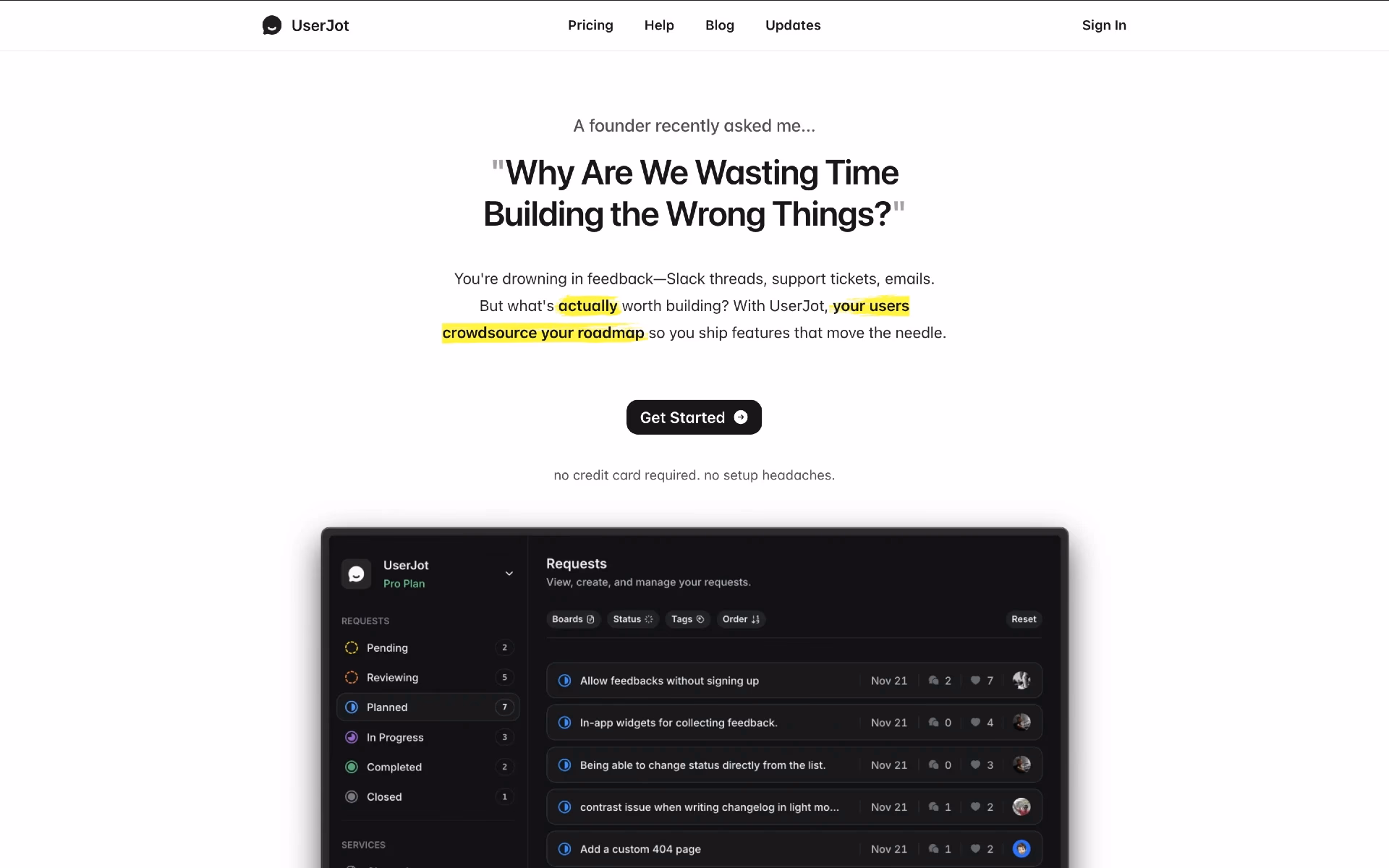
Static taglines are out. In 2025, top SaaS brands are using narrative headlines and supporting visuals to tell a story in seconds.
Think of Notion, Linear, and Framer — their hero sections visually show the product value before you scroll.
Rather than simply stating what your product is (“We are a SaaS tool”), story-driven heroes do more:
- They hint at who the product is for.
- They show the before → after (or problem → solution) arc.
- They create a little narrative moment in the first fold of the page.
👉 Tip: Use animation or micro-interactions in your hero to illustrate the product workflow rather than just describing it.
You can find similar onboarding examples on SaaSFrame.io.
2. Personalized CTAs and Dynamic Value Props
The one-size-fits-all CTA is fading. Expect more personalized landing experiences — dynamic text, pricing previews, and segmented messaging.
These subtle touches increase conversion and keep users engaged from first scroll.
Here's how you can implement it:
- Segment your audience (startup vs enterprise, marketing vs product, B2C vs B2B) and tailor the CTA accordingly.
- Value prop should reflect the visitor’s context (e.g., “for your product type”, “based on your company size”, “designed for your workflow”).
- Use form or interactive inputs to adapt the next step or what you promise — e.g., “How many team members?”, “What industry?”, “What’s your goal?”.
- Avoid generic CTAs like “Sign up” or “Learn more” — instead use benefit-driven language: “See examples built for you”, “Explore templates tailored to your workflow”.
- Leverage dynamic elements: change button text or supporting line based on referral source, campaign, device, or traffic segment.
3. Micro Animations with Purpose
Micro animations aren’t just decorative anymore — they demonstrate functionality. Hover effects, scroll-based progress, and animated dashboards communicate features instantly.
This is one of the strongest SaaS design trends for 2026 — minimal motion that adds meaning, not noise.
Here are a few practical micro-animation ideas you could integrate:
- CTA button hover & pulse: Slightly animate “Browse landing page examples” when hovered.
- Scrolling content reveal: Sections (features, examples, quotes) fade and slide in as the user scrolls.
- Feedback on forms: Show animated checkmark when form fields are correctly filled — e.g., email signup.
- Animated feature icons: Subtle icon motion as each benefit block comes into view.
.gif)
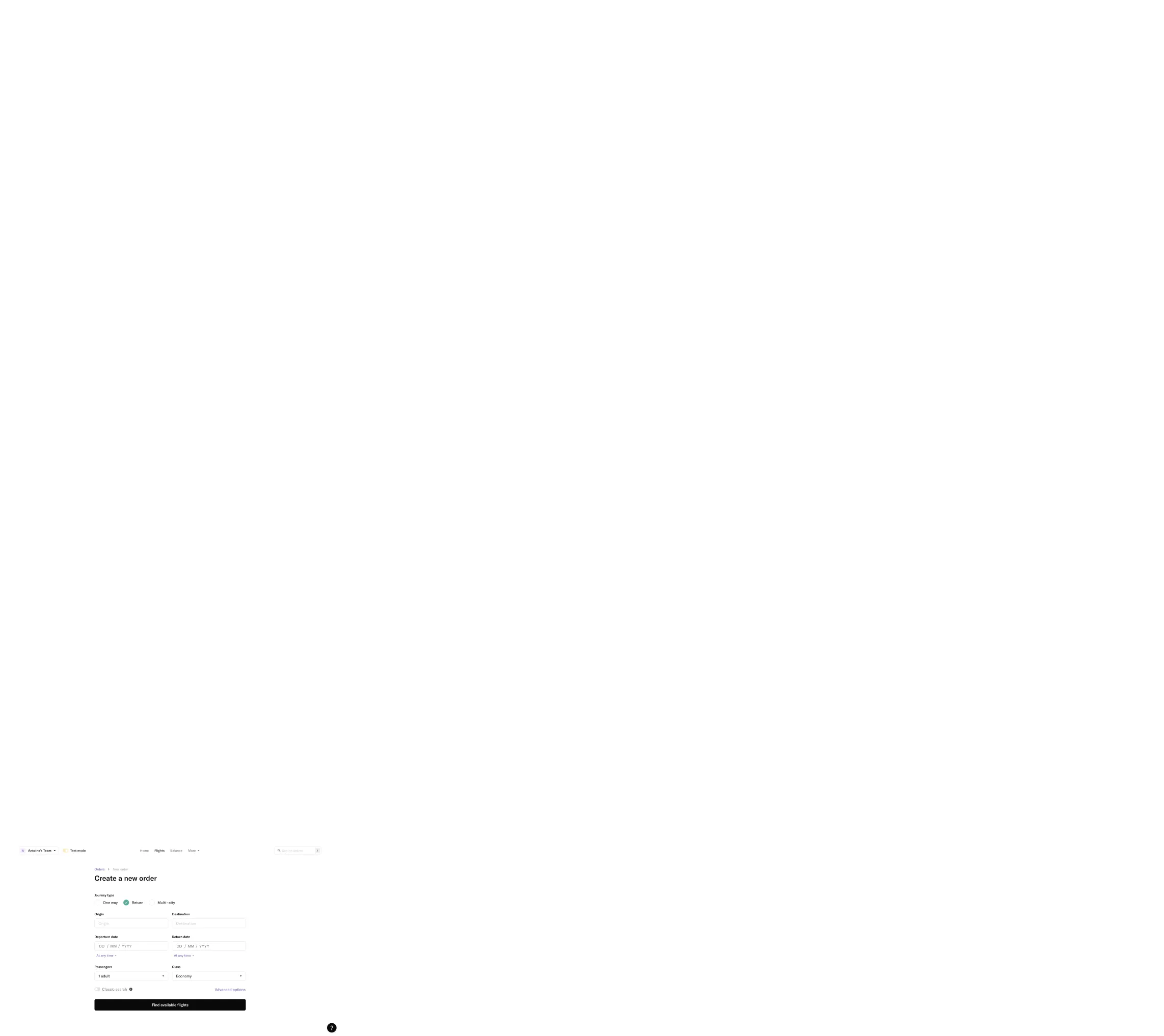
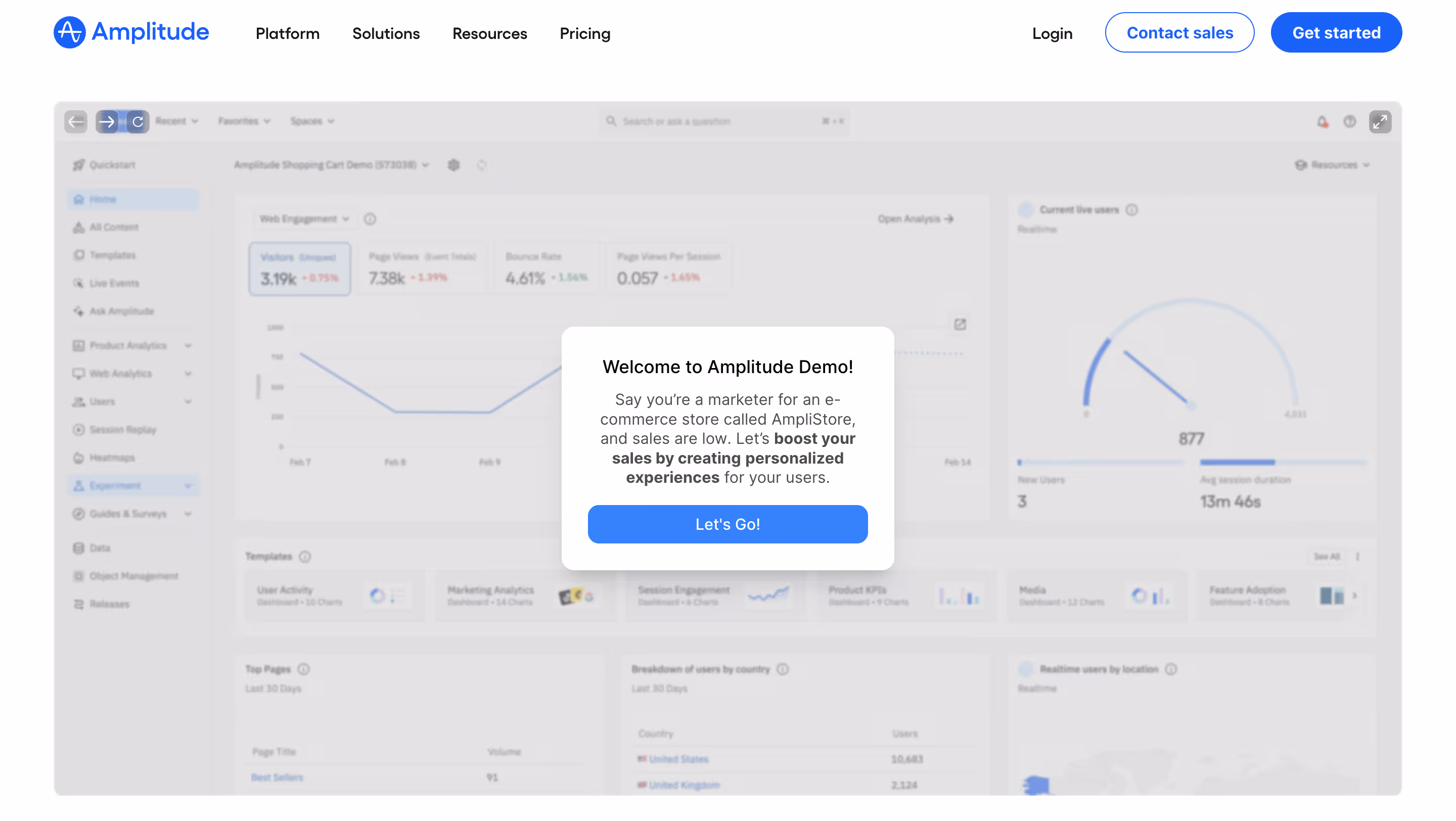
4. Immersive Product Previews
Screenshots are evolving into interactive components. Leading landing page examples now feature embedded product previews, video demos, and guided tours right in the hero section.
Users want to see how it works before signing up — this transparency builds trust.
Many SaaS such as Amplitude, Forest Admin and Zendesk use Guideflow to create their product demos.
Why Interactive Product Demo Work
- Show don’t tell: Rather than long paragraphs of text, users can see real screens, workflows, or product behavior immediately.
- Higher engagement: Interactive or motion elements invite click and scroll — extending time on page and strengthening interest.
- Instant clarity: Especially for UI-heavy products, showing core interactions conveys value in seconds.
5. AI-Assisted Messaging and Visuals
Generative design tools have made it easy to produce on-brand illustrations, icons, and even microcopy.
SaaS startups increasingly use AI-generated design assets for quick iteration and personalization.
- AI-generated headlines, copy, and CTAs
AI can help craft value propositions, headlines, and calls-to-action based on product context and user intent, making messaging clearer, more relevant, and easier to iterate without manual rewrites. - AI-generated visuals and illustrations
Instead of generic stock assets, AI can produce custom illustrations, UI mockups, or visual concepts that align with brand style and reinforce the message being communicated on the page. - AI-driven personalization
Messaging, CTAs, and visuals can adapt dynamically based on visitor behavior, traffic source, or persona, allowing each user to see a version of the page that feels more relevant to their needs.
6. Split-Screen Layouts for Clear Comparisons
Split layouts — where text and visuals share equal weight — are trending again, particularly for B2B SaaS.
They offer great balance for storytelling and performance highlights.
How to Use Split-Screen Comparisons
- Problem vs Solution: show on one side the user’s problem (pain points, chaos, inefficiency), and next to it your product solution (clean UI, clarity, results)
- Two User Personas or Use Cases: Split screens are often used to speak to different audiences at the same time (teams vs individuals, developers vs marketers, SMBs vs enterprises...)
- Before / After Product Comparison: a split layout can show a before (spreadsheets, manual work, messy workflows) and an after (product UI, automation, clean dashboards). It's even better if it's animated or interactive (drag slider).
- Feature or Plan Comparison: that's the most common use-case.

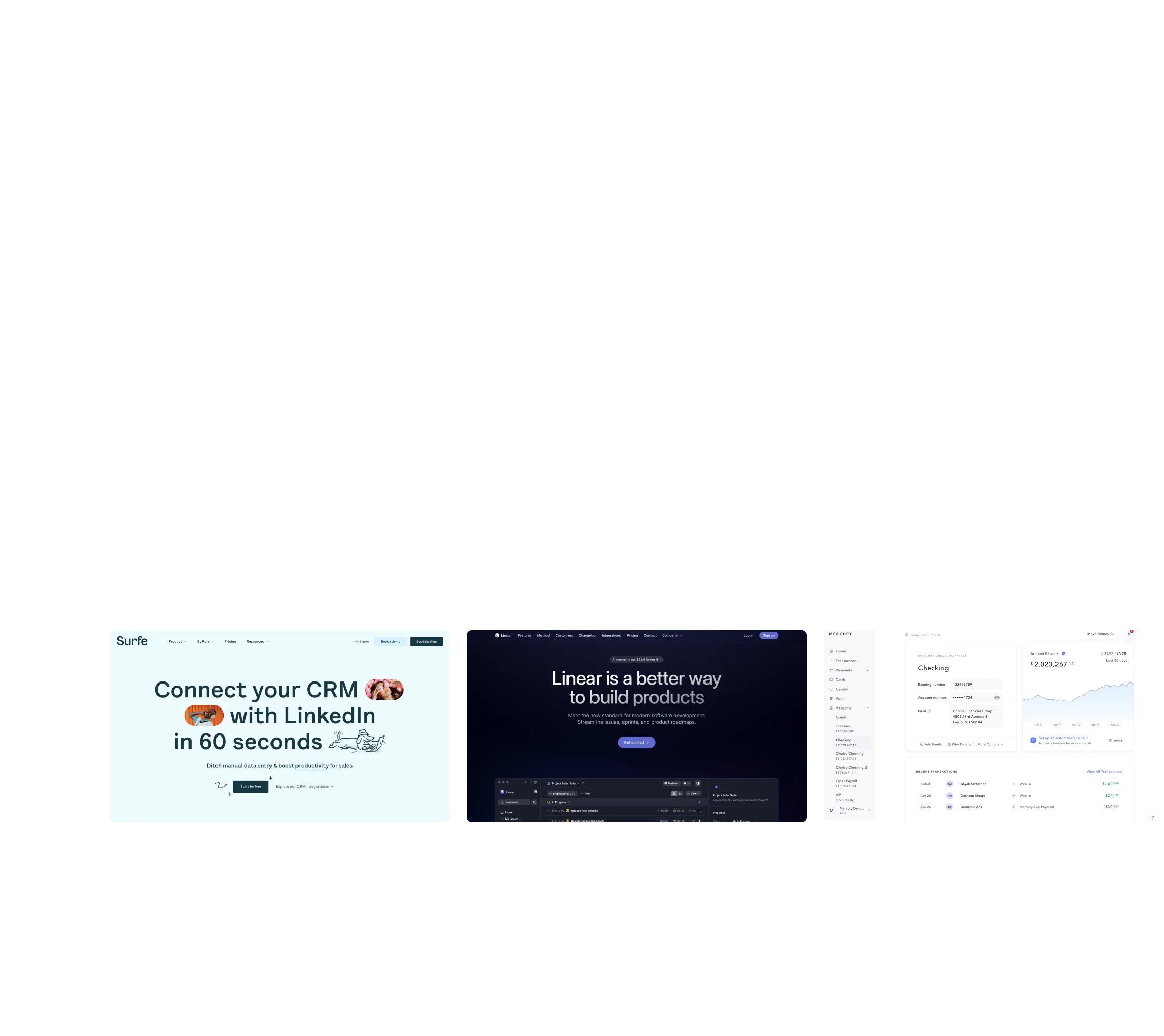
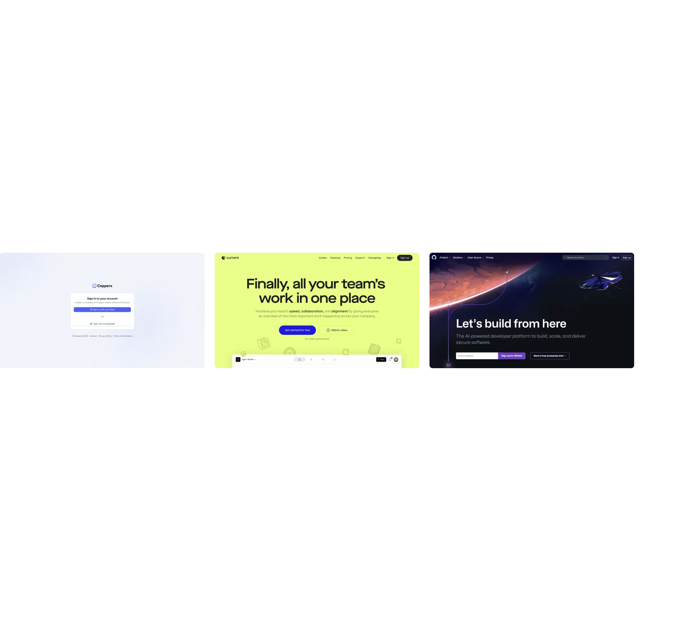
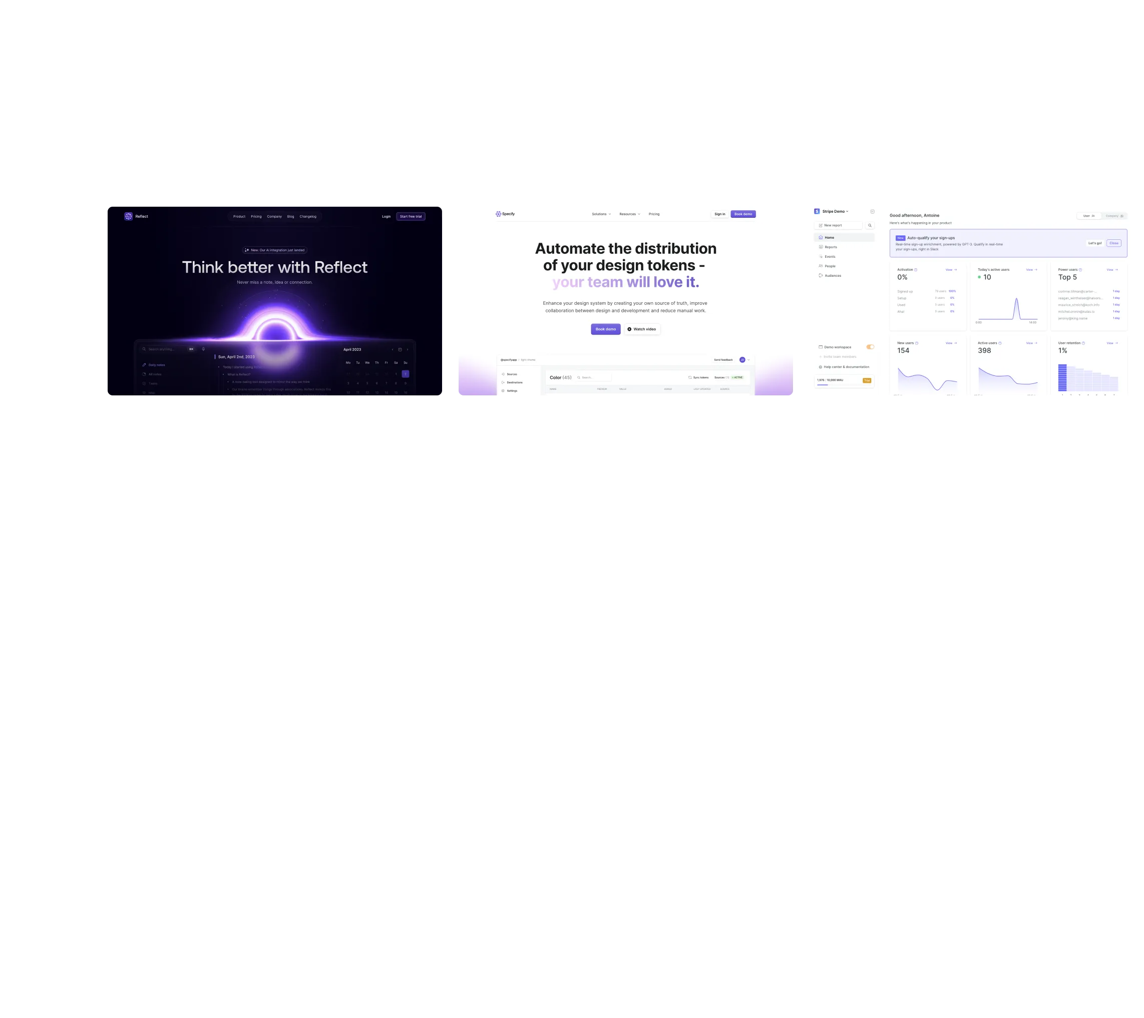
7. Real Customer Contexts Over Abstract Illustrations
We’re seeing a shift away from abstract 3D shapes toward real customer scenarios and screenshots.
Brands are humanizing their visuals — making SaaS more tangible.
Instead of using flat abstract illustrations, you can implement on your website:
- Real interface visuals (screenshots/video) instead of whimsical or abstract illustrations
- Examples or demos showing how the product is used
- Actual workflows paired with copy describing benefits in user terms

8. Conversion-Optimized Navigation
Fewer links, clearer CTAs, and smart sticky headers are common in this year’s landing page examples.
Navigation is now treated as part of the conversion funnel, not just a directory.
Small design decisions — like persistent “Try Free” buttons — can have major impact on engagement.
Here's what to keep in mind to make navigation more conversion-optimized:
- Make your primary CTA sticky and always visible
- Use simple, action-focused labels (e.g., “Schedule a demo”, “Try for free”)
- Reduce extraneous links on landing pages to minimize distraction
- Follow a logical information flow so users find what they need on their way to converting
- Use anchor links to guide users directly to key sections (like pricing or examples) without navigating away
9. Modular Layout Systems
Design teams are increasingly building with reusable components. Modular grids allow faster updates and consistent branding across all touchpoints.
For startups iterating fast, this trend means visual scalability without sacrificing creativity.
10. Playful Typography and Color Systems
Bold serif headlines, gradient overlays, and expressive color palettes are back.
2025’s SaaS websites aren’t afraid of personality — they’re vibrant, confident, and memorable.
These SaaS design trends reflect a shift toward emotional connection and brand differentiation.
🌐 Wrap-Up: What This Means for SaaS Design in 2026
The next generation of SaaS design is about clarity + personality. Landing pages are becoming richer, faster, and more immersive — without losing focus on usability.
If you’re designing your next SaaS landing page, take inspiration from the best in the industry.
You can find hundreds of curated landing page examples, onboarding flows, and pricing pages on SaaSFrame.io.