Generate a new design based on this screen using your own content.
Thank you! Your submission has been received!
Oops! Something went wrong while submitting the form.
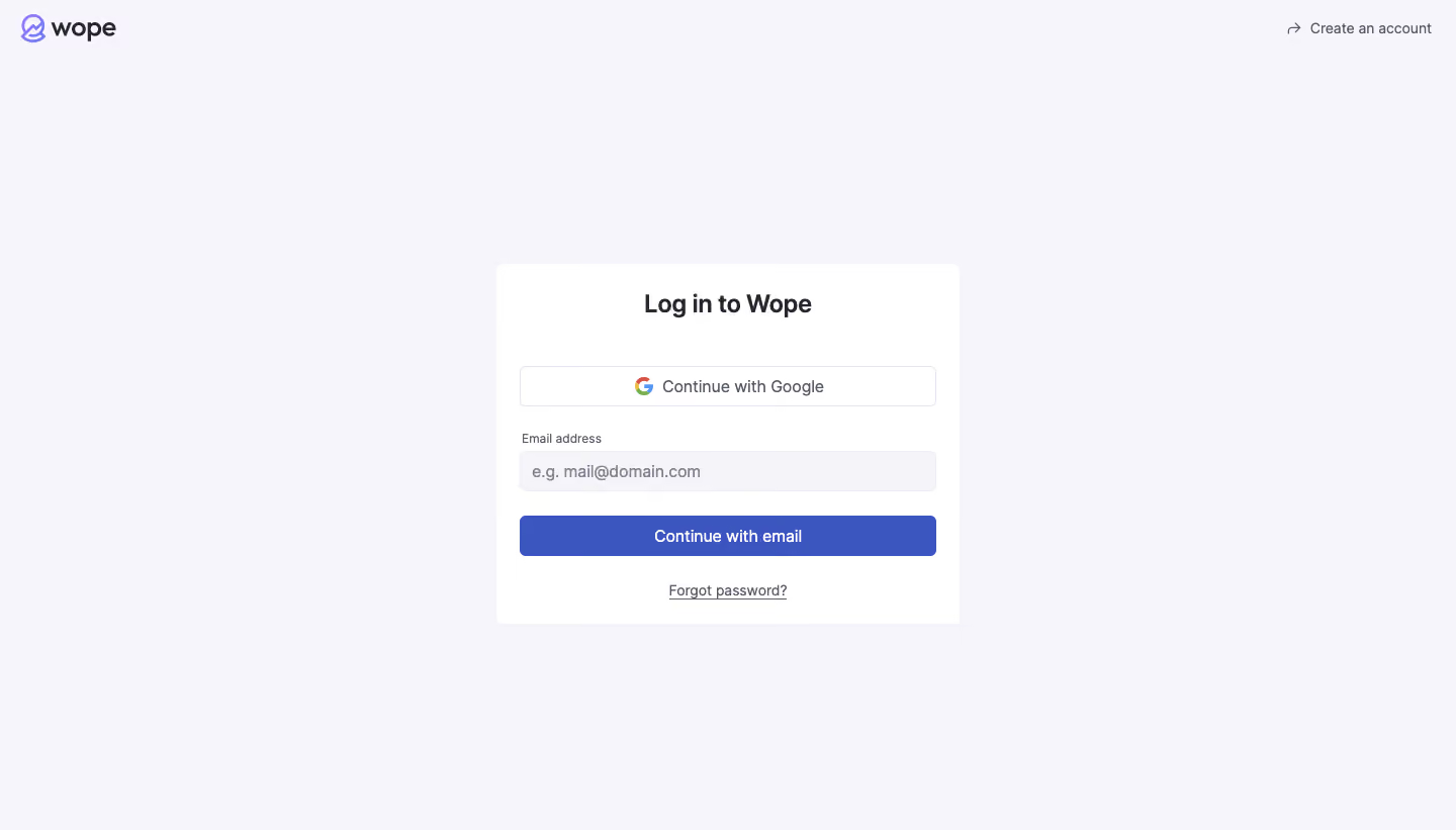
# Design from Reference: Wope Login Page
Create an original, high-fidelity visual design inspired by the reference. Prioritize composition, typography, colors, spacing, and component styling over technical implementation.
## Reference
- **Product:** Wope
- **Category:** Login
- **Screenshot:** https://cdn.prod.website-files.com/5e9dc792e1210c5325f7ebbc/6acbbd133b6b24eada5489a8_6acbbc4ef9eac5af754314db_cms-c04dfeda70b3266df0e11941.webp
Analyze the screenshot first. If inaccessible, request it rather than guessing.
## Content
{{content.instructions}}
{{content.data}}
Preserve essential messaging and factual accuracy. Adapt structure and copy length for visual balance; never invent product claims.
## Visual Design
Use this context to reproduce the reference's visual language: layout, typography, colors, spacing, borders, radii, and distinctive elements. The screenshot takes priority if descriptions conflict.
## Direction
{{preferences.fidelityInstructions}}
## Output
{{output.instructions}}
Deliver a polished, cohesive design with precise alignment, hierarchy, and spacing. Produce the requested visual artifact, not just a description. If unsupported, explain the limitation.
Wope’s login page epitomizes minimalist SaaS design. The interface is refreshingly clean, with abundant whitespace and subtle shadows that let essential elements stand out without distraction. The look is undeniably modern and professional, fostering a sense of trust and focus perfect for productivity-minded users.
Layout and Structure
The structure centers attention immediately on the login form, positioned prominently within a compact container. There are no unnecessary sections—no banners or footers to distract—making the page single-minded in its purpose. A crisp “Create Account” link and unobtrusive password recovery option round out the layout, elegantly guiding user flow.
Visual Elements
Visual minimalism reigns: the only visual embellishments are a subtle logo in soft hues and a gentle background pattern that adds depth without competing for attention. There are no stock images, splashy illustrations, or videos, infusing the experience with clarity and intentionality.
Color Palette and Typography
The color scheme balances soft off-whites with a signature accent color (a bright teal blue for key actions), enhancing readability and visual hierarchy. Typography is streamlined: headings and fields use a friendly, geometric sans-serif font, with decisive weight and spacing that guide the eye effortlessly from field to CTA.
User Experience Patterns
Navigation is direct and immediate: the login form is front-and-center, with logical tab order and accessible labeling. The primary CTA button is boldly styled for instant recognition, while secondary actions remain visible but unobtrusive. Clear feedback on interaction completes a frictionless login experience.
Unique or Notable Design Choices
Wope’s decision to eliminate clutter and embrace radical simplicity is the standout element. The seamless focus, use of calming colors, and intentional spacing evoke trust and confidence—an excellent reference point for SaaS designers seeking clarity, elegance, and user-centered design.