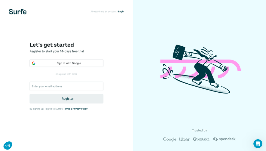
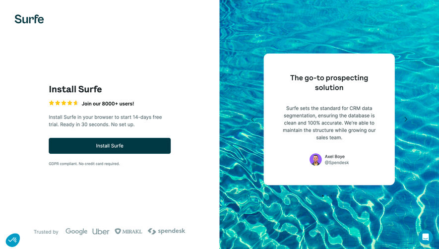
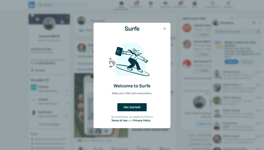
Surfe’s Salesforce Leads Guide page exudes a polished, modern professionalism with a clear SaaS sensibility. The minimalist design leverages white space to let content breathe, while thoughtfully placed accent colors inject energy without overwhelming the viewer. The overall effect is welcoming yet authoritative—a perfect match for B2B audiences seeking both clarity and innovation. ###
Layout and Structure
The page opens with a clean hero section: a bold headline, concise supporting text, and a prominent call-to-action. Below, content is thoughtfully sectioned, using generous padding and clear typographic hierarchy to guide the reader seamlessly from introduction to deeper explanations, tips, and actionable guides. Sticky navigation and linked section headers make exploration effortless, while subtle divider lines create visual separation without clutter. ###
Visual Elements
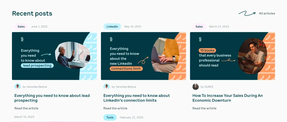
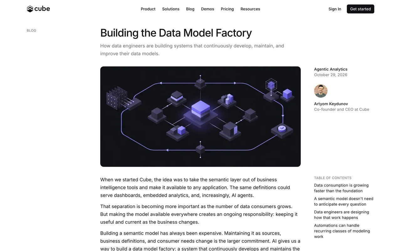
Illustrations and branded icons feature consistently, adding visual interest and aiding user comprehension. The imagery strikes a perfect balance—professional but friendly. Subtle microinteractions, like hover effects on buttons and links, create a tactile, engaging experience. No distracting animations; instead, illustrations and icons reinforce key points with precision. ###
Color Palette and Typography
A clean, tech-forward palette dominates: crisp white backgrounds, charcoal headlines, and distinctive blue and green accents that reflect trust and vitality. Typography follows a logical scale, pairing a geometric sans-serif for headlines with a highly readable body font. Bold text and colored highlights direct attention to key actions and insights throughout. ###
User Experience Patterns & Notable Choices
Navigation is effortlessly intuitive, with clear sticky menus and contextual CTAs. The absence of intrusive pop-ups keeps the focus on content, while anchor-linked headings facilitate smooth, in-page navigation—ideal for long-form guides. Above all, the page’s clarity, strong visual hierarchy, and judicious use of branded graphics showcase a thoughtful, user-centric approach to SaaS web design.
 SaaSFrame