Generate a new design based on this screen using your own content.
Thank you! Your submission has been received!
Oops! Something went wrong while submitting the form.
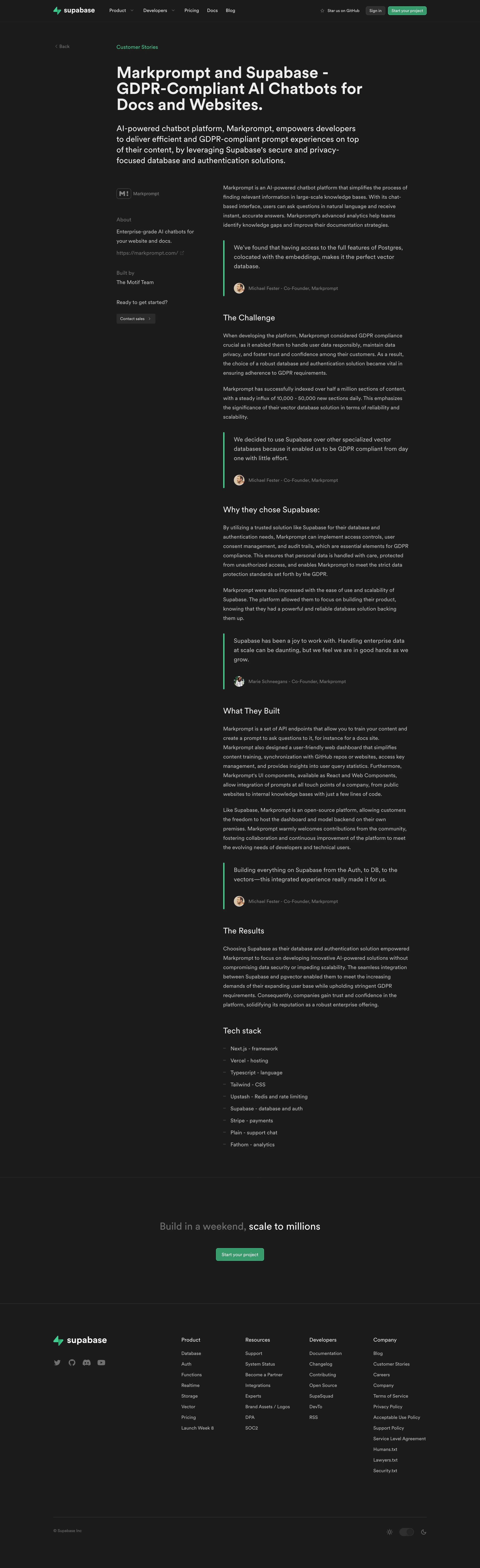
# Design from Reference: Supabase Customer Stories
Create an original, high-fidelity visual design inspired by the reference. Prioritize composition, typography, colors, spacing, and component styling over technical implementation.
## Reference
- **Product:** Supabase
- **Category:** Customer Stories
- **Screenshot:** https://cdn.prod.website-files.com/5e9dc792e1210c5325f7ebbc/6acadcb48c9a73ab05f131a5_6acadc120a7a70fbdd8f2c0d_cms-78010cf607582e7d8f7fa82e.webp
Analyze the screenshot first. If inaccessible, request it rather than guessing.
## Content
{{content.instructions}}
{{content.data}}
Preserve essential messaging and factual accuracy. Adapt structure and copy length for visual balance; never invent product claims.
## Visual Design
Use this context to reproduce the reference's visual language: layout, typography, colors, spacing, borders, radii, and distinctive elements. The screenshot takes priority if descriptions conflict.
## Direction
{{preferences.fidelityInstructions}}
## Output
{{output.instructions}}
Deliver a polished, cohesive design with precise alignment, hierarchy, and spacing. Produce the requested visual artifact, not just a description. If unsupported, explain the limitation.
Supabase’s Markprompt customer page epitomizes a minimalist yet modern SaaS aesthetic. The visual language is clean and uncluttered, balancing generous white space with sharp, professional edges. The mood exudes trustworthiness and innovation, achieved through understated design and strategic content placement.
Layout and Structure
Content unfolds in a clear, digestible hierarchy: a hero section featuring the customer logo and summary, followed by succinct, well-organized case study content. Sidebars and blocks call out technical stacks and benefits, while clever whitespace ensures each section feels self-contained yet interconnected. The page avoids information overload by placing emphasis on key insights and real-world results.
Visual Elements
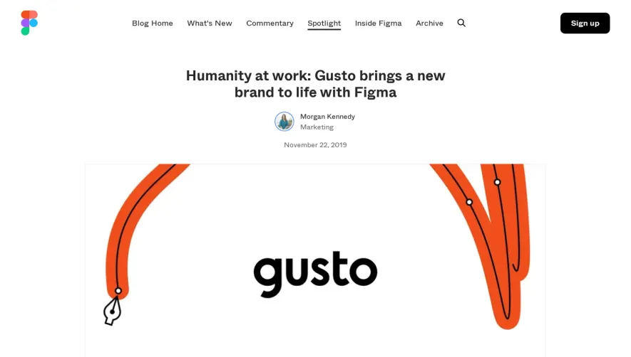
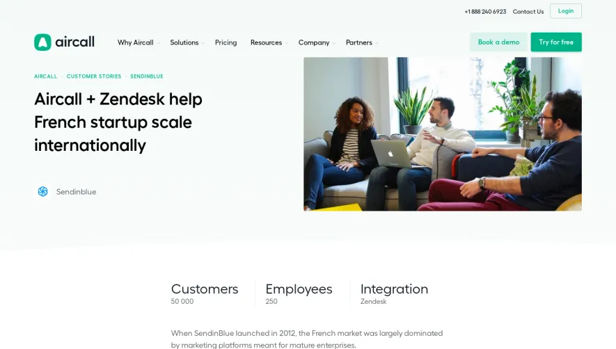
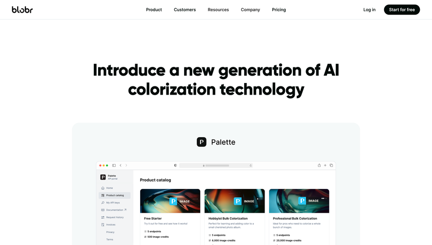
Visual storytelling thrives through a blend of subtle micro-animations and generously-sized imagery. Real product screenshots are used within crisp frames, creating tangibility. Custom illustration accents and branded icons add vibrancy without overwhelming. The hero’s use of photography and logos provides instant context and connection.
Color Palette and Typography
A sophisticated palette—anchored in deep navy, charcoal, and crisp white—accentuates moments of vibrant brand color (greens and blues) in CTAs and highlights. Typography is highly legible and modern: bold sans-serif headlines draw the eye, while lighter body text ensures effortless reading, with clear hierarchy guiding the visitor’s journey.
User Experience Patterns
Navigation is frictionless with a consistent top bar, breadcrumb-like page context, and anchor links for effortless scanning. CTAs are direct and visually pronounced, encouraging engagement without interrupting the narrative. Smooth scroll animations and responsive layouts deliver a polished, device-agnostic experience.
Unique or Notable Design Choices
The integration of real product workflows and customer impact metrics within isolated blocks helps humanize the tech story. Subtle hover states and gentle transitions inject dynamism, while thoughtfully placed logos and accolades amplify credibility. The tone throughout is both aspirational and grounded, projecting a sense of innovative reliability.