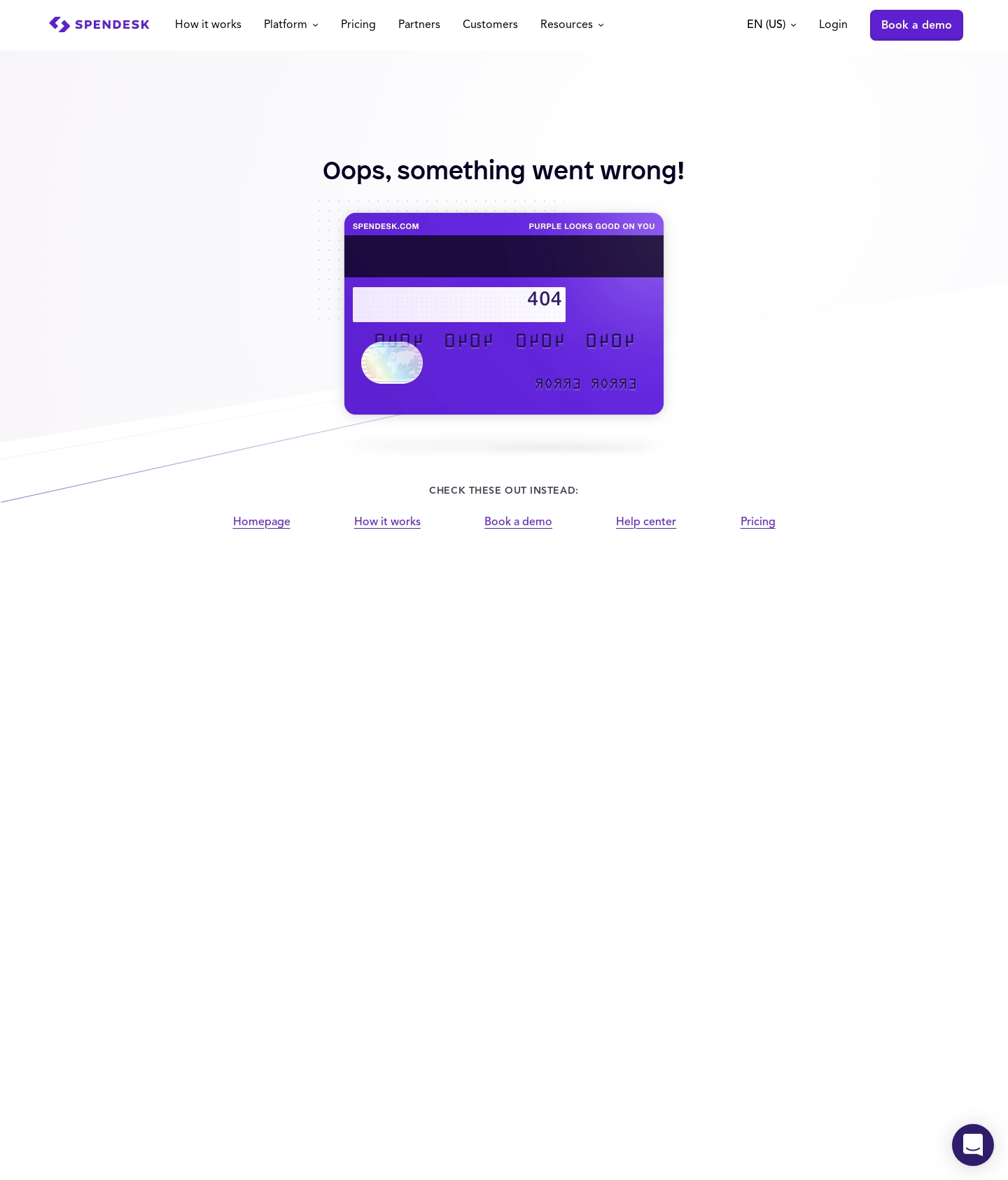
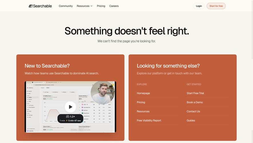
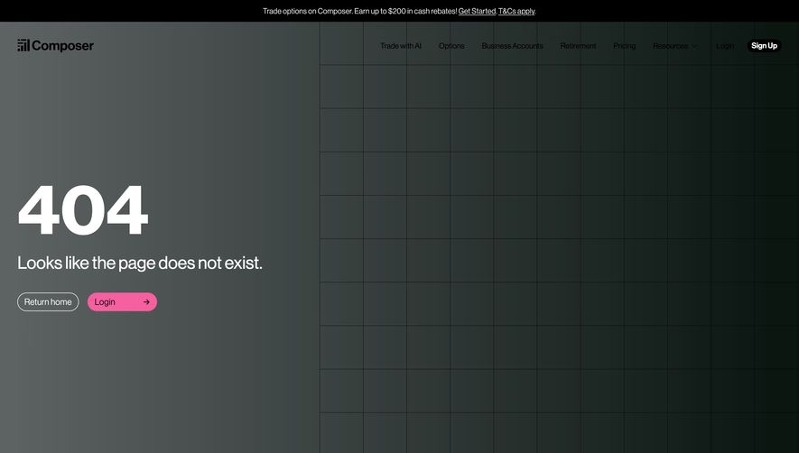
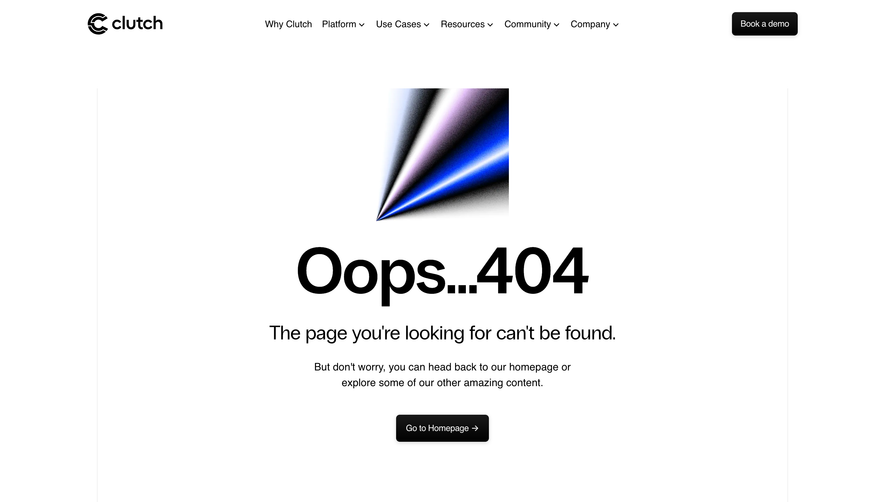
Spendesk’s 404 page immediately radiates a playful yet polished energy—a modern fusion of tech professionalism and whimsy. The vibe is engaging and approachable, with balanced use of white space that signals contemporary minimalism, while the core illustration anchors the page in personality and brand warmth.
Layout and Structure
The page structure is direct and user-centric: a prominent hero section takes center stage, keeping the focus on the error message and delightful illustration. Beneath, a clear call-to-action (“Back to home”) guides users intuitively, with no visual clutter or distraction. There are no extraneous sections (like features, testimonials, or pricing) to complicate the journey.
Visual Elements
A standout, custom illustration—an animated astronaut drifting in space—captures imagination and gently eases the disruption of landing on a 404. The character’s subtle movement adds energy without overwhelming. Minimal icons and no photography keep the user focused, enhancing the “lost in space” metaphor.
Color Palette and Typography
Soft pastel purples and blues blend into a calming, tech-forward background, reflecting the brand’s identity and fostering trust. Typography is bold and clear: a large, sans-serif “404” asserts hierarchy, while friendly, conversational microcopy underneath breaks the tension and adds personality.
User Experience Patterns
Navigation is efficient, thanks to a sizable button that routes users immediately back to the homepage. The absence of secondary links or dense menus eliminates confusion—ideal for a recovery page. Subtle animated cues invite interaction, keeping users feeling engaged and not stranded.
Unique or Notable Design Choices
What truly sets this design apart is its empathetic, light-hearted approach to error handling. The animation, playful tone, and branded color scheme seamlessly reinforce Spendesk’s innovative reputation, ensuring the experience—even as a detour—remains positive and on-brand.
 SaaSFrame