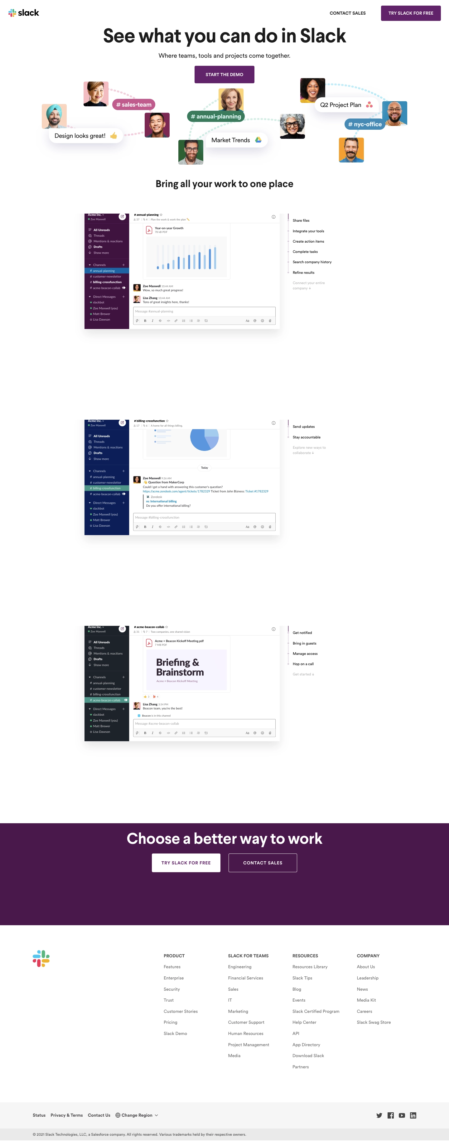
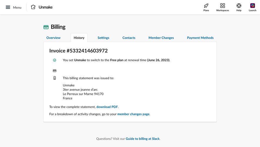
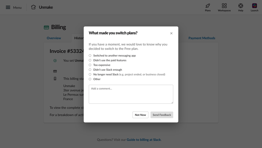
Slackdemo.com exemplifies a modern, minimalist approach, blending playfulness with professionalism. The interface radiates energy and approachability, empowered by bold colors and subtle gradients. Clean lines and generous white space make every element feel purposeful, while dynamic flourishes—like animated transitions and interactive components—inject liveliness into the page.
Layout and Structure
The layout unfolds in a focused, scroll-driven narrative. The hero section seizes attention with a bold headline, concise explanatory text, and a prominent call-to-action. Directly below, a horizontal features walkthrough uses interactive tabs to demonstrate Slack's value clearly, eliminating overwhelming information dumps. There are no superfluous testimonials or pricing sections—the single-minded structure streamlines user attention toward trying the demo experience. The sticky header ensures navigation remains accessible.
Visual Elements
Standout visual choices include tailored product mockups encased in floating, shadowed cards that provide depth and context. Gentle animations guide user eye movement, while crisp icons and interface schemas reinforce clarity and understanding. Absence of stock photography keeps focus on the product interface, promoting authenticity.
Color Palette and Typography
Slack’s signature palette dominates: deep purples, vibrant greens, and flashes of magenta, paired with clean, neutral backgrounds for visual pop. The typography uses a sans-serif family—a likely derivative of Slack’s brand font—which balances friendliness and utility. Clear font hierarchy ensures headlines pop, with supporting copy sized perfectly for scannability.
User Experience Patterns
An intuitive sticky navigation bar, persistent CTAs, and seamless, animated section transitions create a frictionless journey. The scroll-based walkthrough, rather than static screenshots, makes the demo immersive. Conversion points stay visible but unobtrusive.
Unique or Notable Design Choices
The immersive demo-first approach is distinctive—rather than overloading with information, Slackdemo.com guides visitors step-by-step through interactive flows. This not only demonstrates functionality but builds confidence in potential users, resulting in a dynamic and memorable SaaS landing experience.
 SaaSFrame