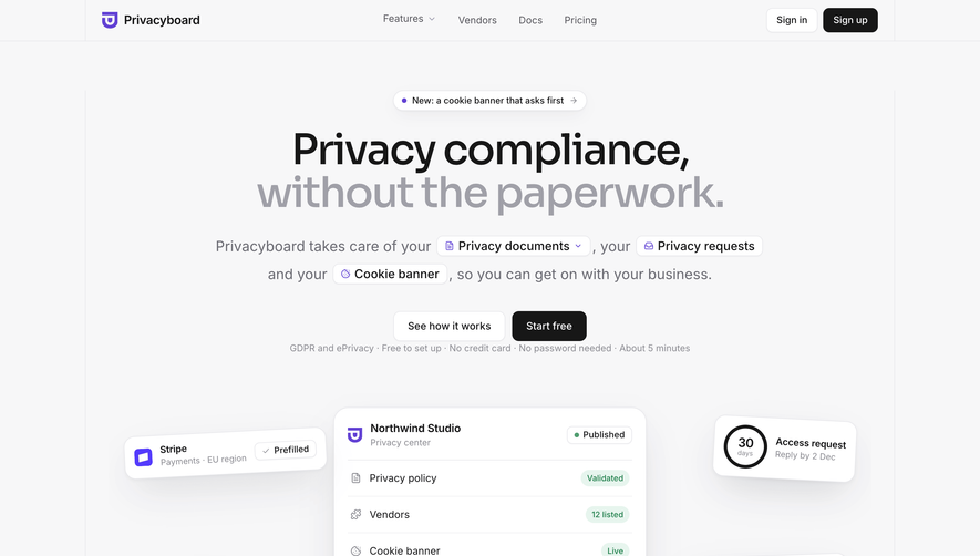
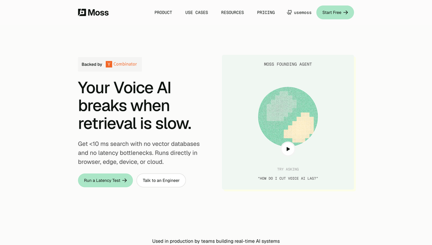
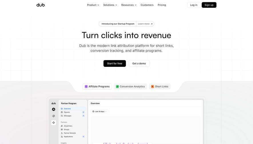
Generate a new design based on this screen, using your own content.
Preview the prompt
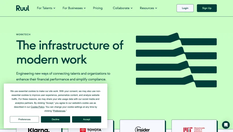
# Design from Reference: Ruul Landing Page

Create an original, high-fidelity visual design inspired by the reference. Prioritize composition, typography, colors, spacing and component styling over technical implementation.

## Reference

- **Product:** Ruul
- **Category:** Landing Page
- **Screenshot:** https://media.saasframe.io/v/c664501b3eda313cffc8-1600.webp

Analyze the screenshot first. If you can’t access it, ask me for it rather than guessing.

## Content

**Instructions:**

Generate realistic example content that fits the selected design reference.

Create appropriate headlines, descriptions, labels, buttons, and supporting copy based on the type of interface being designed.

If a product or business description is provided, use it to guide the content.

Otherwise, invent a plausible fictional SaaS product appropriate for the reference.

Keep the content concise, coherent, and visually balanced.

Do not present fictional statistics, customer names, or testimonials as verified facts.

Preserve essential messaging and factual accuracy. Adapt structure and copy length for visual balance; never invent product claims.

## Visual design

Use this context to reproduce the reference’s visual language: layout, typography, colors, spacing, borders, radii and distinctive elements. The screenshot takes priority if descriptions conflict.

### Overall aesthetic

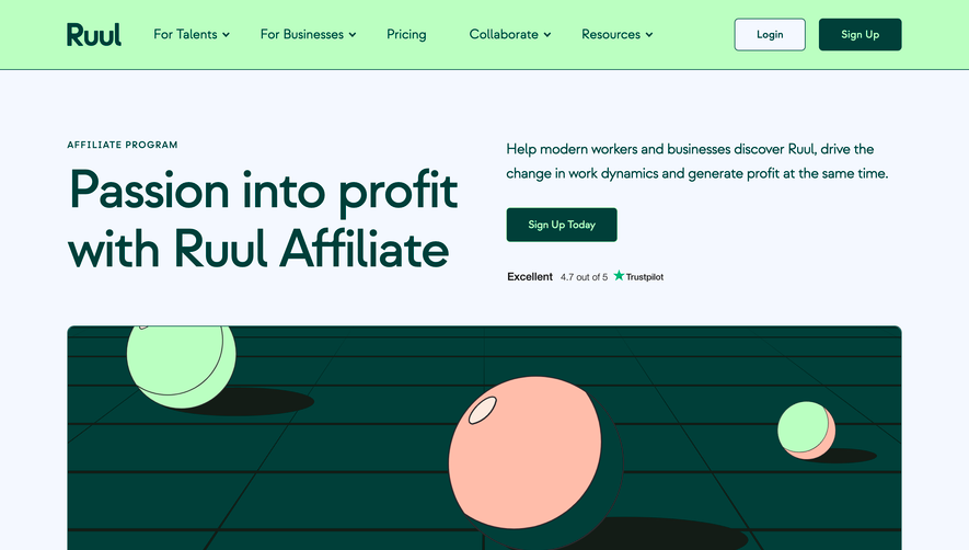
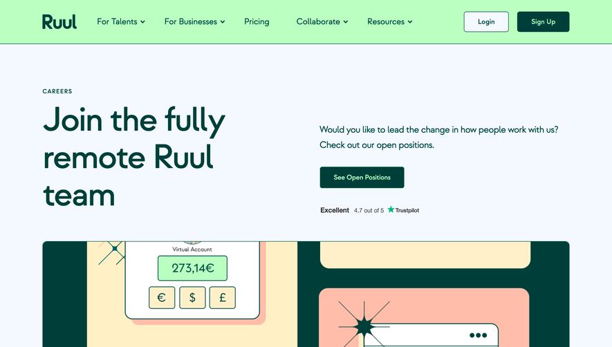
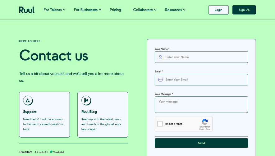
- **Character:** Expressive financial-services marketing with mint surfaces, deep teal outlines, geometric typography, and isometric illustrations.

### Page composition

- **Canvas:** 2880 × 21944 screenshot pixels. Long page moves from split hero and logo tiles through an AOR explanation, audience cards, four solution rows, FAQ, testimonials, closing CTA, editorial/newsletter area, and a multi-column footer.

### Information hierarchy

- **Sequence:** Oversized hero establishes the proposition; paired talent/business actions segment visitors. Alternating solution rows explain capabilities before proof, questions, and the closing conversion section.

### Typography

- **Scale:** Estimated CSS at an assumed 2× capture: hero around 80 px, section headings 72 px, card headings 48 px, body 20–22 px, uppercase tracked eyebrows 14 px. Rounded geometric sans serif family unverified.

### Colors & surfaces

- **Palette:** Sampled sRGB deep teal #003E39, mint #C9FDC6 and #C9FEC6, cream #FDEECA, pale blue-white #F5F8FE, and near-white #F7F8FF. Teal sections invert text to light tones.

### Components

- **Construction:** Estimated CSS content width 1240 px, outer padding about 100 px, column gaps 48 px, and corners 6–8 px.
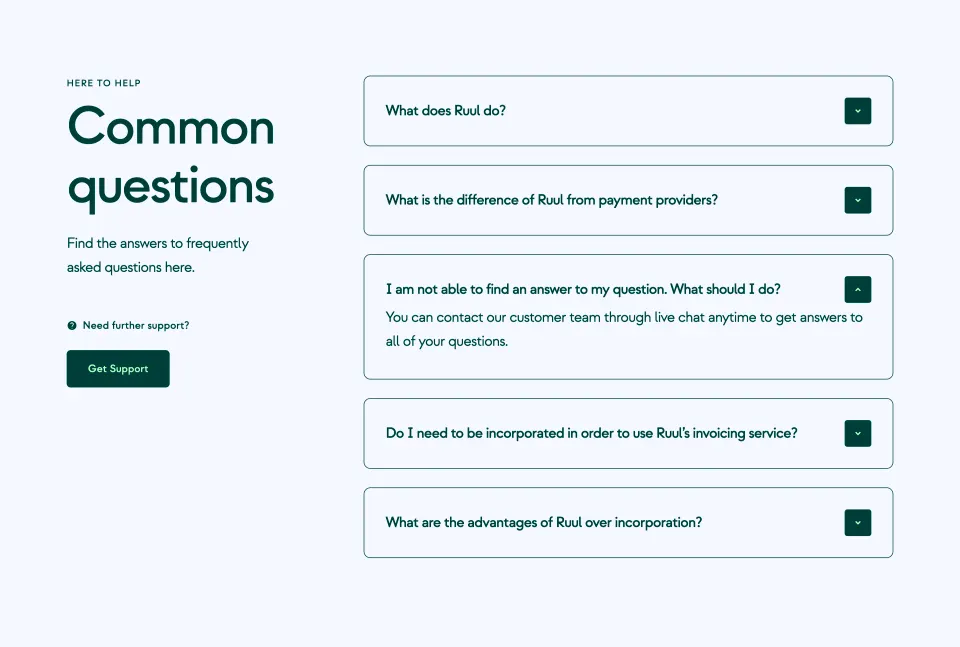
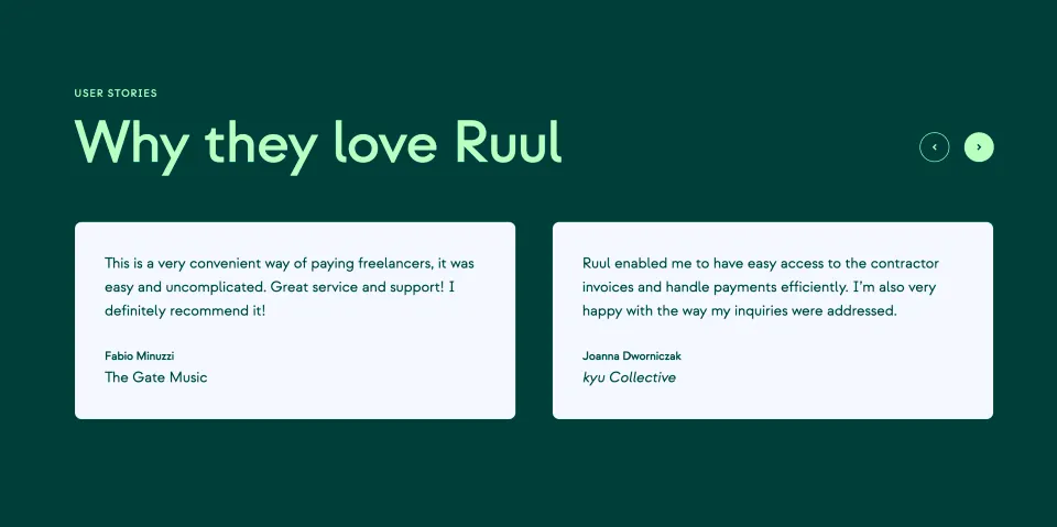
- **Details:** Thin teal borders, roughly 6 px hard offset shadows on logo tiles, paired 50 px actions, outlined FAQ accordions, testimonial cards with arrows, and mint circular social controls.

### Visual rhythm

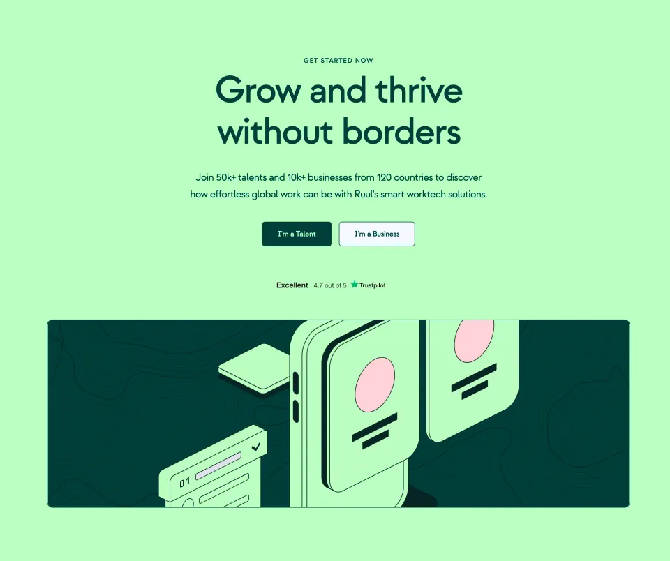
- **Pacing:** Large color-block changes alternate with airy explanatory sections. Mint isometric drawings and abstract bent teal strips balance large text; a photographic editorial feature changes the closing rhythm.

### Responsive

- **Adaptation:** Mobile is not shown. Stack split sections and solution rows, scale headings to 36–48 px, and wrap audience actions while retaining alternating surface colors.

### Adaptation guidance

- **Transfer:** Preserve teal/mint contrast, thin outlined illustration language, paired audience paths, and generous section spacing. Replace financial claims and feature availability with verified content.

## Direction

**Instructions:**

Use the reference screenshot as the main source of visual inspiration rather than a strict layout template.

Preserve its most distinctive design characteristics, such as typography, visual rhythm, color relationships, component treatments, and overall aesthetic.

Feel free to modify section arrangements, proportions, spacing, and individual components to better suit my content.

Introduce original design decisions where they improve usability, composition, or brand consistency.

The result should clearly reflect the reference's visual language without looking like a direct reproduction.

## Output

**Instructions:**

Generate a high-fidelity visual mockup of the requested interface.

Present the design as a polished, realistic website or product UI screenshot.

Prioritize visual composition, typography, spacing, colors, alignment, and component details.

Use the available image-generation or visual-design capabilities.

Do not replace the mockup with source code, a written design specification, or a textual description.

If direct visual generation is unavailable, clearly explain the limitation.

Deliver a polished, cohesive design with precise alignment, hierarchy and spacing. Produce the requested visual artifact, not just a description. If unsupported, explain the limitation.
 SaaSFrame