Overall Style and Aesthetic
Routine’s pricing page embodies a calm, minimalist ethos with a modern twist. The design leverages abundant white space, allowing each content block to breathe and commands attention without feeling overwhelming. Pops of accent color and understated line icons exude both professionalism and approachability—striking a balance between inviting and purposeful. Layout and Structure
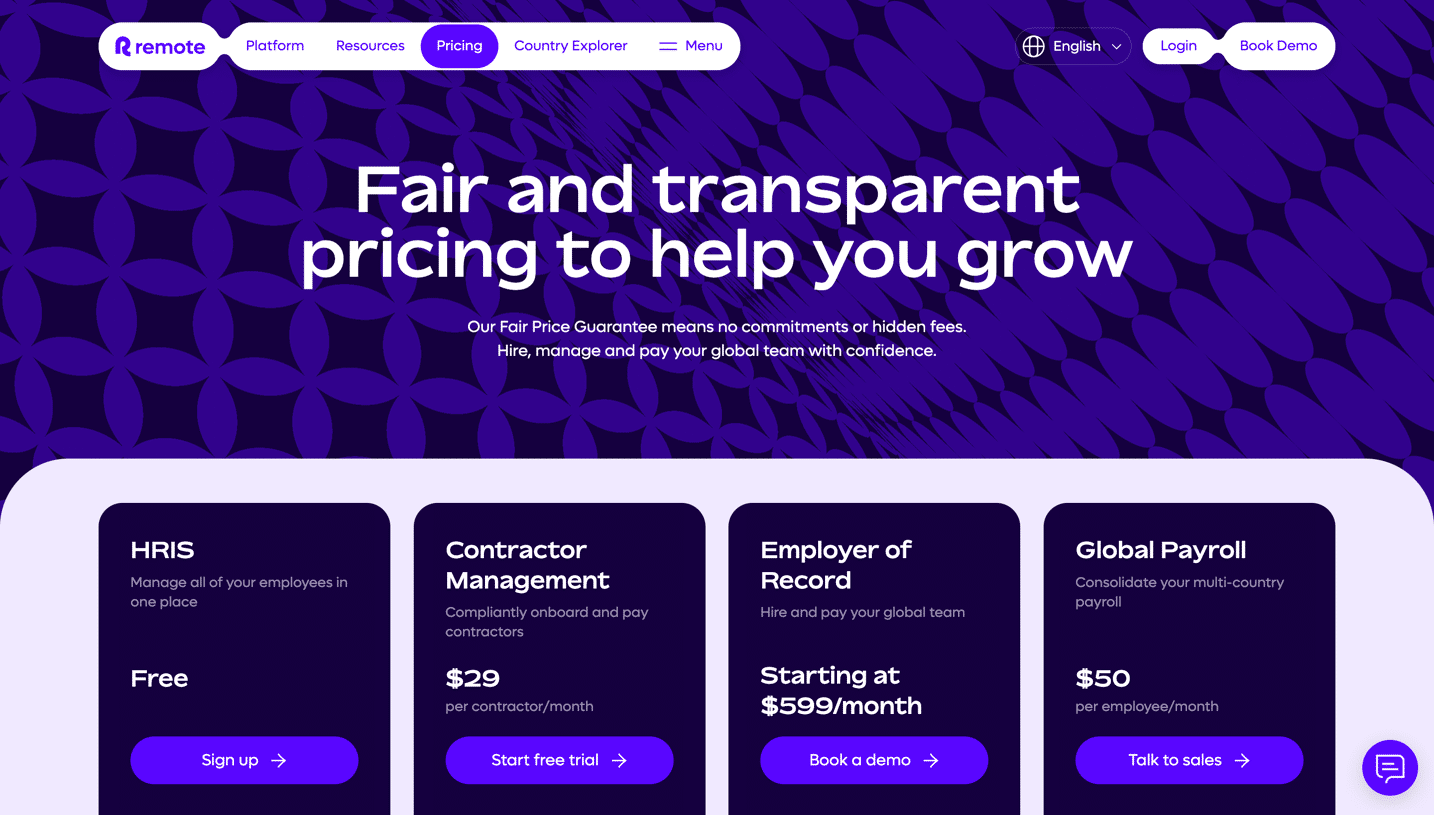
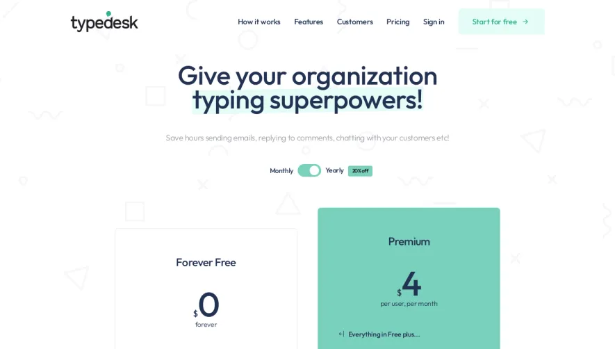
The page opens with a concise hero statement and elegant headline immediately setting expectations. Pricing tiers are laid out horizontally in card format, each with clear segmentation and subtle elevation to suggest interactivity. Feature lists are succinctly organized under each plan, improving comparability. Essential support content (FAQ, support details) is efficiently tiered below, while the footer neatly presents secondary links and discrete company branding. Visual Elements
Distinctive icons, gentle background gradients, and refined line styles distinguish visual cues. There are no heavy-handed animations—instead, microinteractions like subtle hover effects, card shadows, and gentle transitions enhance engagement without distraction. The design eschews generic stock photography, opting instead for purpose-designed illustrations evocative of productivity and calm focus. Color Palette and Typography
Routine leverages a contemporary palette: clean whites, muted grays, and soft blues, with highlights in energizing violet. Sans-serif typography prevails, blending legibility with warmth. Hierarchy is thoughtfully engineered: attention flows naturally from bolder headings to plan-specific features, with ample spacing maintaining clarity. User Experience Patterns
Navigation is streamlined—a sticky header provides persistent access to main site areas. Primary CTAs (like “Start for free”) are prominent, employing high-contrast background fills. The pricing cards themselves invite exploration, making plan selection frictionless. Essential information like features, limitations, and support are easy to scan, ensuring rapid comprehension. Unique or Notable Design Choices
Notably, Routine’s design resists clutter, relying on purposeful whitespace and understated animation to feel both premium and serene. The overall tone projects trustworthiness and forward-thinking utility, reinforcing SaaS credibility while subtly encouraging conversion.