Overall Style and Aesthetic
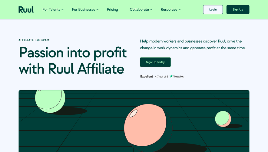
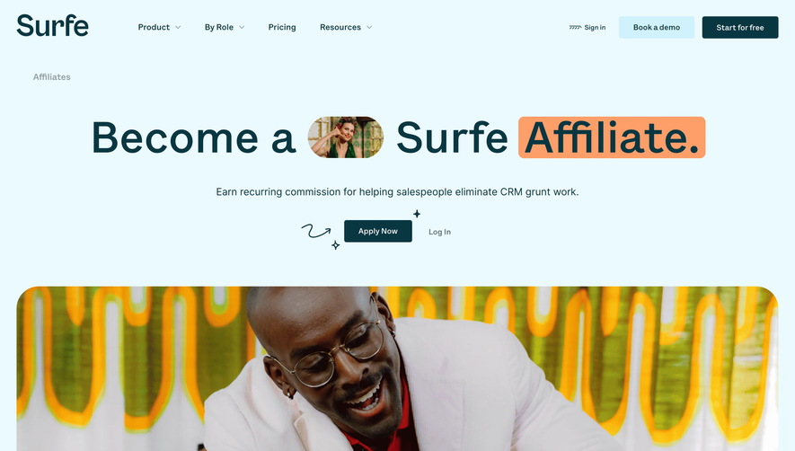
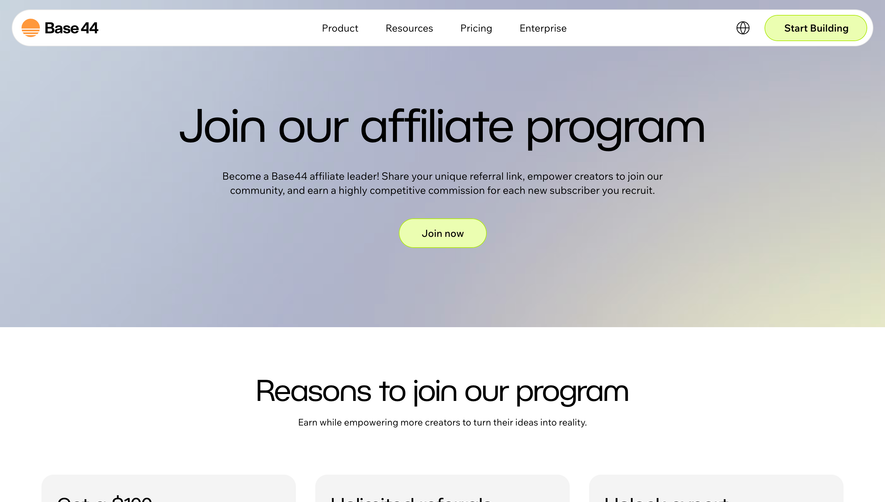
Remote’s Affiliate Partners page exemplifies modern professionalism with a clean, minimalist approach. The design leans on generous white space, subtle gradients, and crisp edges, projecting trust and competence while still feeling approachable. The mood is subtly energetic, balancing a sense of reliability with a forward-thinking attitude ideal for global tech audiences. Layout and Structure
The page opens with a compelling hero section: bold typography, a concise value proposition, and a distinct call-to-action, immediately guiding visitor attention. Scrolling reveals well-spaced content blocks alternating between benefits, program highlights, and a FAQ. There are no distracting complexities—each section flows logically, prioritizing clarity and conversion. The footer is comprehensive yet unobtrusive, consolidating essential links and company details. Visual Elements
Custom illustrations replace stock imagery, lending personality and visual cohesion. Abstract, vector-based graphics echo the brand’s global reach and technological focus. Simple icons support clarity, while carefully animated transitions (e.g., button hover states, card fades) provide a subtly dynamic experience without overwhelming the user. Color Palette and Typography
A dominant crisp blue anchors the interface, punctuated by gradients and muted secondary hues in illustrations. Typography pairs a bold sans-serif for headlines with legible body fonts, employing consistent size hierarchy for effortless scanning. Calls-to-action stand out through intentional color contrasts. User Experience Patterns
Navigation is frictionless, with a sticky top bar and a prominent CTA always within reach. In-page anchors and logical progression minimize scrolling fatigue. The affiliate sign-up form is streamlined for ease and visual clarity, greatly reducing cognitive load. Subtle micro-interactions further guide the user. Unique or Notable Design Choices
What stands out is the page's confident sparseness—every pixel feels deliberate. The visual storytelling, enhanced by minimal yet meaningful animation, conveys a global, innovative spirit. Overall, the tone is robustly trustworthy and encouraging, inspiring confidence in both product and partnership.