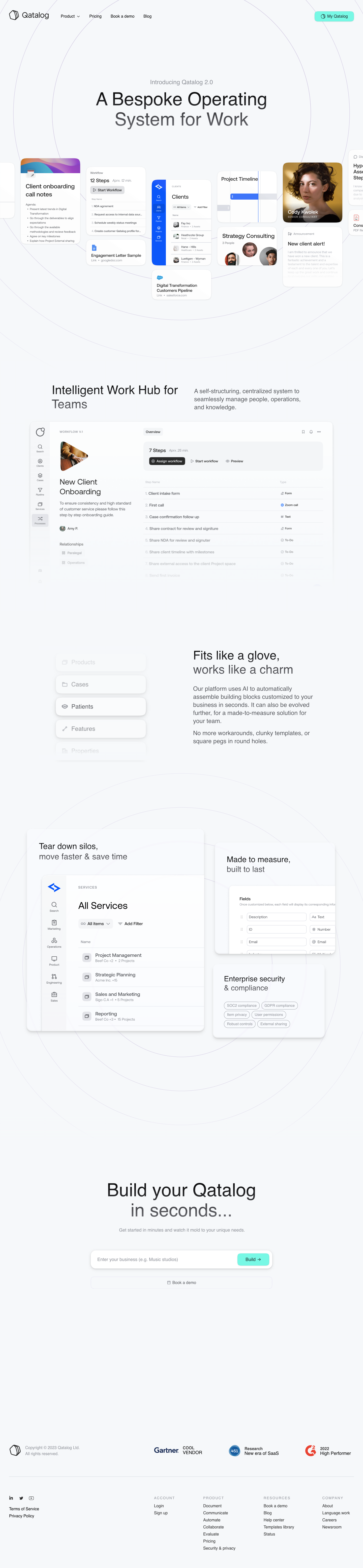
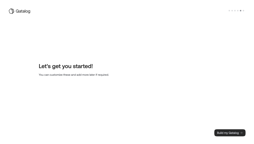
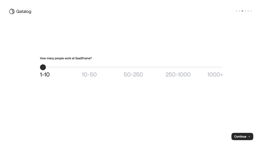
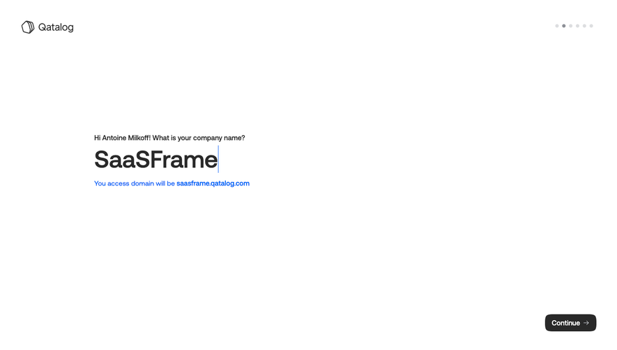
Qatalog’s homepage exudes a polished, ultra-modern sensibility grounded in minimalism. Negative space dominates, letting key content breathe while subtle splashes of color and precise linework lend a quietly futuristic professionalism. The look is sleek yet welcoming, perfectly positioned between corporate reliability and inventive digital energy.
Layout and Structure
The page unfolds with a striking hero section featuring concise messaging and a prominent call to action, immediately orienting visitors. Scrolling reveals thoughtfully segmented bands: feature overviews with bold headings, customer logos, use cases, selective testimonials, and a subdued yet accessible footer. Each section flows logically, creating a pleasing visual rhythm and clear navigational journey.
Visual Elements
Qatalog leans on crafted geometric illustrations and subtle micro-animations—line-drawn graphics, shifting shapes, and refined icons—rather than stock photography. Visuals reinforce product features while keeping the interface uncluttered. Occasional animated explainers and UI previews enhance clarity without overwhelming or distracting users.
Color Palette and Typography
The palette is cool and controlled: crisp whites and soft greys anchor the page, punctuated by calming blues and touches of gradient violet for emphasis. Typography is clean and geometric, likely using sans-serif families for clarity and elegance. Headings stand out with weight and size, establishing a visual hierarchy that aids scanability.
User Experience Patterns
Navigation is sticky and crisp, with clear anchor links and a persistent CTA. Primary actions—like “Book a Demo”—are spotlighted, using bolder color treatments. Smooth scroll and hover interactions add subtle delight, while concise forms and succinct copy keep friction low.
Unique or Notable Design Choices
What sets Qatalog apart is its blend of restraint and expressiveness. Custom iconography and interactive graphics ensure a memorable, branded feel. The tone is quietly innovative—balancing gravitas with hints of playfulness, creating an inviting space for product-led founders and teams seeking trusted, future-facing solutions.
 SaaSFrame