Prompt 1,008 words Copy
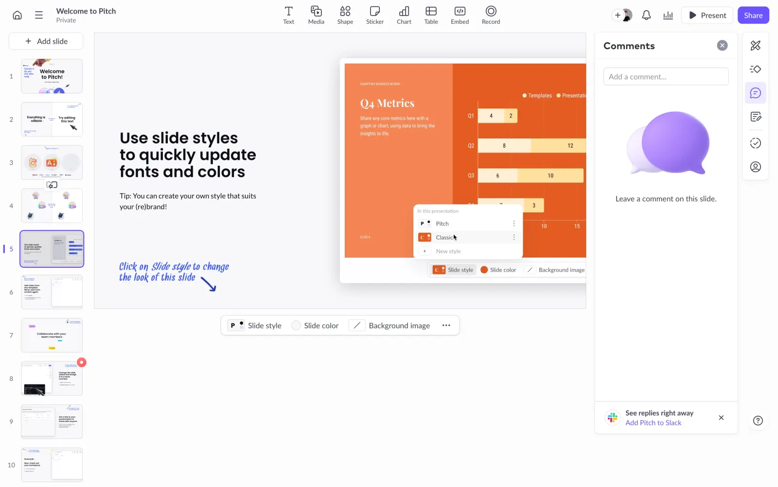
# Design from Reference: Pitch Presentation Comments Side Panel

Create an original, high-fidelity visual design inspired by the reference. Prioritize composition, typography, colors, spacing, and component styling over technical implementation.

## Reference

- **Product:** Pitch
- **Category:** Text Editor
- **Screenshot:** attached to this message (also available at https://media.saasframe.io/v/79339b102bd58c1d6a61-1600.webp)
- **Source:** https://app.pitch.com/app/presentation/601b2bad-8041-46b8-88a7-157dc2d16059/5ed45e07-209f-4a9e-ab2d-594625aefb5c/a5799083-7077-4bae-94bb-e8a26dbcf0a3

Analyze the attached screenshot first. If no image is attached, open the screenshot link; if neither is accessible, ask for it rather than guessing.

## Visual Design Context

### Overall aesthetic

- **Style:** A light presentation editor with compact icon toolbars, a thumbnail rail, central slide canvas, and an open white comments panel.
- **Character:** Precise and productivity-focused. Violet marks collaboration and selection, while the slide's orange artwork provides the strongest color.

### Page composition

- **Capture and scale:** The screenshot measures 2880 × 1804 pixels, consistent with an estimated 2× capture. Following dimensions are estimated CSS pixels under that assumption.
- **Shell:** A shallow top toolbar contains presentation identity left, insertion tools center, and collaboration/present/share controls right.
- **Workspace:** A roughly 170 px left thumbnail rail sits beside a large slide area. A roughly 265 px comments panel and narrow vertical tool strip occupy the right side.
- **Visible slide:** The selected fifth slide contains a bold instructional text block left and a large orange metrics-interface illustration right, with a handwritten blue annotation below.
- **Comments:** The panel contains heading/close, a small comment-entry field, a large violet speech-bubble illustration, empty-state sentence, and a Slack promotion at the bottom.

### Information hierarchy

- **Selection:** The fifth thumbnail uses a violet outline and small selection indicator.
- **Editing focus:** The slide content remains the main workspace, while comments are clearly separated in a white panel.
- **Collaboration:** Share is the strongest top action; the selected comments icon uses a pale violet background in the right tool strip.

### Typography

- **Family:** A neutral sans serif is visible in the editor; slide content also includes serif chart headings and a handwritten annotation. Exact families are unverified.
- **Interface:** Toolbar labels and thumbnail numbers are approximately 10–12 px CSS; panel heading around 18 px semibold.
- **Slide type:** The instructional heading is approximately 28–30 px bold with tight leading, and body copy roughly 14 px. These sizes describe the displayed slide, not necessarily its authoring coordinates.
- **Comments:** Empty-state and utility text are approximately 13–14 px.

### Colors & surfaces

- **Foundation:** Sampled sRGB #FCFCFD, #FFFFFF, and #F8F8FA define shell, comments panel, and canvas. Additional pale tones include #F8F8F9 and #F9F9FB.
- **Slide accent:** Sampled orange #FF7D44 and #F55000 dominate the embedded metrics illustration.
- **Editor accent:** Violet marks selected thumbnail, comments state, Share, and speech-bubble artwork; exact violet values are unverified.
- **Boundaries:** Thin cool-gray borders and soft shadows define panels and floating style controls.

### Components

- **Thumbnail rail:** Ten visible numbered slide previews stack vertically with consistent gaps; the active thumbnail has a bright fine outline.
- **Insertion toolbar:** Small line icons sit above labels for text, media, shapes, stickers, charts, tables, embeds, and recording.
- **Comments panel:** A rounded white panel has a fine border, top heading row, input, centered empty illustration/copy, and separated bottom integration prompt.
- **Style toolbar:** A small floating rounded bar beneath the canvas exposes slide style, color, background, and overflow controls.
- **Right tool strip:** A narrow white rounded stack contains vertically arranged editing/collaboration icons.

### Visual rhythm

- **Spacing:** Keep toolbars compact and canvas surroundings open. Comment content has generous empty vertical space between input and lower promotion.
- **Alignment:** Align panel edges with the slide workspace and maintain consistent thumbnail numbering gutters.
- **Focus:** Avoid adding decorative cards to the editor shell; color should come primarily from the authored slide.

### Responsive

- **Observed state:** Only desktop is visible.
- **Recommended reflow:** Use collapsible thumbnail/comments drawers on narrow screens, preserving canvas space. Allow toolbars to group into menus.
- **Comment access:** Keep the comment composer and panel close control reachable without covering slide content.

### Adaptation guidance

- **Preserve:** Retain the thumbnail/canvas/comments relationship, restrained shell, violet collaboration states, and clear empty-state panel.
- **Adapt:** Use the new product's actual document content and collaboration tools.
- **Avoid:** Do not copy slide instructions or infer comment threads and hidden editing behavior absent from the screenshot.

## Content

**Instructions:**

Generate realistic example content that fits the selected design reference.

Create appropriate headlines, descriptions, labels, buttons, and supporting copy based on the type of interface being designed.

If a product or business description is provided, use it to guide the content.

Otherwise, invent a plausible fictional SaaS product appropriate for the reference.

Keep the content concise, coherent, and visually balanced.

Do not present fictional statistics, customer names, or testimonials as verified facts.

## Design Direction

**Instructions:**

Use the reference screenshot as the main source of visual inspiration rather than a strict layout template.

Preserve its most distinctive design characteristics, such as typography, visual rhythm, color relationships, component treatments, and overall aesthetic.

Feel free to modify section arrangements, proportions, spacing, and individual components to better suit my content.

Introduce original design decisions where they improve usability, composition, or brand consistency.

The result should clearly reflect the reference's visual language without looking like a direct reproduction.

Follow the visual identity of the reference design.

Use its typography, color palette, component styling, and overall aesthetic as the primary design direction.

Do not introduce an unrelated visual identity.

## Output

**Instructions:**

Generate a high-fidelity visual mockup of the requested interface.

Present the design as a polished, realistic website or product UI screenshot.

Prioritize visual composition, typography, spacing, colors, alignment, and component details.

Use the available image-generation or visual-design capabilities.

Do not replace the mockup with source code, a written design specification, or a textual description.

If direct visual generation is unavailable, clearly explain the limitation.

## Constraints

- Use the actual screenshot as the primary visual reference.
- Preserve essential messaging and factual accuracy.
- Prioritize visual quality and consistency.
- Do not invent unsupported product claims.
- Adapt structure and copy length for visual balance.
Reference image Attach it to your message: assistants can’t open image links. Open in ChatGPT ↗ Open in Claude ↗
Build it in Lovable ↗ v0 ↗ Figma Make ↗
Opening a tool copies the screenshot so you can paste it with your prompt.
 SaaSFrame