Prompt 658 words Copy
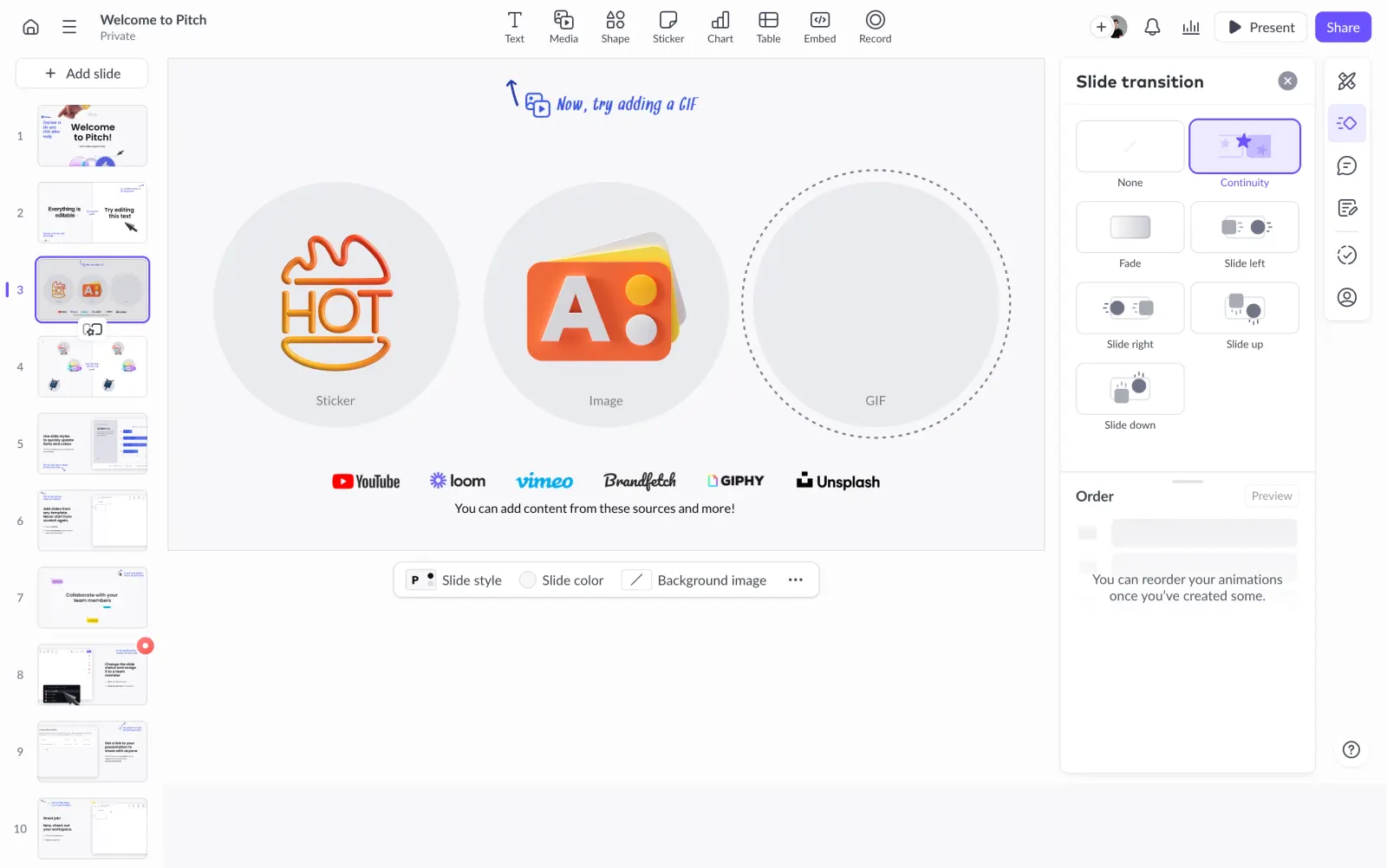
# Design from Reference: Pitch Presentation Animations Side Panel

Create an original, high-fidelity visual design inspired by the reference. Prioritize composition, typography, colors, spacing, and component styling over technical implementation.

## Reference

- **Product:** Pitch
- **Category:** Text Editor
- **Screenshot:** attached to this message (also available at https://media.saasframe.io/v/ca1f2b1af343719cd706-1600.webp)
- **Source:** https://app.pitch.com/app/presentation/601b2bad-8041-46b8-88a7-157dc2d16059/5ed45e07-209f-4a9e-ab2d-594625aefb5c/e94f2732-97ff-478d-a136-de961514ba37

Analyze the attached screenshot first. If no image is attached, open the screenshot link; if neither is accessible, ask for it rather than guessing.

## Visual Design Context

### Overall aesthetic

- **Character:** Light presentation editor with restrained cool grays and violet selection cues.

### Page composition

- **Canvas:** 2880 × 1804 screenshot px; CSS estimates assume 2× capture.
- **Structure:** Top insertion toolbar; left vertical slide thumbnails; large central slide; right Slide transition panel and narrow tool rail; floating slide-style toolbar beneath canvas.

### Information hierarchy

- **Priority:** Selected slide and central artwork dominate. Right panel shows transition options as a visual tile grid, with Continuity selected.

### Typography

- **Family:** Neutral interface sans serif; exact font unverified. Handwritten blue annotation appears within the slide.
- **Scale:** Estimated CSS panel heading 18 px, body 14 px and tile labels 12 px.

### Colors & surfaces

- **Sampled palette:** Near-white #FCFCFD/#F8F8FA, white #FFFFFF and circular placeholder gray #EAEBF0.
- **Accent:** Violet selected outlines/fills, blue instructional annotation and vivid orange slide artwork.

### Components

- **Transition tiles:** Two-column outlined thumbnails with miniature motion symbols; selected tile has violet border and pale lavender fill.
- **Editor:** Numbered slide previews with violet selected frame; central slide contains three large circles for sticker/image/GIF examples.
- **Geometry:** Estimated CSS right panel width 265 px, 10 px corners; fine borders, small shadows and compact rounded toolbar controls.

### Visual rhythm

- **Spacing:** Dense toolbars frame a spacious central canvas. Transition panel divides options from a large empty Order section.

### Responsive

- **Observed:** Desktop editor only.
- **Adaptation:** Present transitions in a drawer and thumbnails in a collapsible filmstrip; retain usable canvas zoom rather than shrinking every pane.

### Adaptation guidance

- **Preserve:** Clear active-state violet, visual transition previews and separation of slide content from editor chrome.
- **Replace:** Use the target deck and supported animation options.

## Content

**Instructions:**

Generate realistic example content that fits the selected design reference.

Create appropriate headlines, descriptions, labels, buttons, and supporting copy based on the type of interface being designed.

If a product or business description is provided, use it to guide the content.

Otherwise, invent a plausible fictional SaaS product appropriate for the reference.

Keep the content concise, coherent, and visually balanced.

Do not present fictional statistics, customer names, or testimonials as verified facts.

## Design Direction

**Instructions:**

Use the reference screenshot as the main source of visual inspiration rather than a strict layout template.

Preserve its most distinctive design characteristics, such as typography, visual rhythm, color relationships, component treatments, and overall aesthetic.

Feel free to modify section arrangements, proportions, spacing, and individual components to better suit my content.

Introduce original design decisions where they improve usability, composition, or brand consistency.

The result should clearly reflect the reference's visual language without looking like a direct reproduction.

Follow the visual identity of the reference design.

Use its typography, color palette, component styling, and overall aesthetic as the primary design direction.

Do not introduce an unrelated visual identity.

## Output

**Instructions:**

Generate a high-fidelity visual mockup of the requested interface.

Present the design as a polished, realistic website or product UI screenshot.

Prioritize visual composition, typography, spacing, colors, alignment, and component details.

Use the available image-generation or visual-design capabilities.

Do not replace the mockup with source code, a written design specification, or a textual description.

If direct visual generation is unavailable, clearly explain the limitation.

## Constraints

- Use the actual screenshot as the primary visual reference.
- Preserve essential messaging and factual accuracy.
- Prioritize visual quality and consistency.
- Do not invent unsupported product claims.
- Adapt structure and copy length for visual balance.
Reference image Attach it to your message: assistants can’t open image links. Open in ChatGPT ↗ Open in Claude ↗
Build it in Lovable ↗ v0 ↗ Figma Make ↗
Opening a tool copies the screenshot so you can paste it with your prompt.
 SaaSFrame