Overall Style and Aesthetic
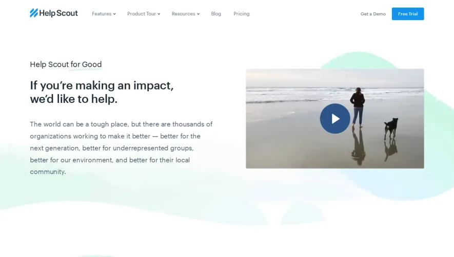
PayFit’s diversity page exemplifies a modern, inviting style that balances professional clarity with a warm, inclusive spirit. The aesthetic is open and minimalist, featuring ample white space that draws attention to purposeful splashes of brand color and energetic imagery. There’s an approachable, human tone; the design supports the serious content while feeling optimistic and welcoming. Layout and Structure
Structurally, the page begins with a bold hero section, highlighting PayFit’s commitment to diversity through succinct messaging and a prominent call to action. Content sections flow logically, alternating between text blocks and expressive visuals to maintain engagement. There’s no clutter of features or pricing here—narrative and impact matter most. Scrolling reveals employee testimonials, DEI initiatives, and clear navigation, culminating in a supportive, informative footer. Visual Elements
Custom, diverse illustrations and photography showcase real team members, reinforcing authenticity and relatability. Dynamic shapes, subtle animations, and tasteful iconography bring the page to life without overwhelming the reader. Movement is subtle yet effective, guiding the eye smoothly down the narrative. Color Palette and Typography
A sophisticated palette merges soft neutrals with strategic pops of blue and purple—signaling both trust and creativity. The typography is crisp and readable: bold sans-serif headlines command attention, while lighter body copy guides the reader effortlessly. Information hierarchy is meticulously organized using scale, color, and spacing. User Experience Patterns & Unique Choices
Navigation is streamlined, promoting seamless exploration—sticky headers and clear CTAs ensure visitors don’t lose their place. The blend of interactive elements and authentic testimonials creates a compelling, motivating user flow. Notably, the absence of sales-driven features in favor of storytelling makes the message resonate more deeply, demonstrating how strong design can support genuine company values.