
Thank you! Your submission has been received!
Oops! Something went wrong while submitting the form.
Get SaaSFrame Pro
Monthly
$18
Quarterly
$48
Yearly
$180
Upgrade to access this feature
Browse all screens & flows
Filter and search screens & flows
Access Figma files
Access mobile versions
Bookmark screens & flows
Join now

PandaDoc Mission Statement & Culture Code

PandaDoc
Effortless eSign Tool
Designed by
No items found.

Bookmark
Bookmark

Design with AI
Thank you! Your submission has been received!
Oops! Something went wrong while submitting the form.
# Design from Reference: PandaDoc Mission Statement & Culture Code
Create an original, high-fidelity visual design inspired by the reference. Prioritize composition, typography, colors, spacing, and component styling over technical implementation.
## Reference
- **Product:** PandaDoc
- **Category:** Culture Handbooks
- **Screenshot:** https://cdn.prod.website-files.com/5e9dc792e1210c5325f7ebbc/62ec9c5dfea76e86539de95e_1659620300339-screenshot-device-7f04f54805e4ccdc7048c9a017bbecfe-1659597981827.webp
Analyze the screenshot first. If inaccessible, request it rather than guessing.
## Content
{{content.instructions}}
{{content.data}}
Preserve essential messaging and factual accuracy. Adapt structure and copy length for visual balance; never invent product claims.
## Visual Design
### Overall aesthetic
- **Character:** A restrained, text-led culture document on a white website canvas; bold black headings and generous margins make a very long article readable.
- **Visual evidence:** The screenshot measures 1440 × 15041 image pixels and was inspected through eleven readable portions. Dimensions below are approximate image-pixel measurements; a near-1× CSS scale is plausible but unverified.
- **Decoration:** Branding and a narrow donation banner provide the main decorative elements; the article relies on typography, lists and comparison tables rather than photography.
### Page composition
- **Header:** A dark donation strip sits above a white horizontal navigation bar with logo, menu links, account access and a green outlined trial action.
- **Article column:** A centered reading area approximately 880px wide leaves about 280px side margins. The title and all article regions share its left edge.
- **Document sequence:** Mission and culture principles lead into people and work values, repeated Like/Dislike tables, learning and development, hiring, a numbered recreation list and two expanded FAQ answers.
- **Footer:** The article opens into a wider five-column link directory, store badges, social icons and a language selector. A rounded cookie notice overlays the lower footer.
### Information hierarchy
- **Entry point:** A large, heavy, two-line title establishes the document; major topics use smaller but still prominent bold headings.
- **Reading structure:** Short question-style subheadings, bold phrases within paragraphs and ordered or square-bulleted lists divide the dense text.
- **Comparison structure:** Repeated tables distinguish a narrow descriptor column from broad Like and Dislike columns; horizontal rules organize feature, definition and example rows.
- **Closing content:** Learning initiatives and hiring guidance retain the same editorial treatment. FAQ answers are visible prose rather than collapsed accordions.
### Typography
- **Family:** Rounded geometric sans-serif forms are visible throughout; the exact font identity is unverified.
- **Title:** Approximately 60px, heavy weight, compact line-height around 1.1 and slightly tight tracking.
- **Heading roles:** Major headings are approximately 32px bold with 38–40px line-height; subordinate headings are approximately 24px bold with 29–32px line-height.
- **Body and tables:** Approximately 18px regular with 27px line-height; emphasized phrases use a distinctly heavier weight without changing size.
- **Navigation and footer:** Smaller approximately 14–16px text, with muted footer links and darker group labels.
### Colors & surfaces
- **Canvas:** Sampled dominant white is #FFFFFF; the article has no tinted card behind it.
- **Text:** Sampled dark tones include #242424, #252525 and #141414. These create the heading/body contrast without pure-black fills across the article.
- **Rules and secondary elements:** Sampled #E8E8E8 supports light separators; #ACACAC appears among muted gray pixels.
- **Accents:** Green links and trial styling are sparse visual accents. The donation strip adds blue and yellow; these accent identities are observed, without asserting an exact brand token.
### Components
- **Value tables:** Full-column comparison tables use thin gray horizontal rules, generous cell padding and top-aligned multiline content. Their geometry is square and editorial, without elevation.
- **Lists:** Ordered lists use hanging indents; nested Roman numbering and small square bullets distinguish subordinate content.
- **Header action:** A compact outlined green trial button contrasts with plain navigation links.
- **Cookie notice:** A white notice approximately 880px wide has rounded corners around 18px, a soft shadow, small multiline copy, an underlined policy link and a separate close icon.
- **Footer utilities:** Store badges are compact outlined image buttons; monochrome social icons form a horizontal group.
### Visual rhythm
- **Paragraph spacing:** Body blocks generally have approximately 24–32px separation, with larger 48–72px breaks before major topics.
- **Alignment:** A stable article left edge and consistent line length unify the unusually long page.
- **Density variation:** Prose, numbered lists and large comparison tables alternate; table rows expand to fit their content rather than forcing uniform heights.
- **Closing transition:** A larger gap separates the last FAQ answer from the wider footer directory.
### Responsive
- **Evidence limit:** Only one desktop capture is available; mobile layouts and sticky behavior are unverified.
- **Reading recommendation:** Reduce the article to a fluid column with 20–24px side padding, 16–18px body text and a smaller title on narrow screens.
- **Table recommendation:** Preserve the Like/Dislike relationship with horizontal scrolling or clearly labeled stacked groups; avoid squeezing long cells into unreadably narrow columns.
- **Navigation recommendation:** Collapse the header menu and stack footer groups; keep the cookie notice inside the viewport without covering essential controls.
### Adaptation guidance
- **Editorial system:** Build reusable title, major-heading, subheading, paragraph, list and comparison-table styles before adding content.
- **Content fidelity:** Preserve the visible hierarchy and text emphasis; do not turn every paragraph into a card or introduce unsupported imagery.
- **Spacing implementation:** Use an approximately 880px maximum reading width and a consistent 8px-based spacing system, then tune against the observed screenshot.
- **Accessibility:** Use semantic headings, lists and table headers, sufficient link contrast, keyboard-accessible navigation and a labeled cookie-dismiss control.
Use this context to reproduce the reference's visual language: layout, typography, colors, spacing, borders, radii, and distinctive elements. The screenshot takes priority if descriptions conflict.
## Direction
{{preferences.fidelityInstructions}}
## Output
{{output.instructions}}
Deliver a polished, cohesive design with precise alignment, hierarchy, and spacing. Produce the requested visual artifact, not just a description. If unsupported, explain the limitation.


Category
Patterns
No items found.
Tech Stack



Added on
April 22, 2020
Similar screens



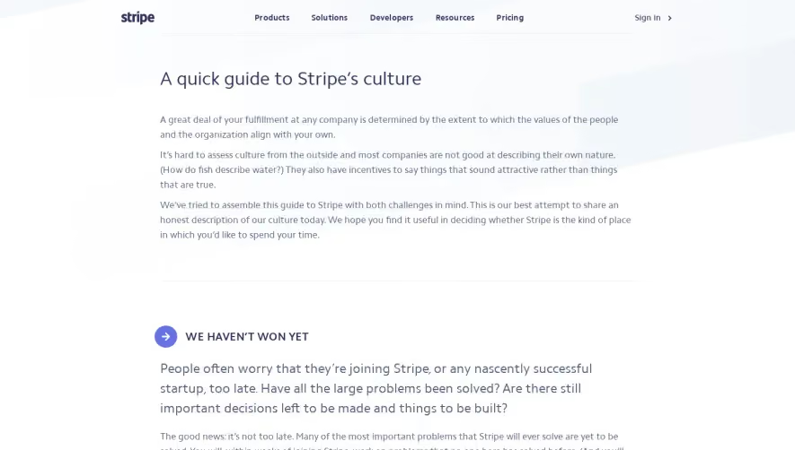

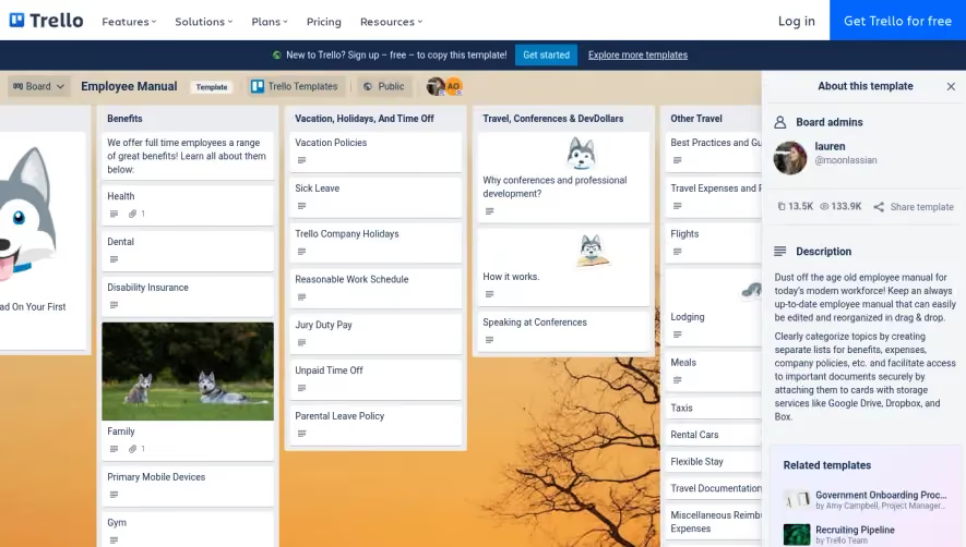

Upgrade to SaaSFrame Pro now to see similar examples.
Monthly
$18 /month
Billed $18 monthly
Browse all screens & flows
Filter and search screens & flows
Search text in screenshots
Access Figma files
Access mobile versions
Join now
Quarterly
$16 /month
Billed $48 quarterly
Browse all screens & flows
Filter and search screens & flows
Search text in screenshots
Access Figma files
Access mobile versions
Join now
Yearly
$15 /month
Billed $180 yearly
Browse all screens & flows
Filter and search screens & flows
Search text in screenshots
Access Figma files
Access mobile versions
Join now