Design with AI
Generate a new design based on this screen using your own content.
# Design from Reference: Officevibe Templates Library
Create an original, high-fidelity visual design inspired by the reference. Prioritize composition, typography, colors, spacing, and component styling over technical implementation.
## Reference
- **Product:** Officevibe
- **Category:** Templates Library
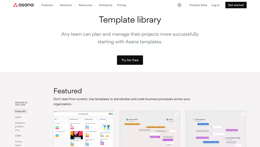
- **Screenshot:** https://cdn.prod.website-files.com/5e9dc792e1210c5325f7ebbc/62ff1da728fc3ccb1b37399c_1660886335597-templates-Laptop%2520Medium-1660886286293.webp
Analyze the screenshot first. If inaccessible, request it rather than guessing.
## Content
{{content.instructions}}
{{content.data}}
Preserve essential messaging and factual accuracy. Adapt structure and copy length for visual balance; never invent product claims.
## Visual Design
### Overall aesthetic
- **Character:** Warm editorial template library with friendly hand-drawn illustrations, cream surfaces and deep plum typography.
### Page composition
- **Canvas:** 1440 × 2873 screenshot pixels; CSS estimates are near screenshot scale, with capture scale unverified.
- **Structure:** Navigation; centered title/intro; left category/filter rail beside a three-column card grid; search above grid; pagination; deep navy footer.
- **Grid:** Twelve cards appear in four rows, with approximately 24px gutters and a narrower left sidebar.
### Information hierarchy
- **Priority:** Large library title with a coral hand-drawn oval around the final word; filters and search support browsing.
- **Cards:** Small uppercase template-type label/icon precedes a large title, with a colorful illustrated lower half.
### Typography
- **Family:** Rounded geometric sans-serif appearance; exact font is unverified.
- **Scale:** Estimated CSS hero 60–64px, card titles 29–32px, body/filter labels 16px and uppercase metadata 13–14px with increased letter spacing.
### Colors & surfaces
- **Sampled palette:** Cream background #FFF6EC; card top #FFF0DE; navy #012045; blue #B3DDF1; yellow #FCC73C; pink #FED8D3; orange #FFA878.
- **Treatment:** Main text is deep plum; the footer shifts to navy with pale blue typography and white input surfaces.
### Components
- **Cards:** Flat two-part panels with about 6px radii and no heavy shadow. Repeated navy line illustrations show conversations, goals and laptop work.
- **Filters:** Vertical category links, decorative wavy separator and two square checkbox options. Search is a thin outlined pill with a filled circular search action.
- **Footer:** Newsletter form/social group beside navigation columns; legal and language controls align along the base.
### Visual rhythm
- **Spacing:** Generous hero-to-library spacing contrasts with a regular card grid. Card headers use approximately 24px padding.
- **Decoration:** Faint wave lines run behind the grid; colorful card bottoms create a repeating visual beat.
### Responsive
- **Guidance:** Mobile is not shown. Move filters to a compact disclosure, stack cards and make search full-width; preserve large readable card headings.
### Adaptation guidance
- **Transfer:** Reuse the cream/plum palette logic, two-part illustrated cards and useful filtering hierarchy. Adapt template categories, illustrations and labels to the target library.
Use this context to reproduce the reference's visual language: layout, typography, colors, spacing, borders, radii, and distinctive elements. The screenshot takes priority if descriptions conflict.
## Direction
{{preferences.fidelityInstructions}}
## Output
{{output.instructions}}
Deliver a polished, cohesive design with precise alignment, hierarchy, and spacing. Produce the requested visual artifact, not just a description. If unsupported, explain the limitation.