Overall Style and Aesthetic
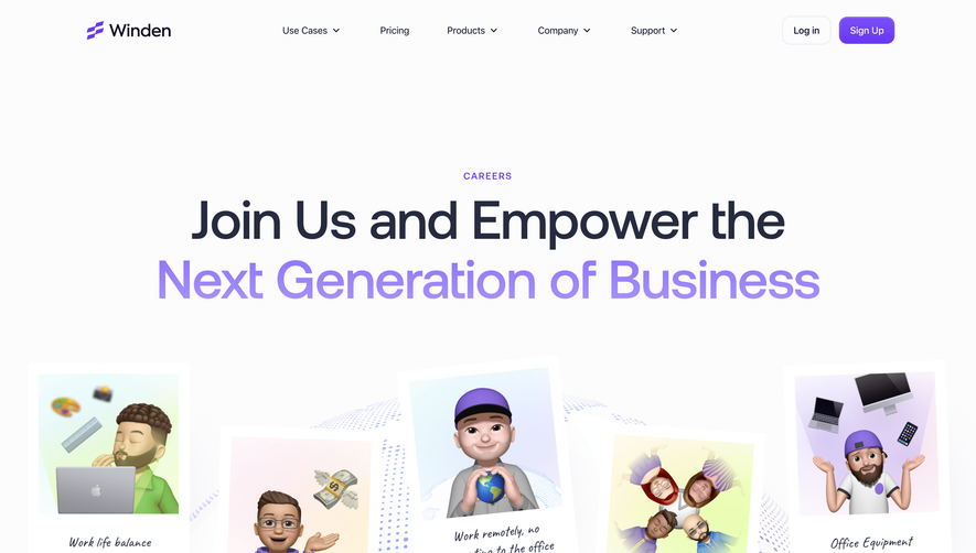
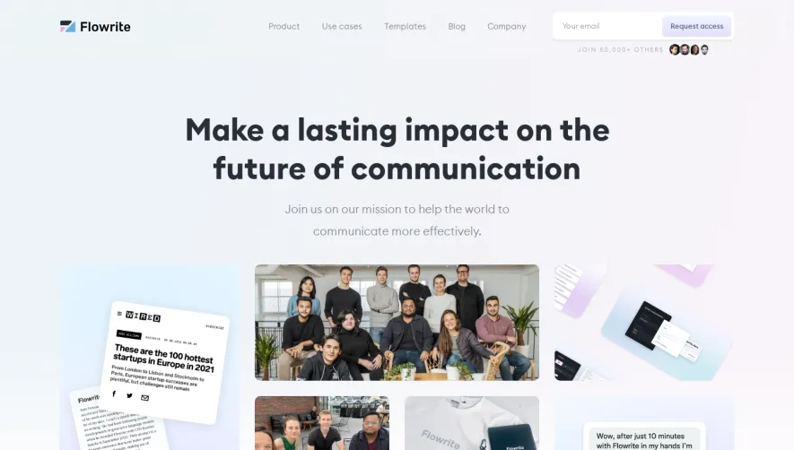
Nord Security’s careers page radiates a modern, professional vibe with a distinctly Scandinavian minimalist approach. The use of ample white space, clean lines, and well-balanced layouts fosters a sense of clarity and trust. Pops of Nord blue paired with subtle neutrals create a calming yet engaging visual atmosphere that appeals to tech-savvy candidates. Layout and Structure
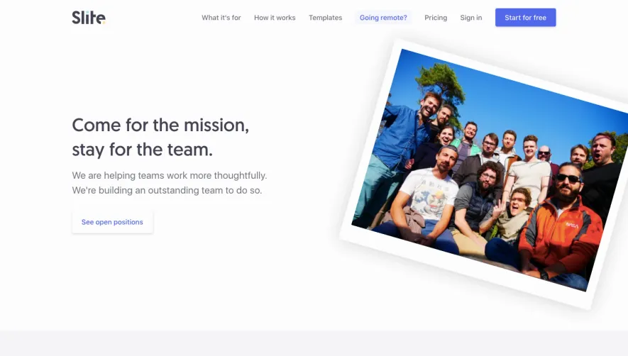
The page kicks off with an inviting hero section, featuring a crisp headline, a succinct mission-driven statement, and a prominent call to action. Scrolling reveals logically organized blocks: company culture highlights, open roles, values, and employee testimonials, each within clear, easily digestible containers. Job search and filter tools are seamlessly integrated above the fold, reducing friction for users exploring opportunities. Visual Elements
High-quality photography and team imagery offer an authentic glimpse inside the company, fostering connection. Subtle animated accents—like gently shifting gradients or understated hover effects on cards and buttons—lend a dynamic touch without overwhelming. Custom, geometric icons bring visual consistency to benefits and values, enhancing content understanding. Color Palette and Typography
The restrained palette leans on deep blues and off-whites, with occasional accent hues, supporting a trustworthy, secure feel. Typographically, bold sans-serifs establish hierarchy: oversized headlines draw attention while smaller supporting text remains legible and approachable. User Experience Patterns and Unique Choices
Sticky navigation streamlines site exploration, while clear, well-placed CTAs encourage conversion. The job listing filters are intuitive, supporting effortless discovery. Notably, the consistent micro-interactions—like animated hover states and smooth section transitions—add polish and reinforce the site’s innovative tone. The overall experience is efficient, energetic, and distinctly user-first.