
Thank you! Your submission has been received!
Oops! Something went wrong while submitting the form.
Get SaaSFrame Pro
Monthly
$18
Quarterly
$48
Yearly
$180
Upgrade to access this feature
Browse all screens & flows
Filter and search screens & flows
Access Figma files
Access mobile versions
Bookmark screens & flows
Join now

Linktree Pricing Page

Linktree
Link in bio
Designed by
No items found.

Bookmark
Bookmark

Design with AI
Thank you! Your submission has been received!
Oops! Something went wrong while submitting the form.
# Design from Reference: Linktree Pricing Page
Create an original, high-fidelity visual design inspired by the reference. Prioritize composition, typography, colors, spacing, and component styling over technical implementation.
## Reference
- **Product:** Linktree
- **Category:** Pricing Page
- **Screenshot:** https://cdn.prod.website-files.com/5e9dc792e1210c5325f7ebbc/6acb6467b206c0d3f8f06697_6acb62d7baddc9f317de34da_cms-4cf1d11b9352fc5b598737b8.webp
Analyze the screenshot first. If inaccessible, request it rather than guessing.
## Content
{{content.instructions}}
{{content.data}}
Preserve essential messaging and factual accuracy. Adapt structure and copy length for visual balance; never invent product claims.
## Visual Design
### Overall aesthetic
- **Character:** A playful, high-contrast pricing page uses oversized heavy typography, pink-and-purple brand fields, pill-shaped actions and a very extensive feature matrix.
- **Capture scale:** The image is 2880 × 27676 pixels, inspected through ten readable portions. A 1440px CSS viewport at 2× density is estimated, not verified.
- **Styling:** Rounded large surfaces and bold color blocks dominate; photography and illustrated feature cards break up the long comparison.
### Page composition
- **Navigation:** A wide white capsule with roughly 32px outer margins contains the brand symbol, menu links, pale login action and dark signup pill.
- **Pricing hero:** A pale pink region contains a large left-aligned title, monthly/annual toggle at right and four plan cards across the page. The Pro card is taller and visually emphasized.
- **Social proof:** An off-white region introduces a large centered trust statement and a horizontal band of brand imagery.
- **Feature comparison:** A left category rail accompanies a wide table with a descriptive column and four plan columns. Multiple separated rounded table groups cover link tools, monetization, appearance, analytics and integrations.
- **Later content:** A large enterprise-plan capsule leads into three illustrated benefit cards, a portrait testimonial, a burgundy FAQ section and a purple signup region.
- **Footer:** A large white four-column directory sits inside the purple closing region, followed by a huge pink brand panel and a centered acknowledgment area with two flags.
### Information hierarchy
- **Pricing emphasis:** Plan names and prices occupy purple card headers; the Pro free-trial badge, larger header and orange action distinguish it from the other plans.
- **Billing state:** Monthly is visibly selected in the two-part toggle. Prices and currencies are screenshot content, not verified current commercial terms.
- **Comparison hierarchy:** Repeated plan headings and actions align above checkmarks, crosses and short text values. The Pro column has a pale pink vertical highlight.
- **Supporting persuasion:** The three benefit cards use illustration, heading, paragraph and small plan chips; the large portrait and quote provide a separate testimonial module.
- **Closing actions:** FAQ rows appear collapsed with chevrons. The final signup input and lime action stand out against purple.
### Typography
- **Family:** A rounded geometric sans-serif appears in both very heavy display and regular text roles; exact font identity is unverified.
- **Hero title:** Approximately 88–96px CSS, extra-bold, tightly tracked and close to 1.0 line-height.
- **Section display:** Major headings and the testimonial quote are approximately 56–64px, heavy, with tight line-height and centered alignment where appropriate.
- **Plan and card roles:** Plan names are around 30–32px bold; benefit headings around 30px; prices around 30px with smaller currency/billing annotations.
- **Table and body:** Approximately 16–18px regular with 24–27px line-height. Small labels, badges and footer links are approximately 14px.
- **FAQ:** Questions are around 26px medium-to-bold, substantially larger than table text.
### Colors & surfaces
- **Primary brand surfaces:** Sampled #E8C0E8 and #E8BFE8 supply pale pink; #502274 forms deep purple plan headers and closing backgrounds.
- **Neutral regions:** Sampled #F3F3F1 supports the long comparison section, with #FFFFFF table and footer surfaces.
- **FAQ surfaces:** Sampled #780016 creates the burgundy band; darker #520310 supports individual accordion rows.
- **Highlighted comparison:** Sampled #F8ECF8 supplies the pale Pro-column tint.
- **Accent usage:** Lime badges and signup actions, orange Pro actions, blue emphasis in the trust statement and turquoise illustration details provide localized high saturation.
- **Text contrast:** Dark navy text appears on light surfaces, white on purple pricing headers and pale pink on burgundy FAQ panels.
### Components
- **Plan cards:** Four approximately 324px-wide CSS cards use about 24–32px corner radii. Purple headers sit above white centered descriptions and wide pill actions; Pro extends lower with a supporting note.
- **Billing toggle:** A white capsule contains a dark selected Monthly pill and a plain Annual option, with a small savings prompt above.
- **Feature matrix:** White rounded groups use roughly 66px-tall rows, thin horizontal separators, left-side chevrons and centered check/cross marks. Longer feature labels wrap and enlarge their rows.
- **Category rail:** A purple active category pill contrasts with plain inactive labels; only the visible state is established.
- **Benefit cards:** Three equal-width colorful rectangles have roughly 32px radii, large top illustration areas, left-aligned text and small outlined plan chips near the bottom.
- **FAQ rows:** A centered approximately 900px-wide stack uses dark burgundy cards, around 32px radii, generous padding and trailing chevrons.
- **Final form and footer:** A white URL input sits beside a lime pill button; the footer groups links above login/signup controls, store badges and circular social buttons.
### Visual rhythm
- **Outer grid:** Approximately 48px CSS side gutters frame major content; the comparison reserves around 220px for its category rail.
- **Hero spacing:** Large gaps separate capsule navigation, title and plan cards; card gutters are approximately 16px.
- **Table cadence:** Fine row rules and a continuous highlighted Pro column maintain alignment through the unusually long comparison.
- **Section spacing:** Major modules are separated by roughly 120–200px of open space; table groups have around 64px gaps.
- **Shape repetition:** Pills recur in navigation, buttons, chips, enterprise messaging and the testimonial image frame, unifying the page.
### Responsive
- **Evidence limit:** The screenshot shows one desktop state; sticky headers, carousel movement and expanded FAQ behavior are unverified.
- **Pricing recommendation:** Stack plan cards or use an accessible horizontal selector at narrow widths, keeping the highlighted plan's pricing and action together.
- **Matrix recommendation:** Preserve row/column relationships with labeled horizontal scrolling or an explicit plan comparison selector; keep feature names available while scrolling.
- **Content recommendation:** Stack benefit cards and footer columns, reduce display typography and retain readable paragraph sizes.
- **Controls recommendation:** Keep billing selection, FAQ controls and signup actions keyboard accessible with visible focus and adequate touch size.
### Adaptation guidance
- **Design system:** Define pink, purple, burgundy and neutral surfaces alongside separate pill, large-card and table-group radii.
- **Comparison implementation:** Use semantic table headers and accessible availability labels; do not rely only on checkmarks, crosses or column color.
- **Content maintenance:** Generate plan cards and comparison headings from consistent data so billing periods, trial labels and actions remain synchronized.
- **Visual assets:** Use authentic brand marks and purposeful illustrations, retaining the observed balance between comparison detail and large supporting modules.
- **Behavior:** Implement and test responsive comparison, billing selection and FAQ expansion separately; the static capture does not verify those interactions.
Use this context to reproduce the reference's visual language: layout, typography, colors, spacing, borders, radii, and distinctive elements. The screenshot takes priority if descriptions conflict.
## Direction
{{preferences.fidelityInstructions}}
## Output
{{output.instructions}}
Deliver a polished, cohesive design with precise alignment, hierarchy, and spacing. Produce the requested visual artifact, not just a description. If unsupported, explain the limitation.


Category
Patterns
No items found.
Tech Stack

Added on
July 20, 2023
Similar screens
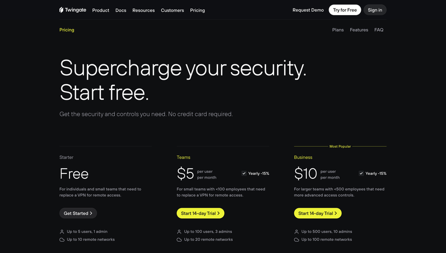



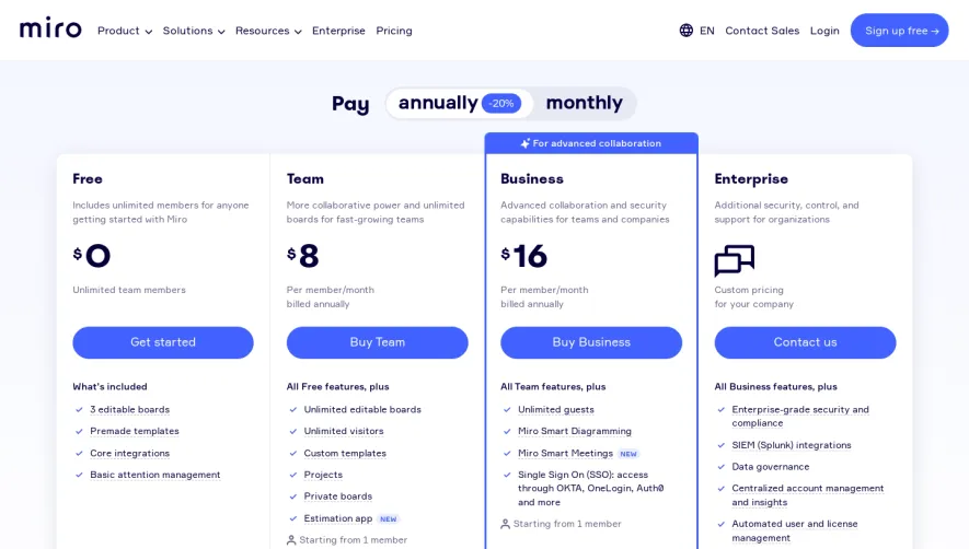

Upgrade to SaaSFrame Pro now to see similar examples.
Monthly
$18 /month
Billed $18 monthly
Browse all screens & flows
Filter and search screens & flows
Search text in screenshots
Access Figma files
Access mobile versions
Join now
Quarterly
$16 /month
Billed $48 quarterly
Browse all screens & flows
Filter and search screens & flows
Search text in screenshots
Access Figma files
Access mobile versions
Join now
Yearly
$15 /month
Billed $180 yearly
Browse all screens & flows
Filter and search screens & flows
Search text in screenshots
Access Figma files
Access mobile versions
Join now