Overall Style & Aesthetic
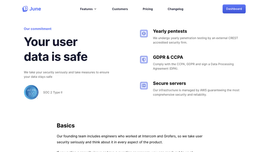
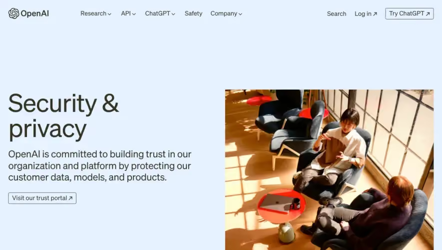
Klu’s Security page delivers a crisp, reassuringly modern design that exudes trust and authority. The style is minimalist yet far from stark, leveraging white space and muted gradients to keep the user focused and at ease. A blend of soft blue and subtle purple accents sets a professional yet innovative tone, conveying security without feeling cold or impersonal. Layout & Structure
The page structure follows a logical, user-centric flow. A concise hero section introduces the page with bold headlines and a calming security-themed illustration. Immediately below, security features are presented in digestible cards—each paired with a custom icon and direct copy. The absence of testimonials and pricing on this page keeps the spotlight fully on trust-building content. The sticky navigation ensures effortless access to key sections, while a well-padded footer anchors the page with essential links. Visual Elements
Illustrations play a starring role—abstract, soft-edged visuals reinforce the page’s technical theme without overwhelming the content. Subtle iconography supports major points, and micro-interactions enliven CTAs and icons, offering a touch of delight. There’s no photography or video, which keeps the page load light and the focus sharp. Color Palette & Typography
A soothing palette of blues, blue-grays, and gentle purples drives a trustworthy vibe, while warmer accents (like green indicators) highlight certifications and compliance. Sans-serif typography—clean, rounded, with distinct hierarchy—guides the eye naturally from headlines to CTAs, maintaining excellent readability. User Experience Patterns & Unique Touches
The sticky nav, succinct content blocks, and clear, inviting CTAs make for a smooth scrolling journey. Standout details include animated badges, tailored icons, and strategic whitespace—each contributing to a refined, credible experience that fosters visitor confidence in Klu’s security protocols.