Prompt 1,129 words Copy
# Design from Reference: June Customer Stories

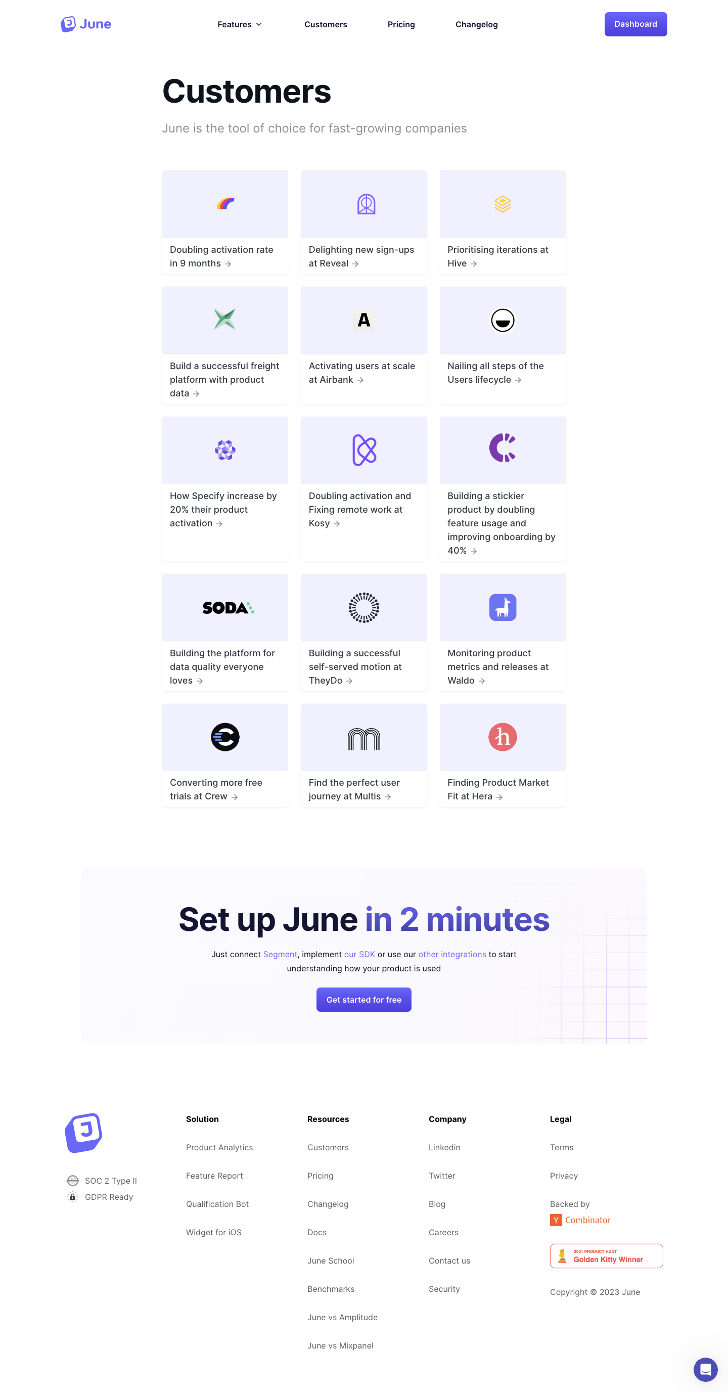
Create an original, high-fidelity visual design inspired by the reference. Prioritize composition, typography, colors, spacing, and component styling over technical implementation.

## Reference

- **Product:** June
- **Category:** Customer Stories
- **Screenshot:** attached to this message (also available at https://media.saasframe.io/o/e8bdbe08180ce7a8f050.webp)
- **Source:** https://www.june.so/customer-stories

Analyze the attached screenshot first. If no image is attached, open the screenshot link; if neither is accessible, ask for it rather than guessing.

## Visual Design Context

### Overall aesthetic

- **Character:** A clean customer-story directory uses white space, pale lavender logo panels and blue-violet actions.
- **Capture evidence:** The screenshot measures 1440 × 2753 pixels and was inspected in two portions through the footer. Approximate dimensions are image pixels; near-1× CSS scale is estimated.
- **Tone:** Simple repeated cards and a broad conversion banner keep the page light and easy to browse.

### Page composition

- **Navigation:** The June brand sits left, four primary destinations span the center and a filled Dashboard button sits right.
- **Introduction:** A large Customers heading and muted one-line subtitle align with a narrow centered content area.
- **Story grid:** Fifteen customer cards form three columns and five rows.
- **Conversion panel:** A wider pale rounded banner contains a centered setup headline, short integration explanation and blue-violet signup action.
- **Footer:** Brand/trust details occupy the left, followed by Solution, Resources, Company and Legal columns. A chat launcher appears lower right.

### Information hierarchy

- **Directory heading:** Customers is the strongest entry text, followed by a lighter explanatory line.
- **Card content:** Centered customer marks sit above multiline story titles and small trailing arrows.
- **Grid equality:** Cards receive similar visual weight; no featured story or category filter is visible.
- **Conversion emphasis:** The lower banner uses large dark text with a blue-violet phrase and one primary action.
- **Footer proof:** Small certification labels, an accelerator mark and an award badge appear among the footer details.

### Typography

- **Family:** A rounded sans-serif is visible; exact identity is unverified.
- **Page title:** Approximately 64px bold with 72px line-height and slightly tight tracking.
- **Subtitle:** Approximately 24px regular, muted gray.
- **Card titles:** Approximately 18px medium with 26px line-height.
- **Conversion headline:** Approximately 64px bold, with the emphasized phrase in blue-violet.
- **Supporting/footer text:** Around 16px with 26px line-height; footer group labels are bold.
- **Navigation:** Approximately 16px semibold.

### Colors & surfaces

- **Canvas:** Sampled #FFFFFF dominates the page.
- **Logo tiles:** Sampled #F0F1FE supplies pale lavender image regions.
- **Conversion surface:** Sampled #FAF9FE and nearby #FAFAFF/#FAFAFE provide the very pale banner background.
- **Primary ink:** Dark navy-black headings and card text contrast with muted gray supporting copy.
- **Action accent:** Blue-violet fills the Dashboard and signup controls and appears in brand marks and inline links.
- **Footer accents:** Orange is localized to accelerator/award content, while customer logos retain their own colors.

### Components

- **Story cards:** Approximately 250px wide, with a 134px-high lavender logo area and white text area beneath; subtle border/shadow and small rounded lower corners define the card.
- **Logo placement:** Customer marks are centered with substantial blank space around them.
- **Card text:** Around 16px padding surrounds story titles; the small arrow follows the last line rather than occupying a separate button.
- **Conversion banner:** Approximately 1120px wide with around 18px radii and a faint blue grid fading in from the right.
- **Primary buttons:** Blue-violet rectangles use around 8px radii, white semibold labels and moderate horizontal padding.
- **Footer proof:** Small monochrome certification symbols sit below the tilted brand icon; an outlined award badge appears in the Legal area.
- **Chat launcher:** A small blue-violet circle contains a white chat glyph.

### Visual rhythm

- **Grid width:** The story list is around 800px wide, centered with broad side margins.
- **Card gaps:** Approximately 24px separates columns and rows.
- **Height variation:** Text areas grow with title length while each row remains visually aligned.
- **Section breaks:** Large 100–140px gaps separate the grid, conversion banner and footer.
- **Footer cadence:** Generous vertical link spacing contrasts with compact card content.

### Responsive

- **Evidence limit:** Only a desktop layout is observed; card hover, story destinations and responsive transitions are unverified.
- **Grid recommendation:** Reduce to two columns and then one as width decreases.
- **Text recommendation:** Let card titles wrap naturally; avoid fixed heights that clip longer stories.
- **Banner recommendation:** Scale the display headline down and retain a readable integration explanation.
- **Footer recommendation:** Stack link columns and keep proof marks secondary to navigation.

### Adaptation guidance

- **Directory component:** Use a reusable logo/title/link card with consistent image-region proportions.
- **Visual consistency:** Preserve the pale lavender tile treatment and restrained shadows rather than adding unrelated photography.
- **Content maintenance:** Keep story titles and customer marks paired accurately; displayed performance claims remain source-page content.
- **Accessibility:** Give each card a descriptive link name, visible focus and useful logo alternatives.
- **Conversion:** Keep the setup banner as a clear separate module with one primary signup action.

## Content

**Instructions:**

Generate realistic example content that fits the selected design reference.

Create appropriate headlines, descriptions, labels, buttons, and supporting copy based on the type of interface being designed.

If a product or business description is provided, use it to guide the content.

Otherwise, invent a plausible fictional SaaS product appropriate for the reference.

Keep the content concise, coherent, and visually balanced.

Do not present fictional statistics, customer names, or testimonials as verified facts.

## Design Direction

**Instructions:**

Use the reference screenshot as the main source of visual inspiration rather than a strict layout template.

Preserve its most distinctive design characteristics, such as typography, visual rhythm, color relationships, component treatments, and overall aesthetic.

Feel free to modify section arrangements, proportions, spacing, and individual components to better suit my content.

Introduce original design decisions where they improve usability, composition, or brand consistency.

The result should clearly reflect the reference's visual language without looking like a direct reproduction.

Follow the visual identity of the reference design.

Use its typography, color palette, component styling, and overall aesthetic as the primary design direction.

Do not introduce an unrelated visual identity.

## Output

**Instructions:**

Generate a high-fidelity visual mockup of the requested interface.

Present the design as a polished, realistic website or product UI screenshot.

Prioritize visual composition, typography, spacing, colors, alignment, and component details.

Use the available image-generation or visual-design capabilities.

Do not replace the mockup with source code, a written design specification, or a textual description.

If direct visual generation is unavailable, clearly explain the limitation.

## Constraints

- Use the actual screenshot as the primary visual reference.
- Preserve essential messaging and factual accuracy.
- Prioritize visual quality and consistency.
- Do not invent unsupported product claims.
- Adapt structure and copy length for visual balance.
Reference image Attach it to your message: assistants can’t open image links. Open in ChatGPT ↗ Open in Claude ↗
Build it in Lovable ↗ v0 ↗ Figma Make ↗
Opening a tool copies the screenshot so you can paste it with your prompt.
 SaaSFrame