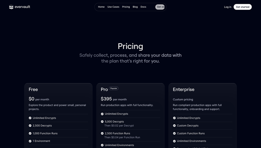
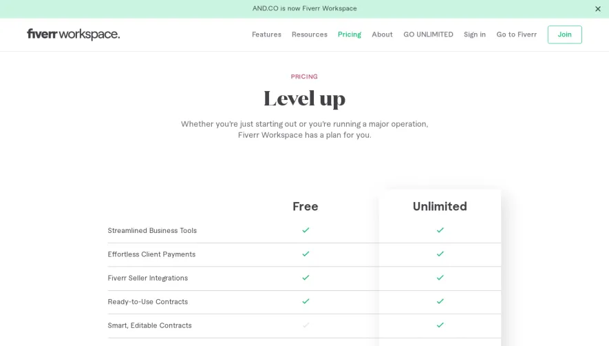
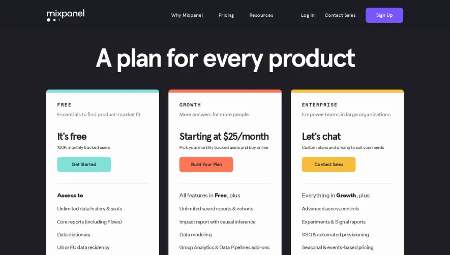
Generate a new design based on this screen using your own content.
Thank you! Your submission has been received!
Oops! Something went wrong while submitting the form.
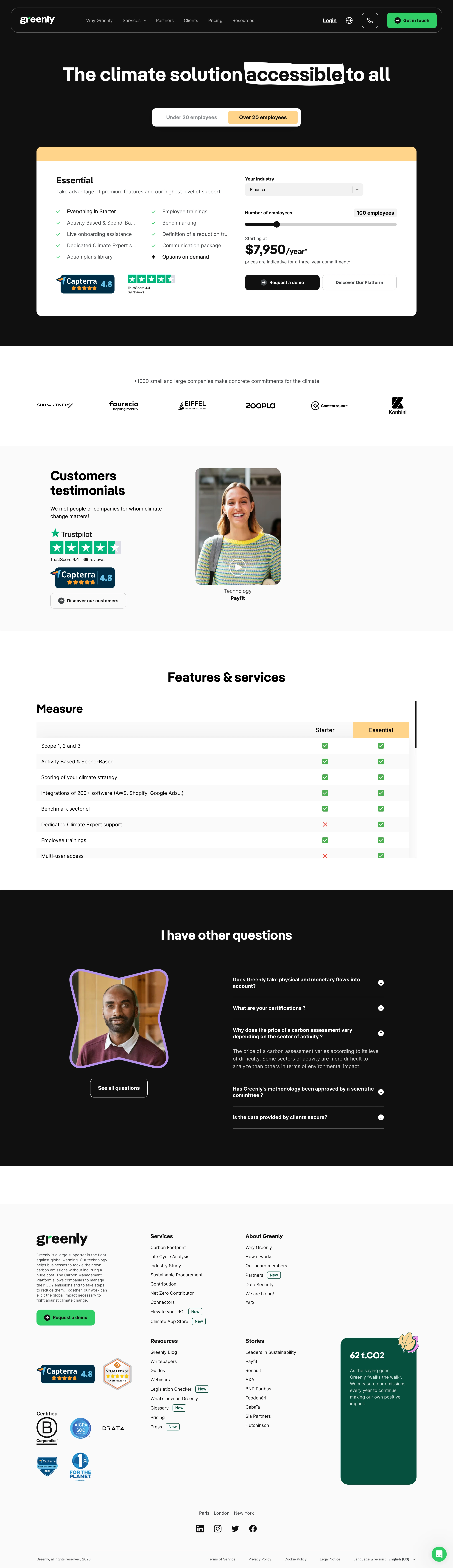
# Design from Reference: Greenly Pricing Page
Create an original, high-fidelity visual design inspired by the reference. Prioritize composition, typography, colors, spacing, and component styling over technical implementation.
## Reference
- **Product:** Greenly
- **Category:** Pricing Page
- **Screenshot:** https://cdn.prod.website-files.com/5e9dc792e1210c5325f7ebbc/6acadbead05a3f53c0a86341_6acadb3e40b06292973e59f4_cms-846df260242513adef931434.webp
Analyze the screenshot first. If inaccessible, request it rather than guessing.
## Content
{{content.instructions}}
{{content.data}}
Preserve essential messaging and factual accuracy. Adapt structure and copy length for visual balance; never invent product claims.
## Visual Design
Use this context to reproduce the reference's visual language: layout, typography, colors, spacing, borders, radii, and distinctive elements. The screenshot takes priority if descriptions conflict.
## Direction
{{preferences.fidelityInstructions}}
## Output
{{output.instructions}}
Deliver a polished, cohesive design with precise alignment, hierarchy, and spacing. Produce the requested visual artifact, not just a description. If unsupported, explain the limitation.
Greenly’s pricing page embodies a clean, ultra-modern SaaS vibe with eco-friendly sensibilities. The aesthetic is minimalist yet inviting, using generous white space and airy layouts to evoke professionalism and trust. Playful accent elements—like soft shapes and approachable icons—add personality without overwhelming the page.
Layout and Structure
The structure is highly scannable: a concise hero section introduces the value proposition, followed by prominent, differentiated pricing tiers laid out horizontally. Each plan card provides a quick-feature overview and clear CTAs, while sticky navigation streamlines the browsing experience. Additional sections—comparison tables, social proof, FAQs—are nested further down, enhancing transparency and confidence.
Visual Elements
Distinctive flat illustrations and gentle animations reinforce the platform’s sustainable focus. Environmental motifs (plant leaves, earth icons) support the brand’s mission visually. Subtle hover effects and microinteractions liven up user engagement and help clarify clickable elements throughout.
Color Palette and Typography
The color palette mixes crisp whites with calming shades of green and blue, cleverly echoing eco-conscious values. Highlight colors draw attention to key actions like “Get Started.” Sans-serif typography delivers clarity and modernity, using font weights and sizing to guide attention through headline, plan names, and supporting details.
User Experience Patterns
Navigation is intuitive, with anchored links and buttons that keep users oriented. CTAs are bold and above the fold, while comparison toggles and supporting details appear on demand, minimizing cognitive overload. Pricing cards are interactive, and simple inquiry/contact forms facilitate conversion.
Unique or Notable Design Choices
Noteworthy: Thoughtful use of sustainability-themed iconography, a transparent comparison matrix, and gentle motion cues foster an innovative, reliable, and mission-driven ambiance—making Greenly’s pricing page both memorable and conversion-minded.