GitHub ithub Social Impact

GitHub

Where the world builds software
Designedย by
No items found.
Subject


Bookmark
Bookmark
Category
Patterns
No items found.
Added on
March 16, 2023

GitHub ithub Social Impact Structure

Overall Style and Aesthetic

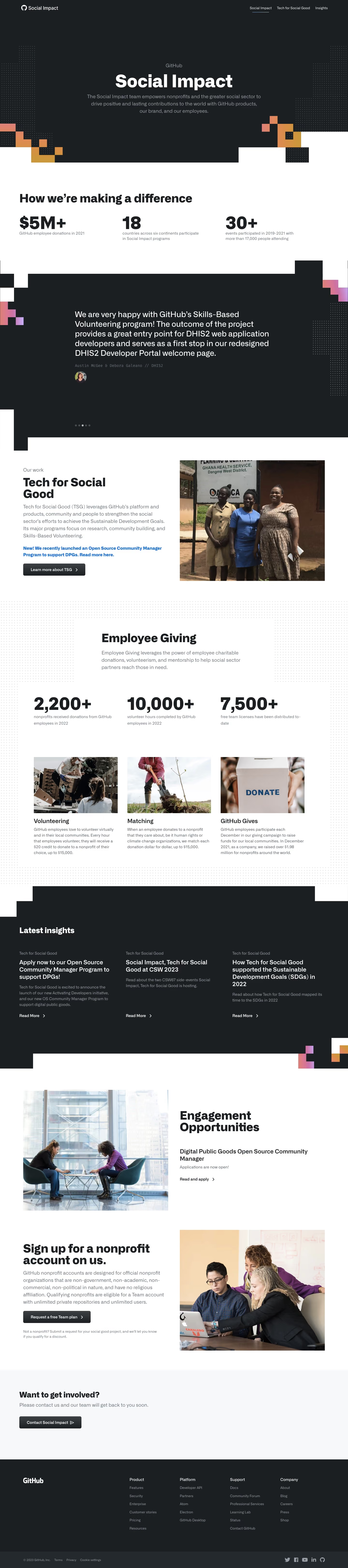
Social Impactโ€™s website embraces a modern, minimalist aesthetic with a refreshing tech-forward edge. The design exudes professionalism, enhanced by ample white space that allows each element to breathe. Subtle gradients and bold accent colors inject vibrancy without overwhelming the viewer, striking a harmonious balance between energy and refinement.

Layout and Structure

The site adopts a streamlined single-page format, starting with a concise hero section that immediately delivers the mission statement and supporting visual. Below, content is organized into well-defined, scrollable blocks highlighting the project's vision, involved organizations, and open-source focus. A lightweight footer anchors navigation and calls to action, keeping the journey focused and intuitive.

Visual Elements

Striking SVG illustrations and logos from partner organizations create visual interest while emphasizing collaboration. Thereโ€™s a smart use of iconography and delightful micro-animationsโ€”such as subtle hover effectsโ€”that maintain user engagement. The imagery is clean and purpose-driven, showcasing people-focused motifs and collaborative networks.

Color Palette and Typography

A crisp palette dominated by whites and deep blues is accented with bright primary colors, reinforcing a sense of innovation and trustworthiness. Typography relies on bold, modern sans-serif fonts for headlines, providing clear hierarchy against lighter body copy. Ample line height ensures high readability throughout.

User Experience Patterns

Navigation is instantly accessible via a sticky, minimal top bar, with smart anchor links guiding users smoothly down the long-scroll page. CTAs are prominent but unobtrusive, encouraging exploration without pressure. Interactive elements, like button hover states, provide tactile feedback that improves usability.

Notable Design Choices and Tone

Distinctive use of organization logos and a clear focus on social collaboration set this site apart, making the mission instantly clear. The overall tone is welcoming, transparent, and purpose-driven, positioning Social Impact as both innovative and deeply trustworthyโ€”a compelling reference for clean, engaging SaaS design.
Similar screens

Upgrade to SaaSFrame Pro now to see similar examples.

Monthly

$18 /month

Billed $18 monthly
Browse all screens & flows
Filter and search screens & flows
Search text in screenshots
Access Figma files
Access mobile versions
Join now

Quarterly

$16 /month

Billed $48 quarterly
Browse all screens & flows
Filter and search screens & flows
Search text in screenshots
Access Figma files
Access mobile versions
Join now

Yearly

$15 /month

Billed $180 yearly
Browse all screens & flows
Filter and search screens & flows
Search text in screenshots
Access Figma files
Access mobile versions
Join now
Generate a new design based on this screen using your own content.
Content source
Webpage URL
Your content
Design fidelity
Output format
Thank you! Your submission has been received!
Oops! Something went wrong while submitting the form.
# Design from Reference: GitHub ithub Social Impact Create an original, high-fidelity visual design inspired by the reference. Prioritize composition, typography, colors, spacing, and component styling over technical implementation. ## Reference - **Product:** GitHub - **Category:** Impact Page - **Screenshot:** https://cdn.prod.website-files.com/5e9dc792e1210c5325f7ebbc/6acb6de90e8221f130836597_6acb6bced8a653ae3d58f20a_cms-445a7d6fb15276837a0e4700.webp Analyze the screenshot first. If inaccessible, request it rather than guessing. ## Content {{content.instructions}} {{content.data}} Preserve essential messaging and factual accuracy. Adapt structure and copy length for visual balance; never invent product claims. ## Visual Design Use this context to reproduce the reference's visual language: layout, typography, colors, spacing, borders, radii, and distinctive elements. The screenshot takes priority if descriptions conflict. ## Direction {{preferences.fidelityInstructions}} ## Output {{output.instructions}} Deliver a polished, cohesive design with precise alignment, hierarchy, and spacing. Produce the requested visual artifact, not just a description. If unsupported, explain the limitation.