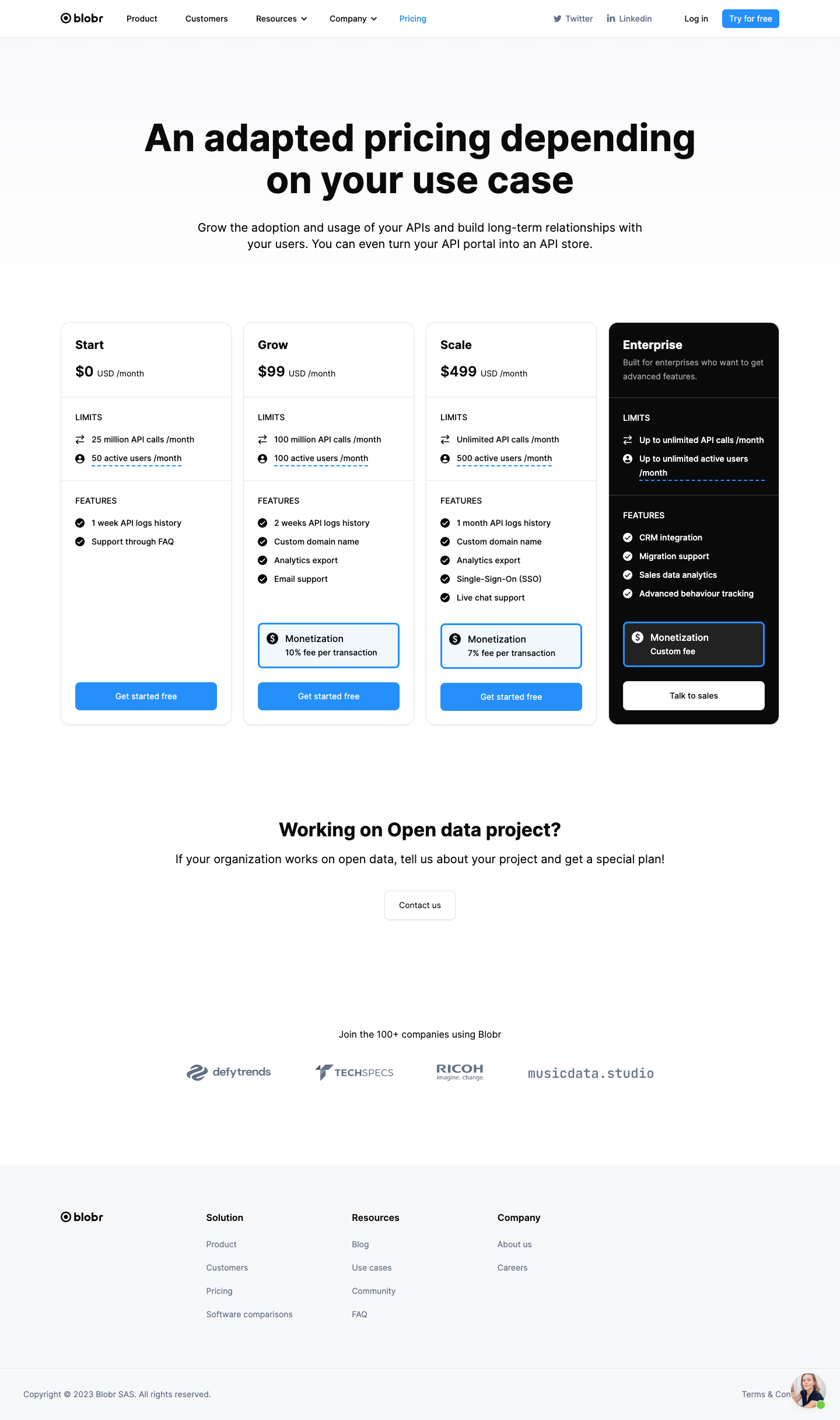
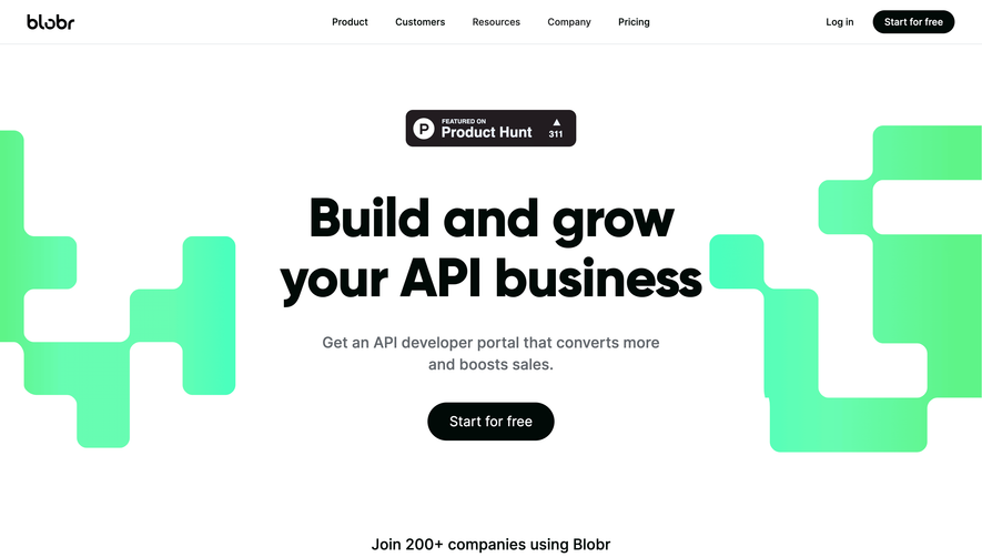
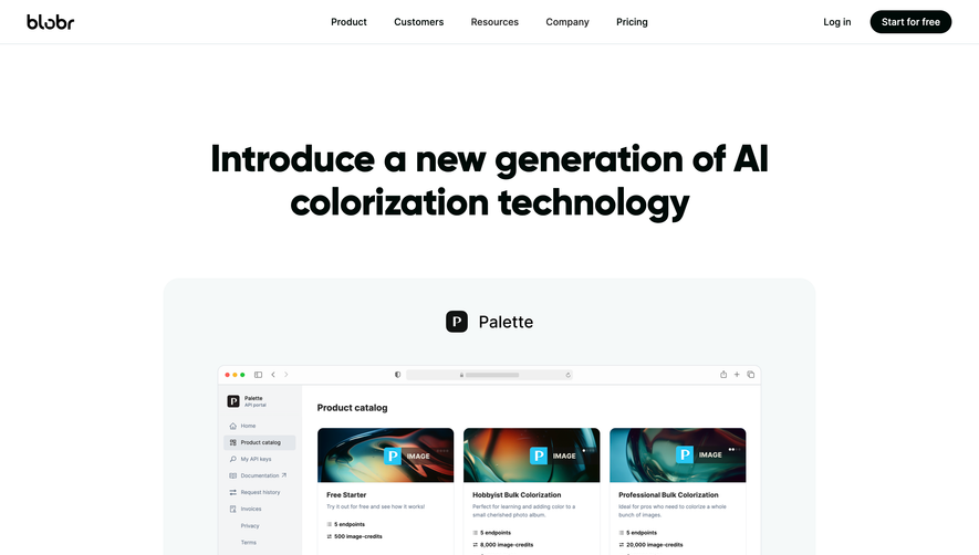
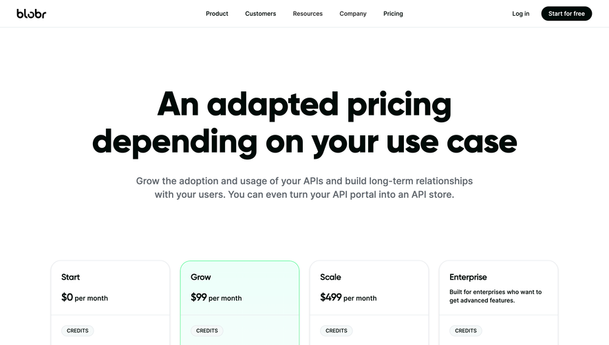
Blobr’s pricing page exudes a fresh, modern aesthetic rooted in minimalism and clarity. The design embraces ample white space, bold accent colors, and clean lines, projecting an approachable and professional vibe. Soft, subtle gradients and modular elements reinforce a sense of contemporary innovation without overwhelming the viewer.
Layout and Structure
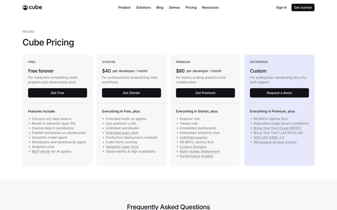
The page structure follows a logical and focused flow. A concise hero section introduces the pricing context, immediately orienting users. Pricing plans are presented in a clear, horizontally-aligned grid, making comparison effortless. Supplementary sections include FAQs for reassurance and a final call-to-action strip, all capped by a compact footer.
Visual Elements
Playful yet refined vector illustrations punctuate the page, adding personality while remaining on-brand. Iconography enhances clarity and quick scanning. Transition animations and hover effects add polish—pricing plan cards elevate smoothly on hover, inviting interaction.
Color Palette and Typography
Blobr’s palette centers around calming blues and crisp whites, energized with cerulean accents for CTAs and highlights. Ample use of contrast aids readability. Typography is geometric and sans-serif, with strong headline weights for section titles and lighter body copy, creating distinct, user-friendly hierarchy.
User Experience Patterns & Unique Touches
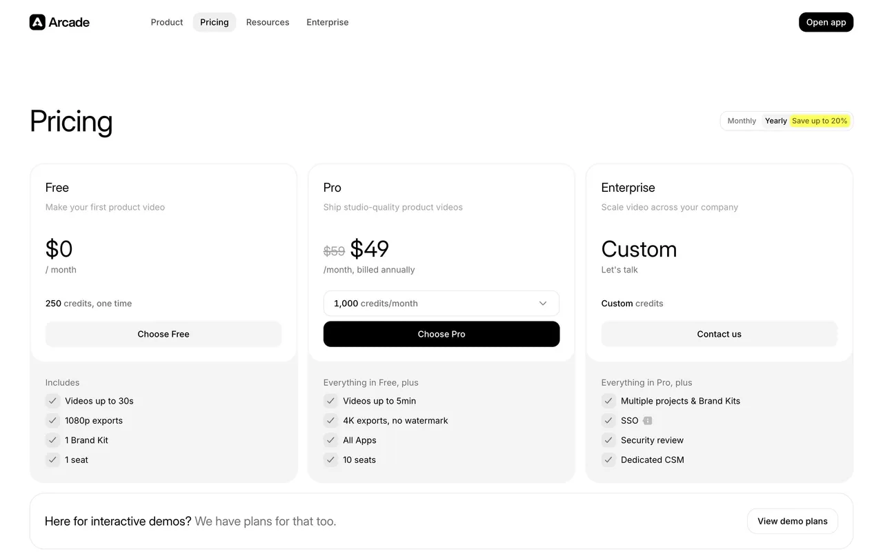
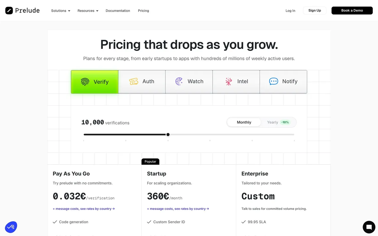
Navigation is sticky and minimalist, with clear, prominent CTAs (“Start Free”) anchoring the journey. Pricing toggles (monthly/yearly) enable quick plan comparison, enhancing usability. The absence of distracting clutter, paired with subtle microinteractions, builds an experience that feels both trustworthy and future-forward. The overall tone is quietly confident—creative, yet grounded in clarity and ease of use.
 SaaSFrame