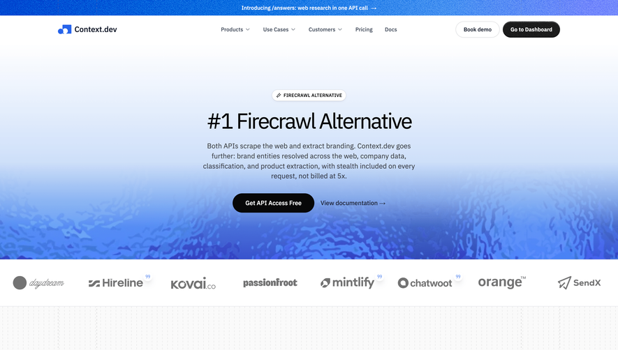
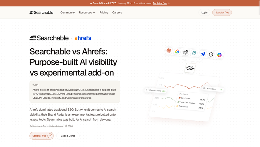
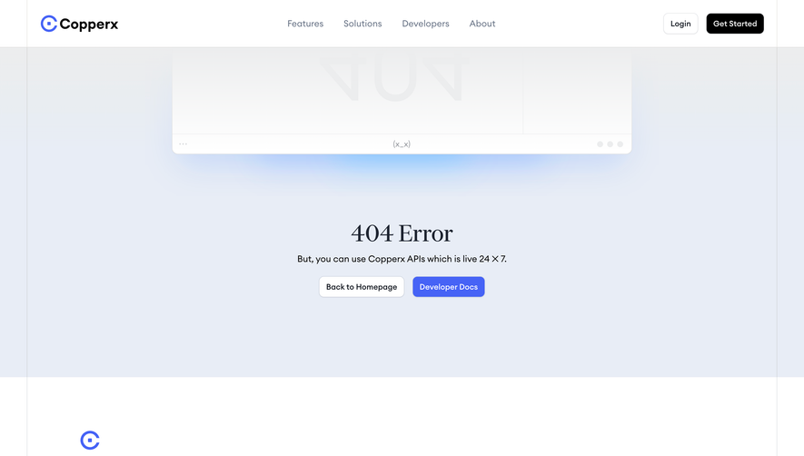
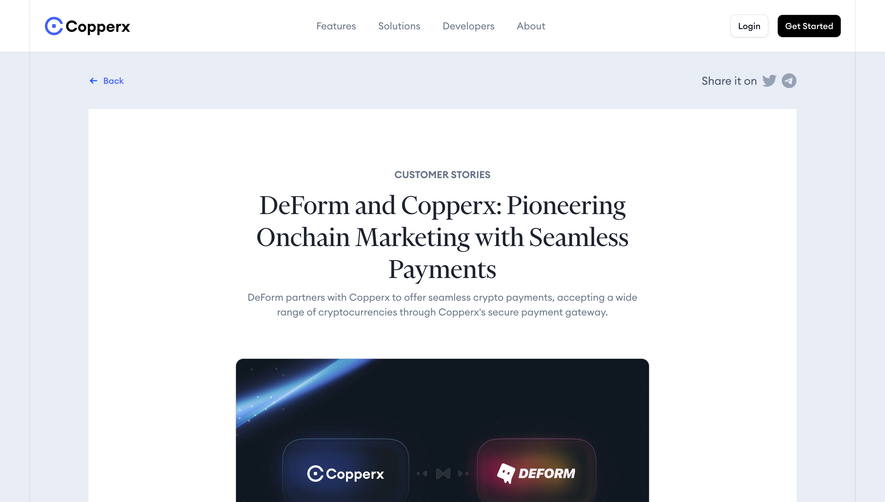
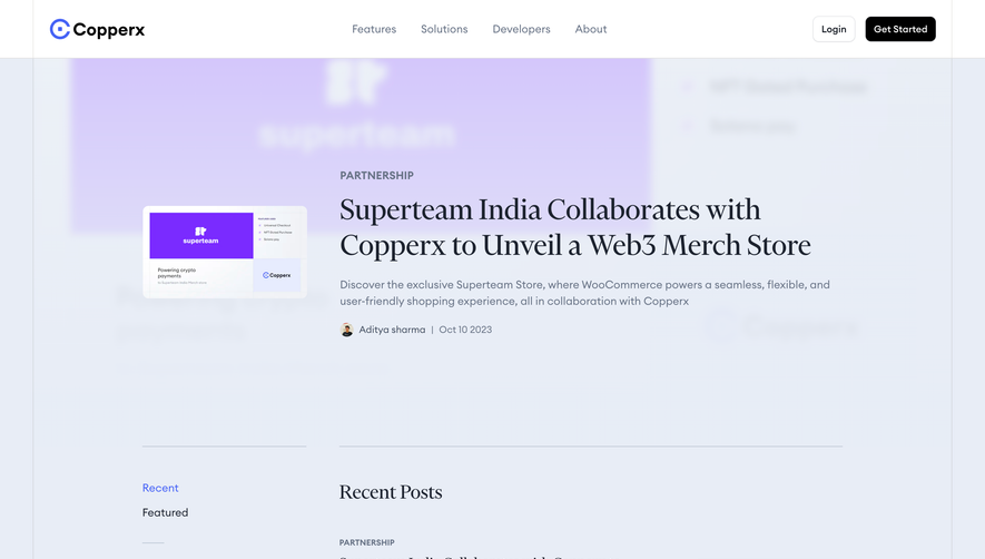
CopperX’s comparison page embodies a distinctly modern and professional aesthetic with a minimalist touch. Crisp layouts and understated animations signal innovation while maintaining clarity. Subtle gradients and nuanced shadows evoke a sense of depth without distracting from content, supporting a visual language that feels both high-tech and approachable.
Layout and Structure
The layout unfolds in a user-centric hierarchy: a compelling hero section introduces the value proposition, followed by a side-by-side feature comparison table, and finishing with trust-building elements like testimonials and a persuasive CTA. Each section feels spacious and clean, leveraging white space for maximum readability. Navigation is persistent and intuitive, with sticky elements ensuring visitors don’t lose their bearings.
Visual Elements
Custom illustrations and crisp SVG icons punctuate the experience, providing visual cues that reinforce key messages. Animations are tasteful, limited to subtle transitions that guide the eye rather than overwhelm. No stock photography; every graphic feels bespoke, enhancing brand personality and uniformity.
Color Palette and Typography
A harmonious palette of cool blues, gentle gradients, and energetic accents draws attention to important elements and CTAs. The typography uses a modern, geometric sans-serif with sharp hierarchy—bold headers, clear subheads, and generous paragraph spacing—making it scannable and accessible.
User Experience Patterns
Microinteractions (like table hover states) offer feedback and clarity. Primary CTAs are prominent but unobtrusive. Navigation stays accessible without clutter, and comparison data is easy to digest at a glance. Forms are rapid and frictionless, with visual validation cues.
Unique or Notable Design Choices
The innovative use of a dynamic, side-by-side comparison table stands out—clean, interactive, and mobile-friendly. Trust signals, like badges and testimonials, are artfully integrated rather than intrusive. The tone is quietly confident, fostering trust and projecting expertise without a hint of arrogance.
 SaaSFrame