Overall Style and Aesthetic
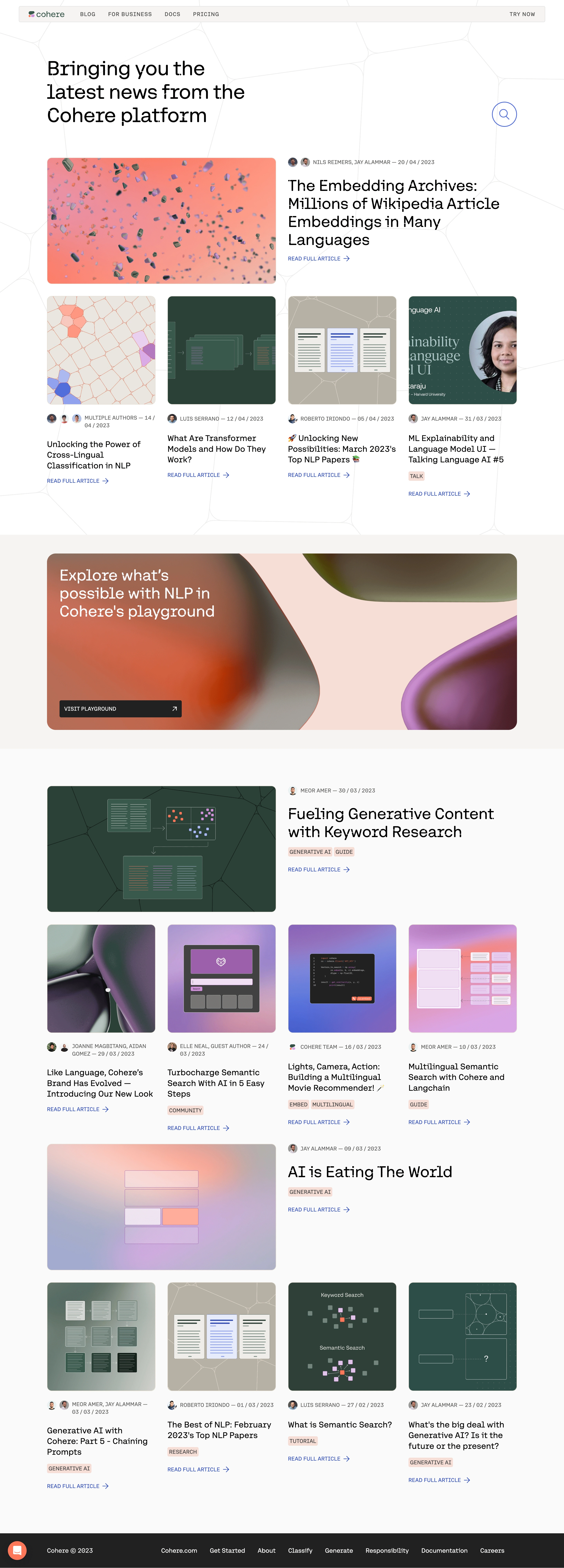
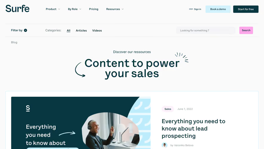
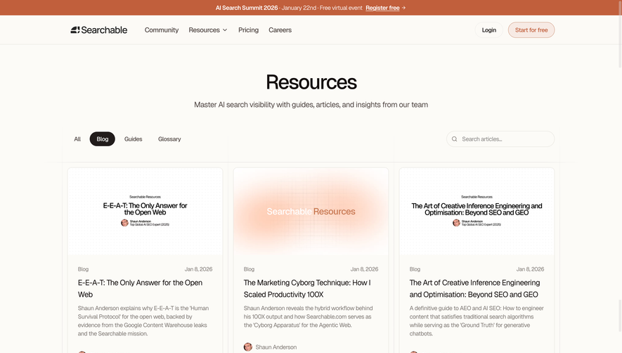
Cohere’s txt.cohere.com page instantly impresses with its ultra-minimalist, modern aesthetic. Crisp whitespace envelopes every section, exuding sophistication and clarity. The design is unmistakably professional, balancing a sense of technological innovation with welcoming accessibility. Subtle micro-interactions and fluid transitions contribute to a calm, frictionless browsing experience. Layout and Structure
The site deploys a streamlined single-page structure. The hero section commands immediate attention with a bold headline, an interactive prompt input, and a subtle background gradient. Beneath, feature highlights are elegantly presented as concise cards, each supported by a distinctive icon. There's no clutter—testimonials, case studies, or extensive pricing grids are omitted, sustaining focus and immediacy. Visual Elements
Rather than heavy illustrations or photography, the design leans on purposeful iconography and dynamic gradients. Animated input/output examples in the hero banner make the AI-powered product come alive. Icons are geometric and unified in color and size, reinforcing cohesiveness. These choices keep the experience fast and distraction-free. Color Palette and Typography
The palette centers on deep blues and vibrant purples, evoking trust and modernity, offset by ample white space for breathability. Large, sans-serif headings command attention, while supporting text uses subtler gray tones, ensuring effortless hierarchy and scanability. User Experience Patterns
Navigation is nearly invisible—anchored by a lone primary CTA and a sticky, minimal menu. The interactive prompt form in the hero encourages immediate engagement. Scroll reveals are smooth but understated, nudging users downward without overwhelming them. Unique or Notable Design Choices
The immediate, central demo—letting users interact directly with the AI—builds both curiosity and trust, eliminating barriers to experimentation. The absence of extraneous marketing fluff sets a new bar for functional SaaS landing pages, making every pixel work harder. Tone and Feel
Every aspect projects confidence, trustworthiness, and technical prowess, yet retains an inviting and non-intimidating personality—ideal inspiration for anyone seeking clean, modern SaaS web design.